
Retail Soccer Product Page

This is what the desktop landing page could look like before it is properly branded.
Creative Brief
The design challenge was to create an engaging purchasing experience for a major soccer brand. Specifically, the client needed assistance lowering the current bounce rate while increasing traffic volume and profitability.
Design Challenge
At the start of the project, the client did not have a responsive mobile site to facilitate the projected revenue it was after. In response to this issue, a cohesive desktop and mobile concept was presented based on online competitive research.

Texture was a design element I wanted to incorporate into the visual design of the project.
Competitive Research
Before the project launched into full swing, I investigated six competing brands as a user to get a feel for what components were working well. In addition, I was looking to identify pain points during the purchasing process for each retailer. It was important for me to know how many total clicks it took to find a pair of men’s cleats and add them to my cart in any given site.

Desktop Sketches
Before using the computer to create wireframes, I complied a couple of sketches for the desktop to get a feel for how I was going to move forward with the design of the landing page. During the sketching process, it became clear to me that full size imagery was going to be employed throughout the site.


Desktop Wireframes
After sketching out a couple of layouts, I was forced to produce wireframes shortly after reviewing them with the lead designer. Since we only had one week to deliver a working prototype, we did not have the luxury of conducting traditional user tests and revising the design based on feedback. However, we were able to lean on the user research team to provide us with the human insights we needed to make informed design choices.


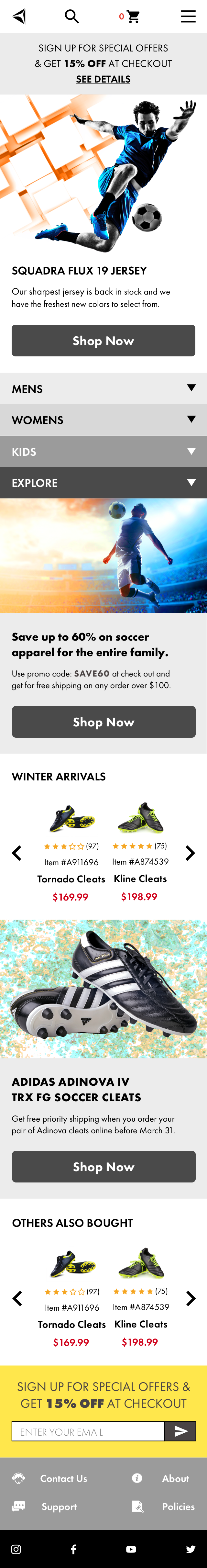
Desktop Landing Page
Once I had the chance to review the layout with the senior designer, he pointed out that I needed to make changes to the header. The cart icon and profile log in features were missing and needed to be included in the polished version. My use of color needed to improve in terms of contrast so the target audience has an easier time reading the content and navigating the site.

Mobile Exploration
Once the desktop layout was configured, designing the mobile landing page was the second phase of the project. Since the design had to support legacy users, the layout was optimized for viewing on an iPhone 5.

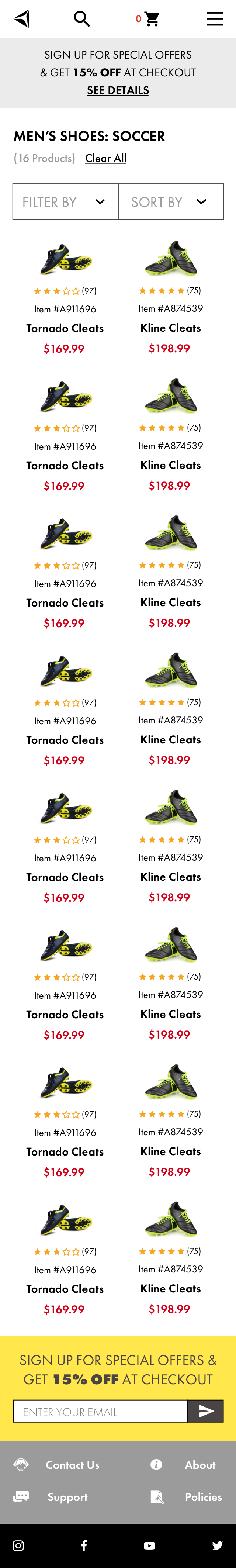
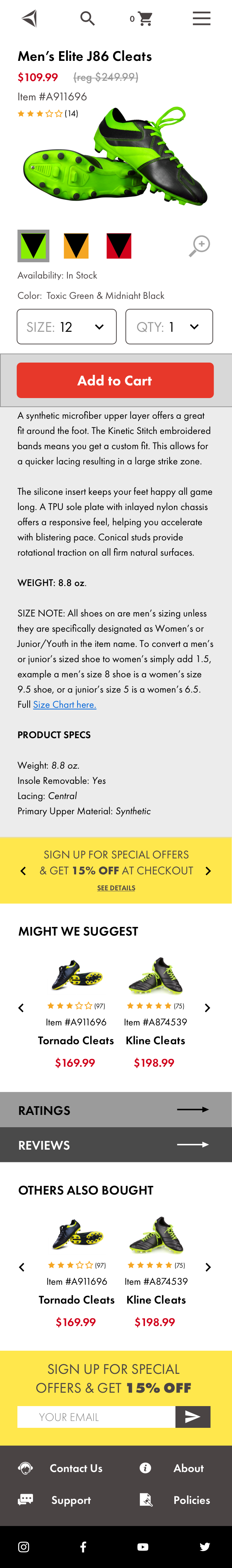
High Fidelity Wireframes
The turnaround time for this phase of the project was unreal. The client expected to have a clickable prototype in a matter of days not weeks. Considering the time frame, the design lead gave me the green light to leap from sketches to wireframes. After the design was presented, I would come to realize the menu layout was not user friendly and needed some serious attention.
Accessibility Testing
While on assignment with a different client, the subject of accessibility came into question. Inadvertently, I tested some random people and discovered one of them had a condition known as Deuteranopia. By using Sim Daltonism, I was able to experience what a user with color blindness sees when they engage the layout. This realization made me change direction in terms of the color choices used for all of the call to action buttons.
Conclusion
Once user testing concluded, the layout was finalized minus the branding aspect. Since functionality was the focus of the challenge, the final visual design was completed by internal resources from the client side. Although I had some creative ideas for the branding campaign, I felt comfortable leaving those decisions to the client’s internal design team since that portion of the project was out of scope.