
Playbulb

Playbulb Candle Photo: Eric Guzman
Creative Brief
Playbulb is a product that started out as a Kickstarter project looking for funding. This brand appeals to tech savvy adults with disposable income looking to enhance their relaxation time. Therefore, it is essential that the typography, color selections, and icons for the brand reinforce the feeling of tranquility. Overall, the main goal of the campaign is aimed at retaining the loyalty of the existing customer base.
Design Challenge
By developing a new logo and adopting a different color palette, the brand will be more engaging to the target audience. Once the new branding system is implemented across all online platforms, users will be more engaged with the product and should have a better consumer experience.

Playbulb Candle Photo: Eric Guzman
Research Through Interviews
It was not hard to find subjects to interview when I started to conduct research, Social media made it easy to find customers who already purchased products from Playbulb. It was important for me to understand if they were loyal to brand based on their experiences. Most of the people interviewed were very happy with their purchases but were unlikely to make another purchase. Details from the interviews are available for download and review.
Logo Development
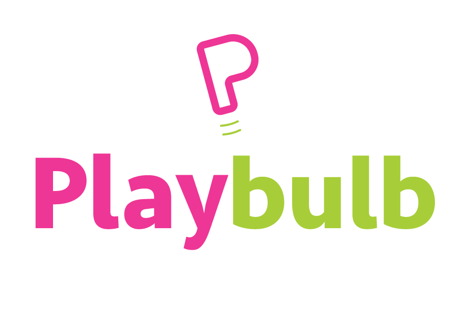
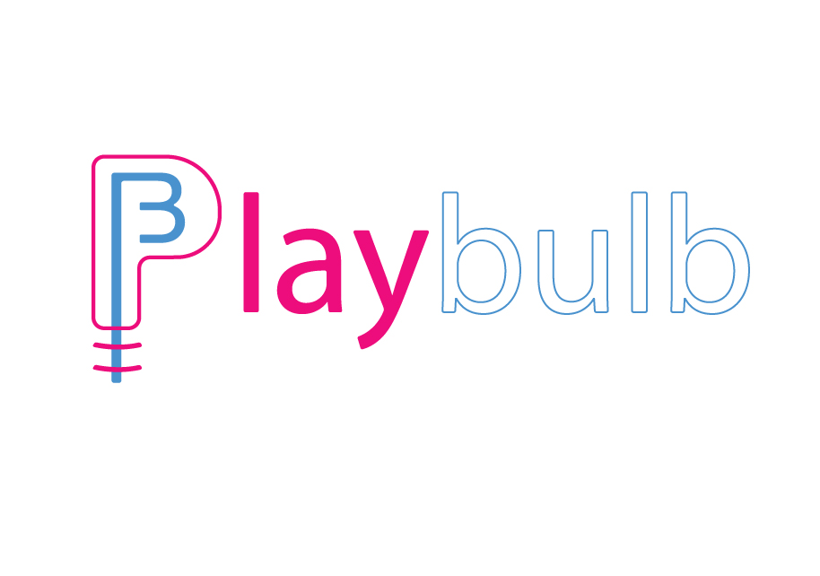
Originally, the logo design on the left was a collaborative effort between Kyle Ledezma and myself. The finalized version, displayed using green, was designed using PT Sans and Seravek. Most of the letters are Seravek but the last letter of play is actually PT Sans. Tilted by nine degrees, the letter above the name doubles as an implied light bulb. After I revised the logo, the target audience is more inclined to engage with the product because the playfulness of the brand is clearly evident through the use of color and font selections.
Branding Identity
When Kyle and myself were initially faced the design challenge for the brand, we agreed that the magenta color would be perfect for this campaign. According to our combined research, we discovered that our target market was composed of mostly adults born in 1980's. The two colors selected were inspired by American culture during the 1980's. All icons are rotated 9 degrees to emulate the feeling of relaxation.


Site Architecture
Once the new logo and branding identity were finalized, the Design Thinking process was started. Using post it note pads, I mapped out the website's functionality and ensured all of the relevant content was accounted for.


User Experience Sketches
This stage of the design process was crucial for me to visualize the components that make for a successful user experience. Since my target audience were mostly tech savvy young adults, I wanted to create a layout that was engaging and adhered to the principles of hierarchy. The left sketch is of the home page while the right side depicts the product page layout.


Paper Protoypes
Since this project was for a retail product, I developed a layout that would lead the user from left to right in a manner that adhered to a person's innate behavior. Once again, I looked to various websites for inspiration and decided to organize the content in a manner that placed heavy emphasis on hierarchy.


User Testing
The user testing confirmed that the layout I composed was easy for users to navigate. In addition, the content was presented in a manner that placed an emphasis on hierarchy while minimizing unnecessary information.
Wireframes
After the prototypes were tested, I created wireframes similar to the prototypes. However, these designs were conceived prior to me purchasing the Playbulb Candle. The product shots that I composed ultimately lead me to rearrange the final layout of the website. The left image is the home page wireframe while the right side depicts the product page.


Desktop Website

Aside from a new logo, the Playbulb brand needed improvements to the website. Since all of the products utilize light, it was important to place emphasis on color and base the arrangement of the content in a fashion that keeps the audience moving from left to right across the layout.
Playbulb Home Page
All of the users of the site will have fewer navigational choices to make. This makes finding information easier for a wider user base. The readers are lead from left to right across the picture plane. All of the content is presented in a manner that adheres to the principle of hierarchy.

Playbulb Product Page
Having a Playbulb Candle at my disposal enabled me to use my own photography for the product page. Kyle Ledezma provided his assistance during several product shoots.
