
HCL Travel App

Why are we doing this?
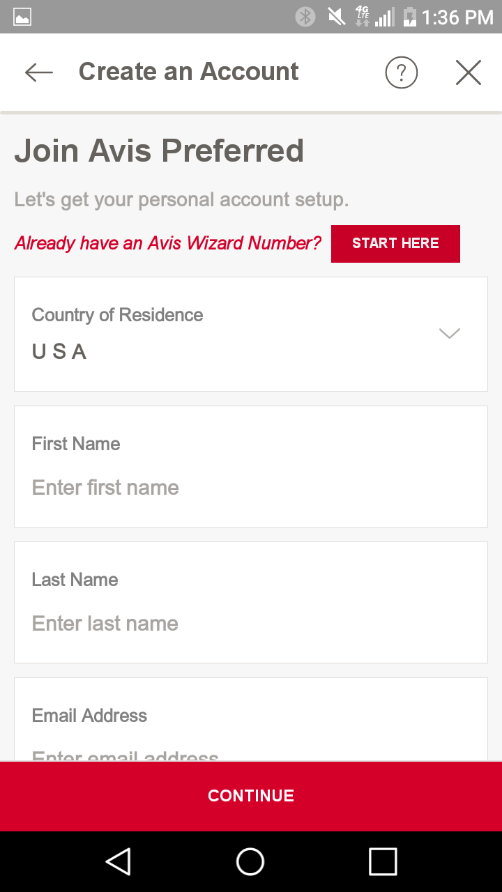
During my time at HCL, I was exposed to the UX consultant lifestyle. This required extensive travel for just about everyone at the senior level. Since we were often tasked with booking our own travel and hotel, this was not something any of us ever looked forward to. Needless to say, the process put into place, while I was there, was riddled with inefficiency. Our director of operations proposed that I design a branded proof of concept travel app that would address our collective pain points.

This is a mock of the final boarding pass design for iOs mobile.
What else is out there?
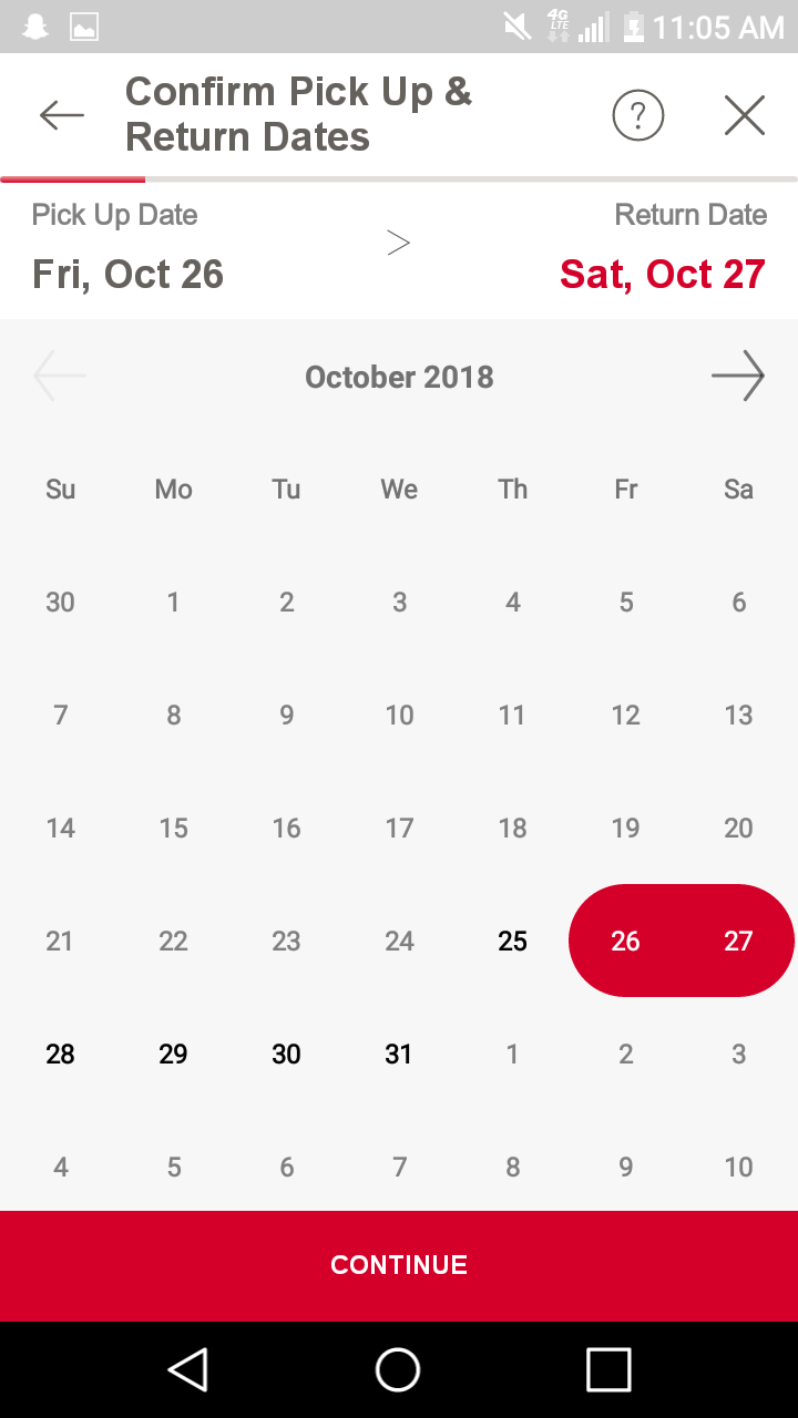
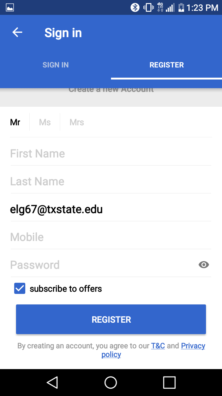
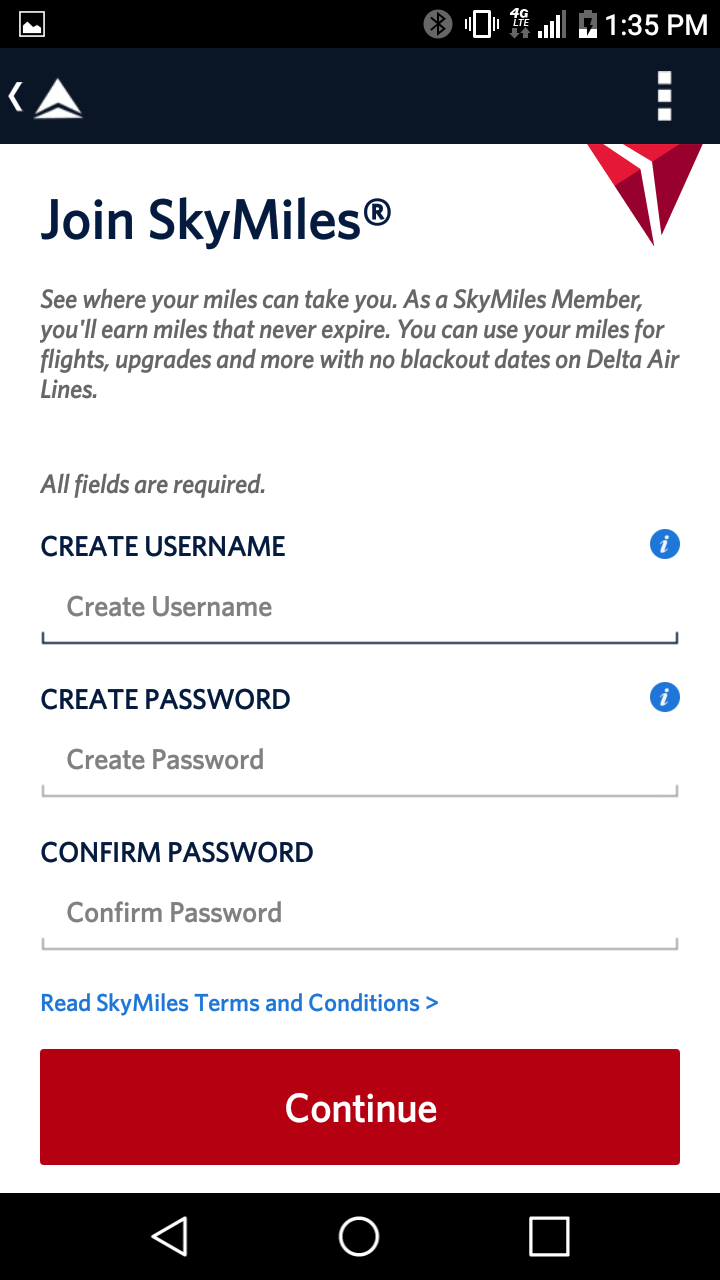
Once the project officially kicked off, a discussion guide was assembled with assistance from the director of insights. Personas were designed to define the use cases. Three qualitative interviews were conducted with internal users to document the respective pain points. Journey maps were created to highlight user frustration and identify potential areas of improvement. Competitive analysis was conducted to document which features were available from competing vendors. Over twenty different vendors were sourced for competitive analysis and mobile screenshots were used for inspiration. Four competing examples are featured below.


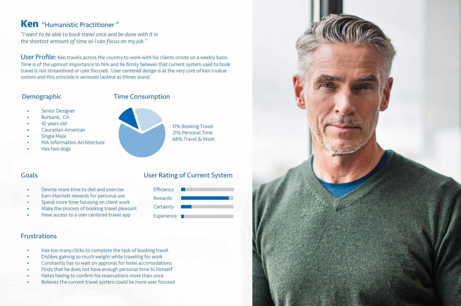
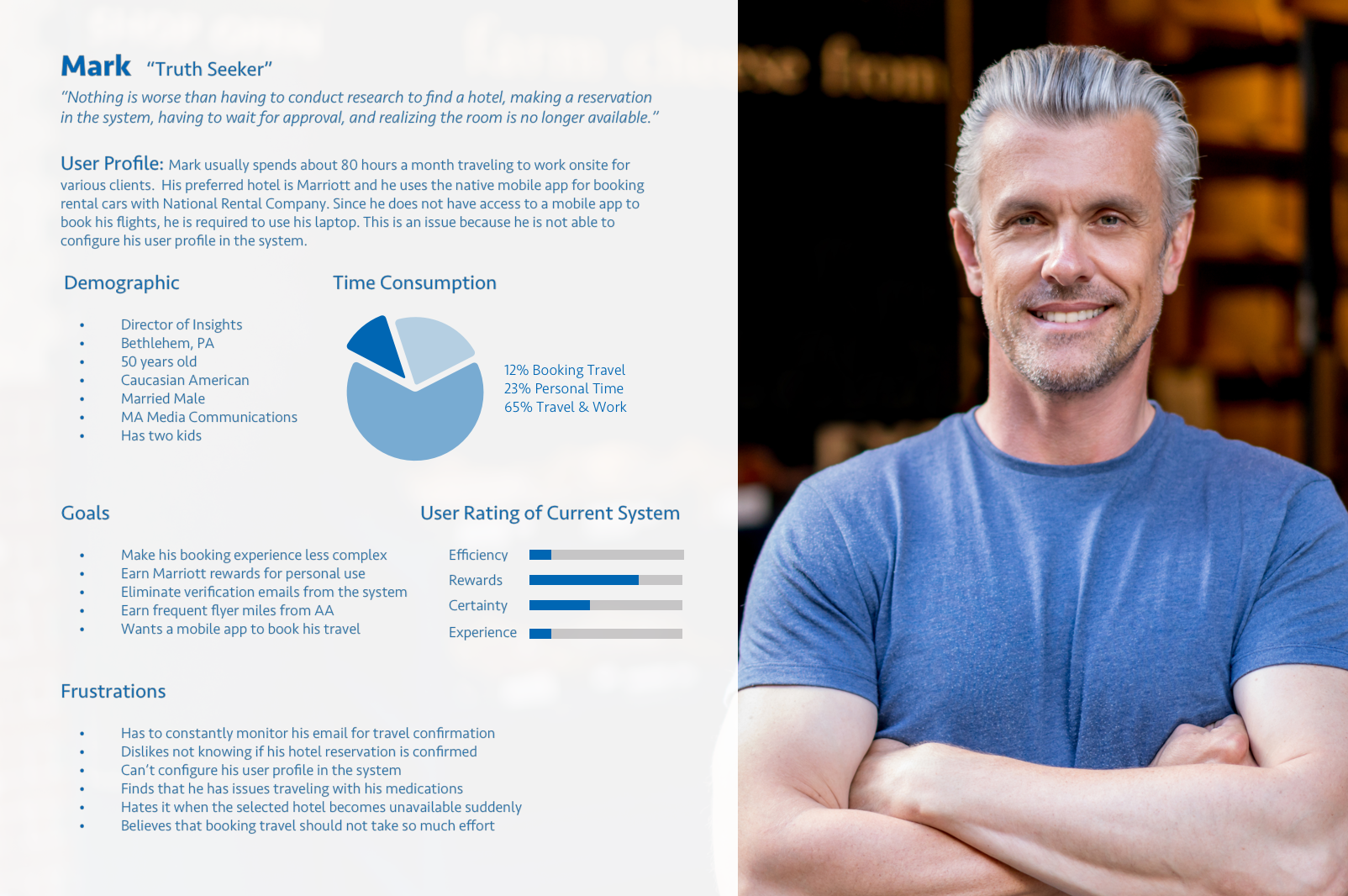
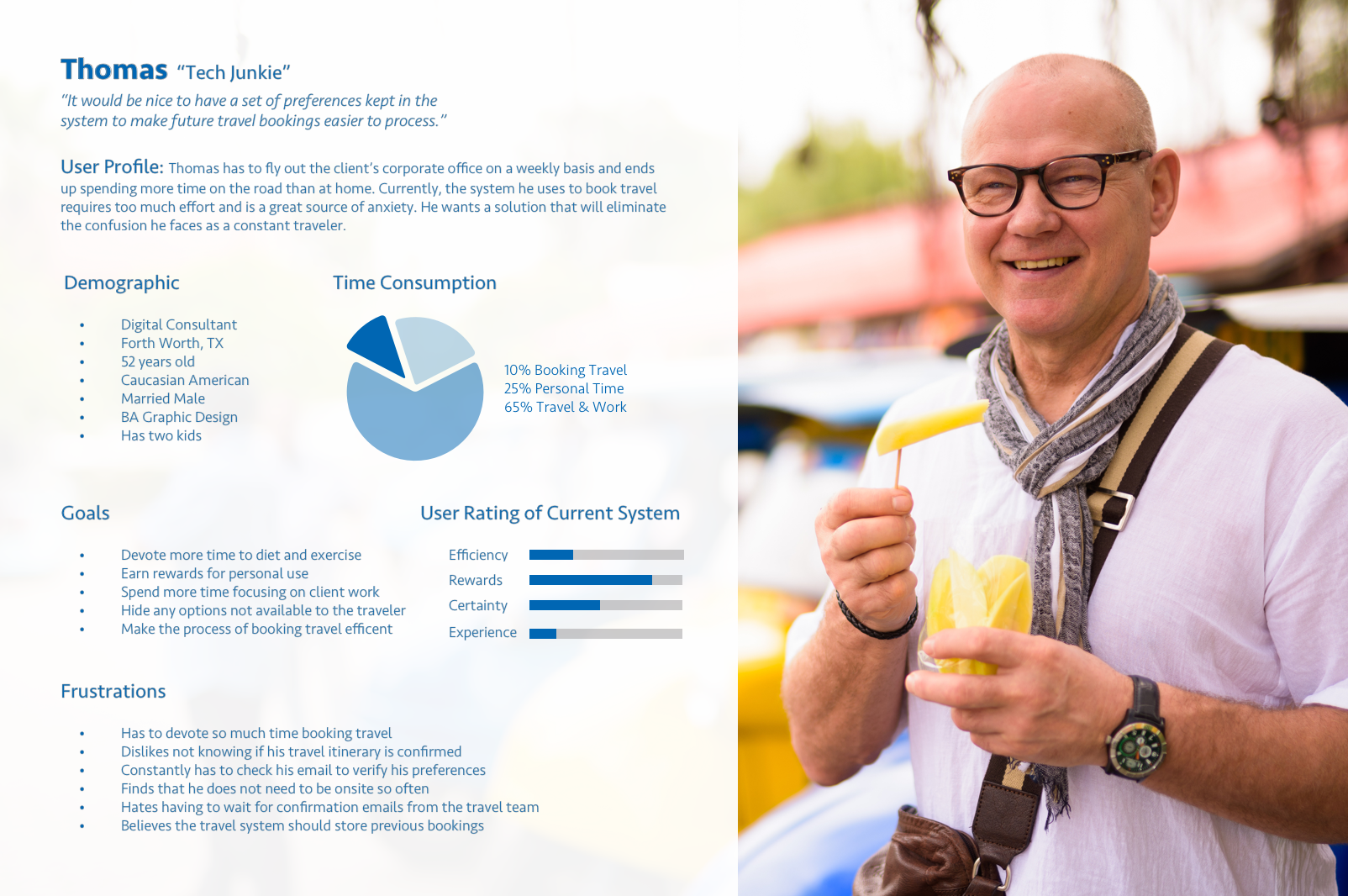
Meeting the users
Three internal coworkers, who were confirmed power users at the time, were interviewed once the discussion guide was finalized. All of the information provided by my coworkers was illustrated in the form of these three personas. The actual interviews themselves are available for download below.
Understanding the user journey
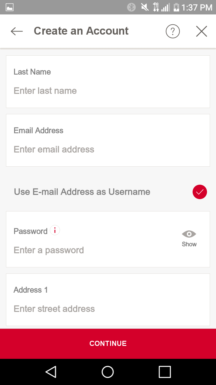
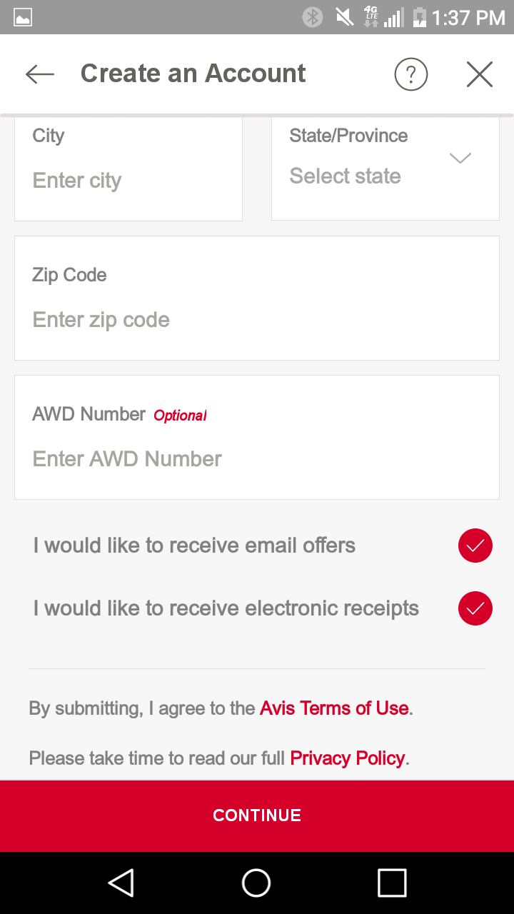
After cultivating user insights from the qualitative interviews, I realized there was plenty of ways of improve the user experience while booking travel. Ultimately, it takes far too much time to confirm booking once the process officially starts. System visibility was missing in several areas and needed to be enabled. In addition, users were not able to save preferences and should not be shown options not available to them. Lastly, the journey needed to be streamlined and free from technical constraints leading to user frustration.

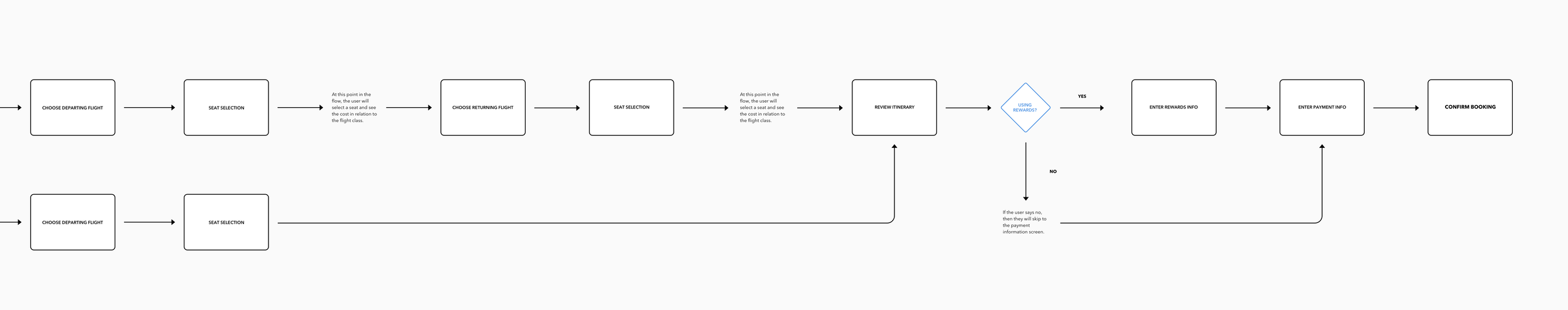
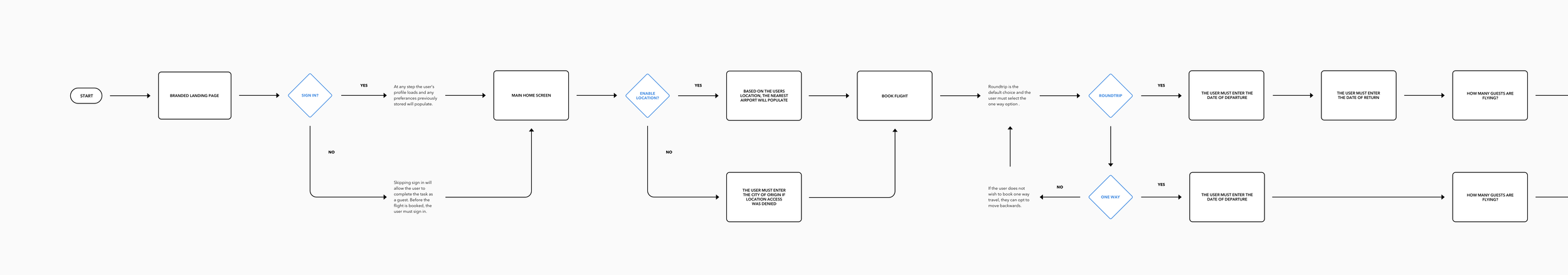
User flow for booking flight
After the layout sketches were complete, I compiled a user flow based on the input from users who shared their insights. The flow is broken up into sequential segments to make it easier to read and was later revised after management review.
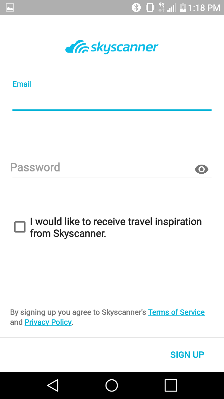
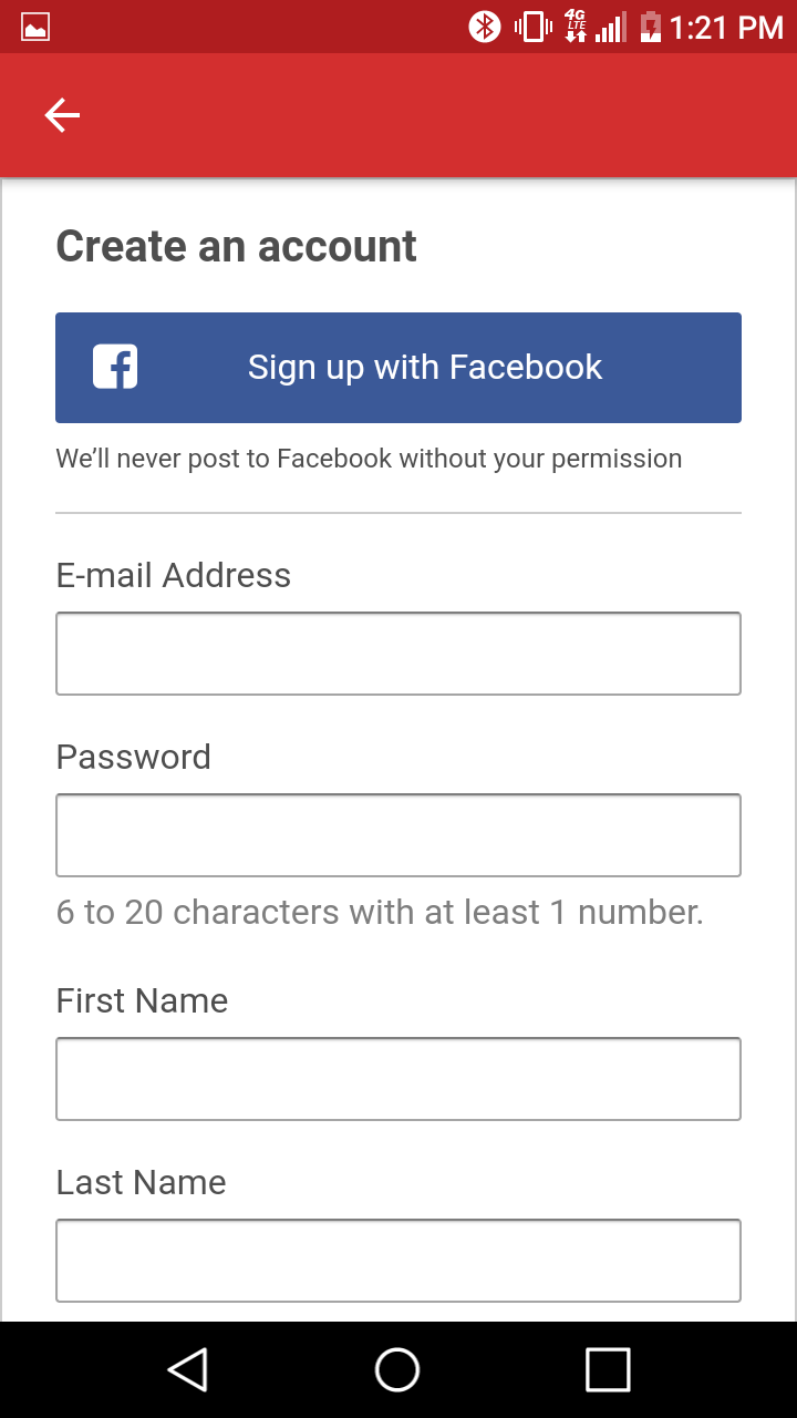
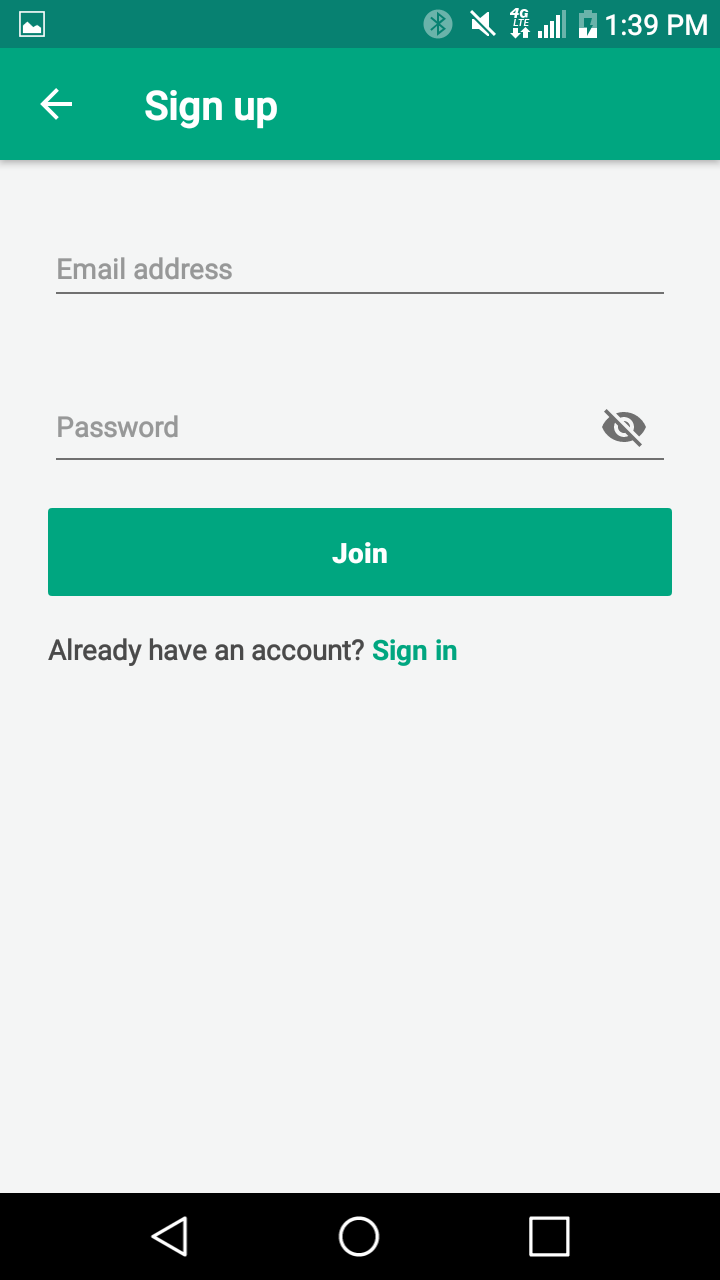
Login screen inspiration
Our VP of Operations asked me to design a simple login screen. Mockups were presented to stakeholders in an effort to secure funding for development. Before I produced any designs, I gathered as many screenshots as I could. My goal was to identify existing patterns and confirm the hierarchy for each composition.
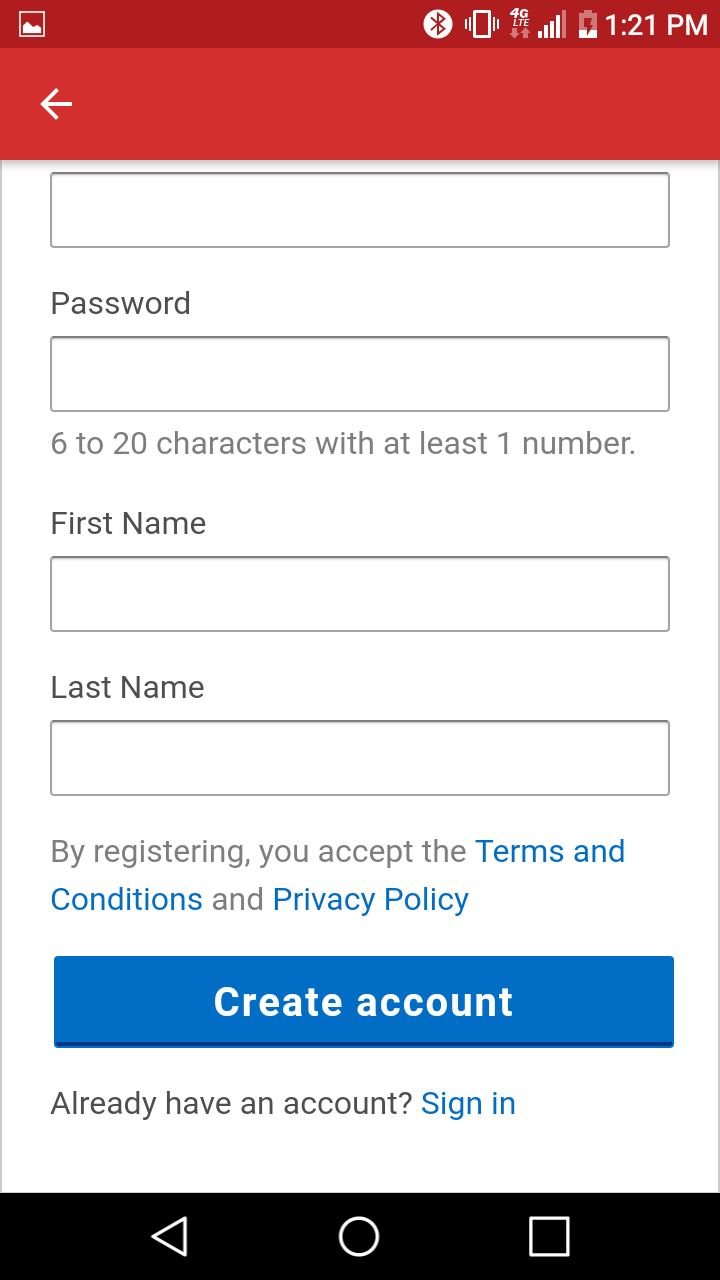
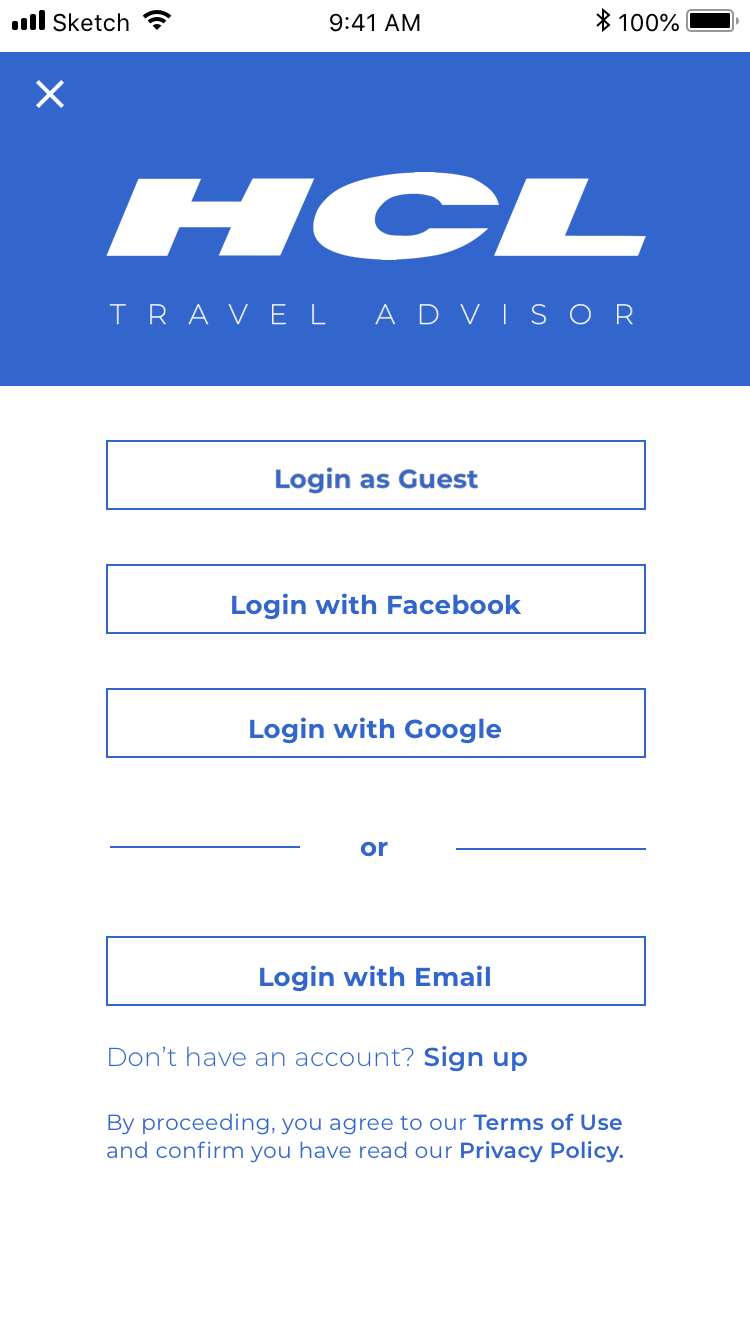
Proof of concept mockups
Considering the tight time frame for delivery, I was compelled to showcase designs in high fidelity state right off the bat. After internal review, management advised for me to remove the login with Facebook and Google option. This feature was not supported by the existing architectural structure.


The final solution
After removing the Facebook and Google login functionality, I settled on the final visual design. It was approved during an internal review and given to the appropriate resource for future development. Unfortunately, my tenure came to an abrupt end before I was able to see the designs come into fruition.


Boarding pass concept
Before the project came to a hard stop, the management team asked all of the designers to submit mockups for a mobile boarding pass. A few variants are available for review below. The final submission is seen at the top of this page.


