

Assessment Audit Reports

The business goal of this project was to bridge the feature gap for existing customers and provide a means for our support team to generate aggregate reports efficiently .
Legacy Application Innovation
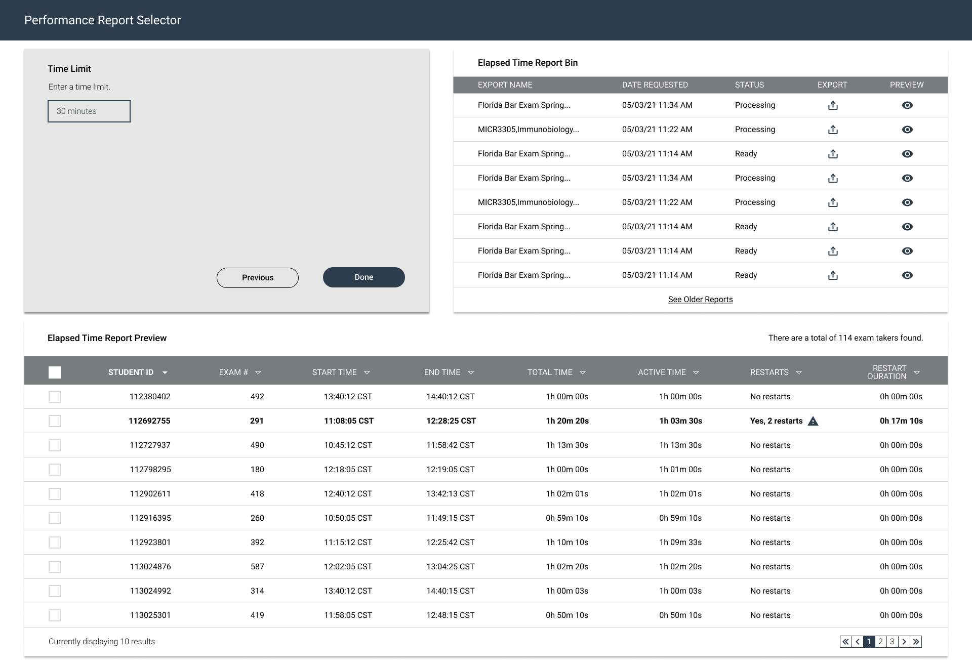
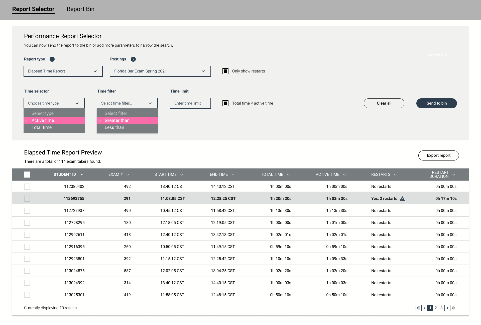
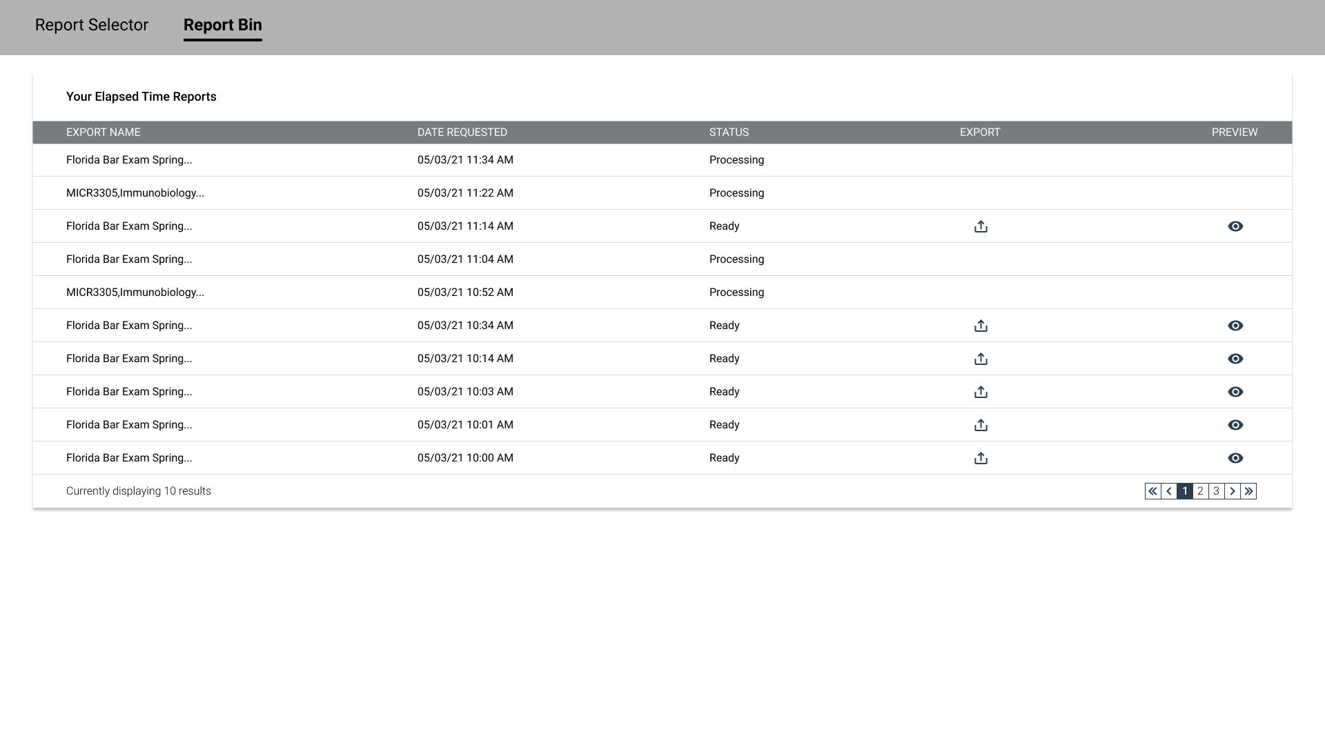
Institutions are Examsoft’s primary customers. Having said, customers are allocated to one of two possible operating platforms. The original operating platform is a legacy system. The newest user platform is called enterprise. As is stands now, the legacy platform offers a robust array of functionality not currently available for enterprise users. In essence, the ask from my product owner was to bridge the feature gap for some of our enterprise subscribers and provide a means of generating an elapsed time report. Screenshots from the legacy experience have been captured and compiled into a sequential document that is available for download below.
Product Requirements
As the project began to gain momentum, the support team advised us that the elapsed time report was utilized more than any other report type. The conceptual drawings showcased in the gallery below were created specifically for the elapsed time report by the product owner prior to my allocation to the effort. For the most part, the initial ask was to create a copycat design that was similar to the screenshot posted below.
Competitive Analysis
At first, I knew I had to conduct research so I could start to make sense of the problem at hand. Most importantly, I had to understand what audit reporting software does and how it looks. Surely, there had to be software already on the market that could offer me some guidance or inspiration to improve the existing legacy experience. As it turns out, there were plenty of products available on the market. That documentation is available for download below.
Stakeholder Discussion
This video details why the product was needed and goes on to explain the use cases for the interface. Clients were hesitant to migrate from the legacy platform over to enterprise because they could lose visibility on how their customers are operating. Bridging this feature gap would allow for aggregate reporting for large scale assessments. Integrity issues are a major concern for these large scale assessments and this product would allow users to efficiently gather the necessary data to identify students that may need special attention.
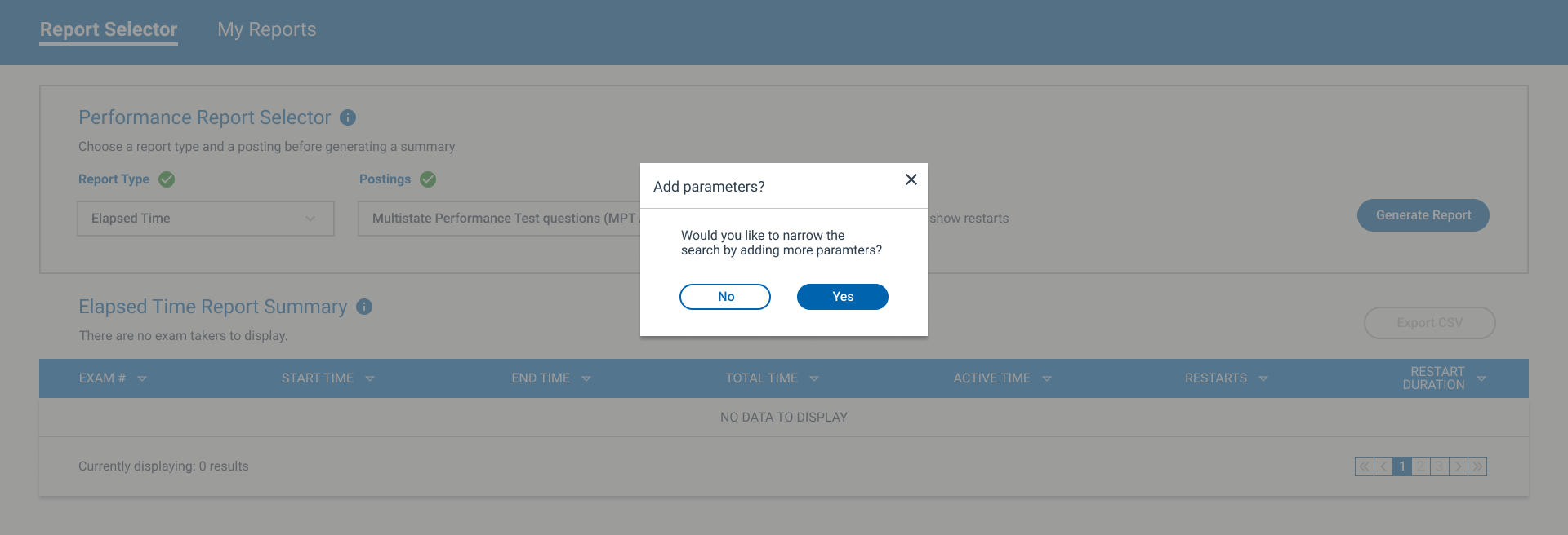
Two Possible Solutions
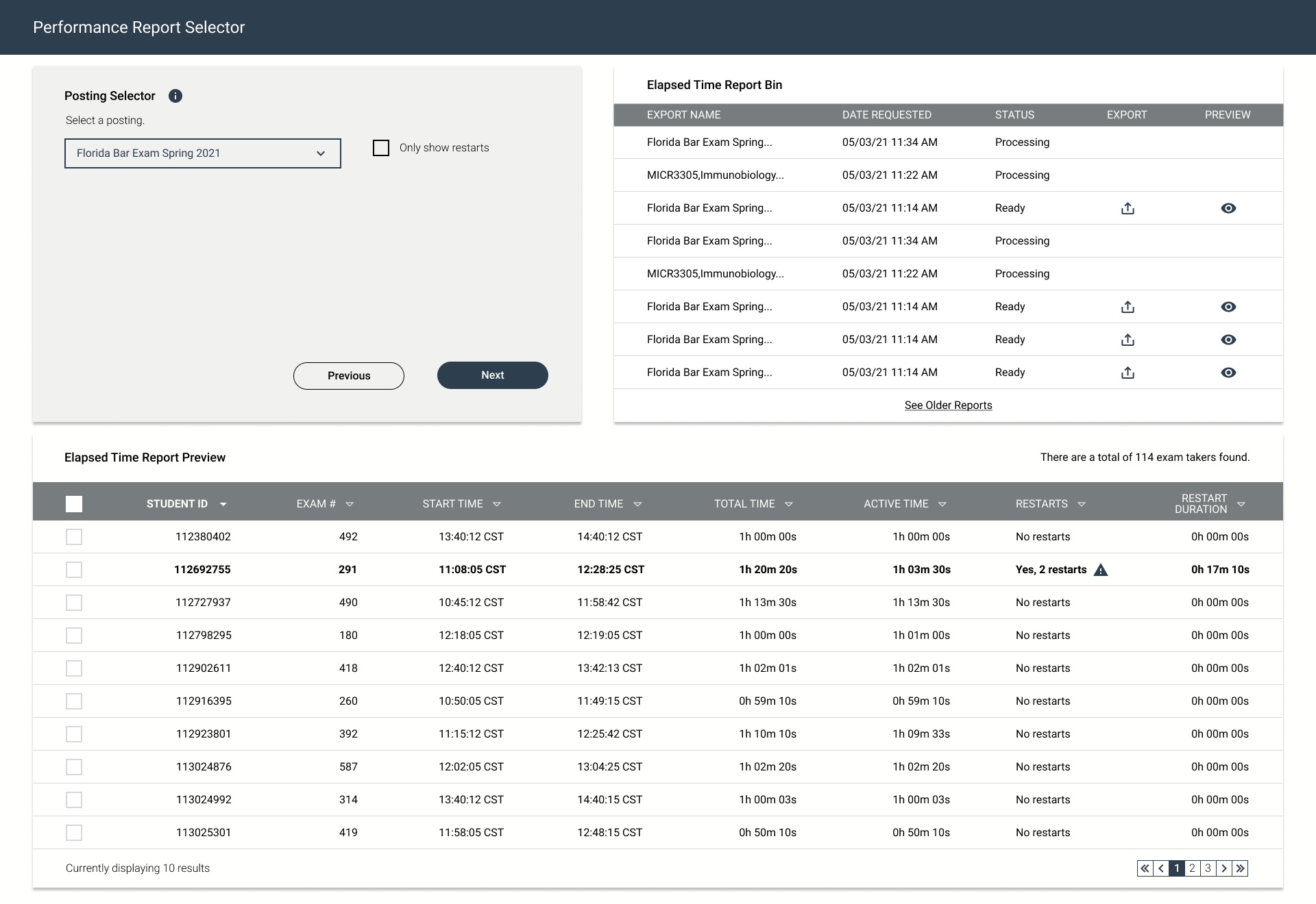
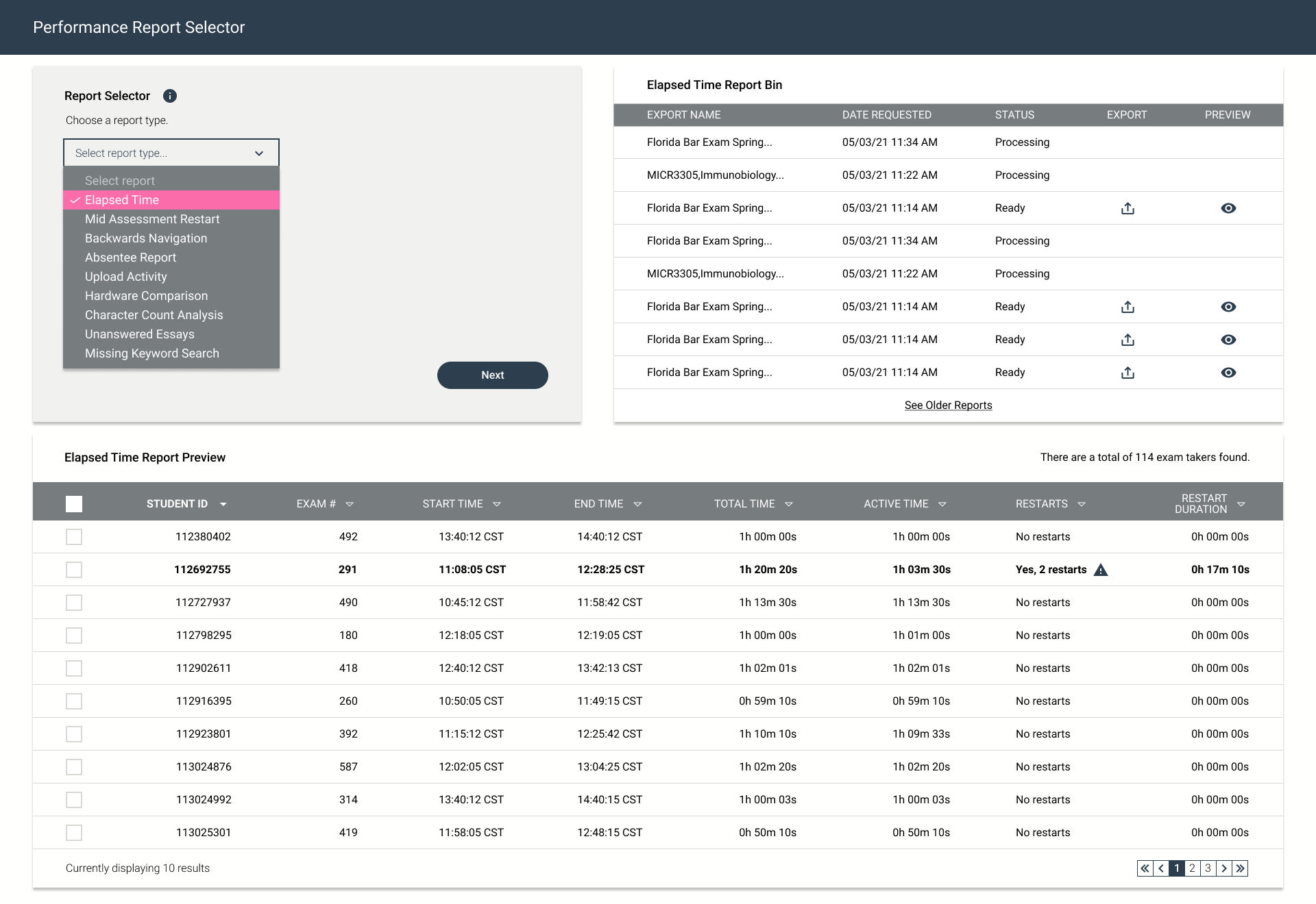
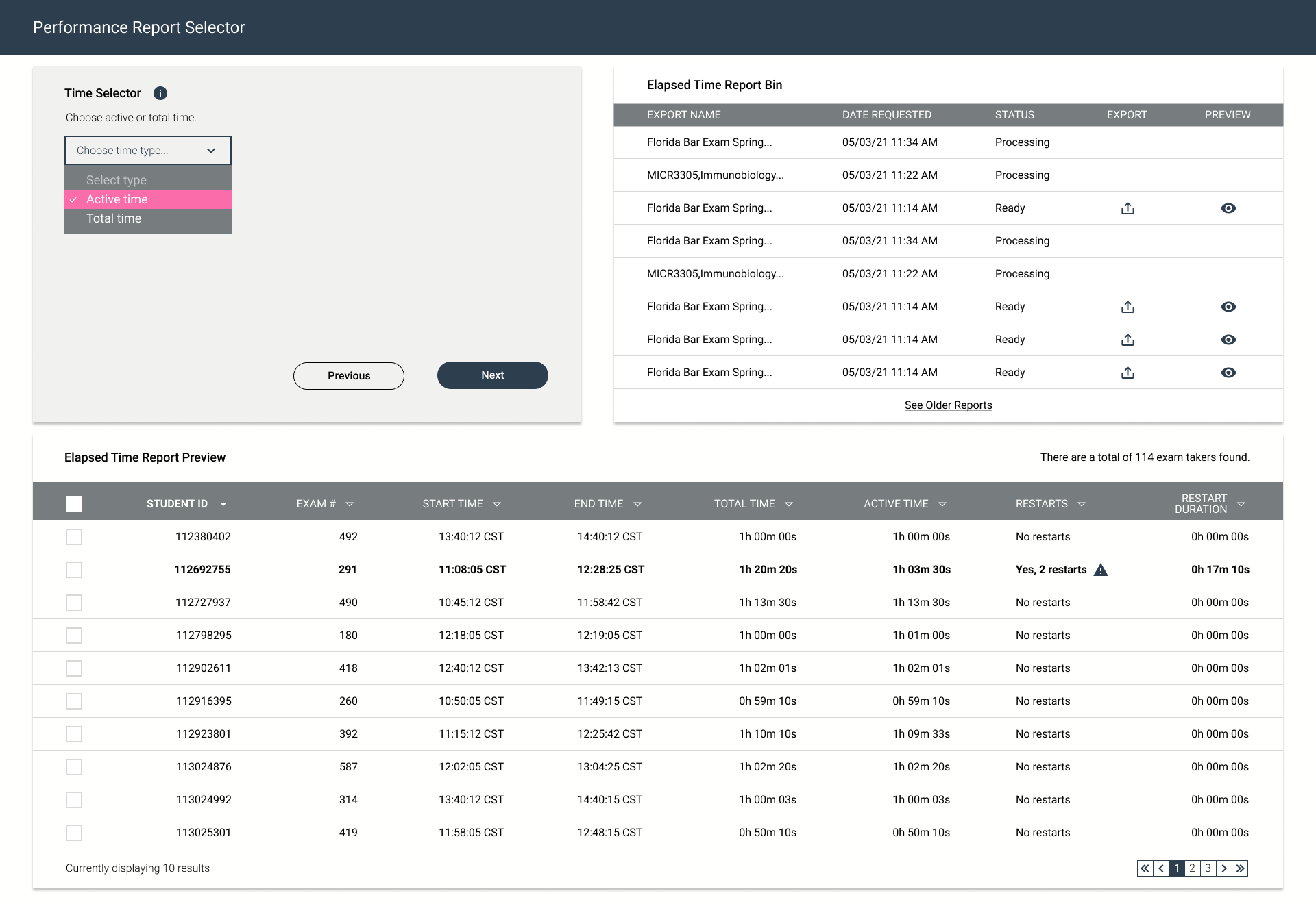
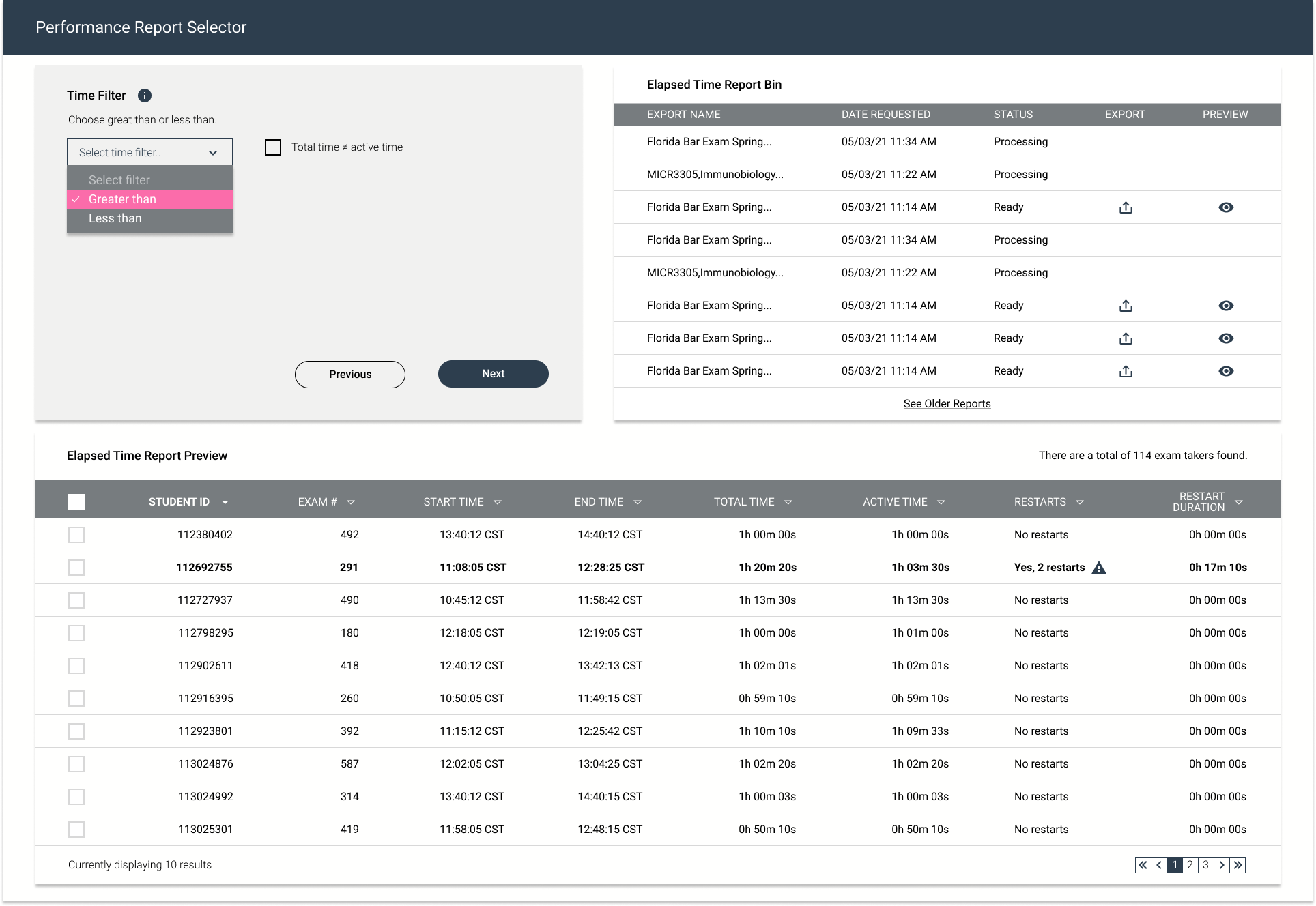
Taking inspiration from the legacy interface, I complied an array of solutions that took into consideration all of the existing architectural constraints at hand. In addition, I wanted the user to help shape the experience before any designs were handed off to the development team. Therefore, I designed a mock, that is featured below, where the entire experience as laid out on a single page while utilizing a wizard to set all of the parameters. The alternative solution relies on a tab structure to break up the experience in an effort to reduce the upfront cognitive load. A third stacked solution was also designed initially but was quickly discarded because it did not promote an elegant user experience.
The wizard featured above was aimed at reducing as much cognitive load as possible while heavily favoring the existing backend architecture. In addition it was the solution that the UX manager felt was the best layout.
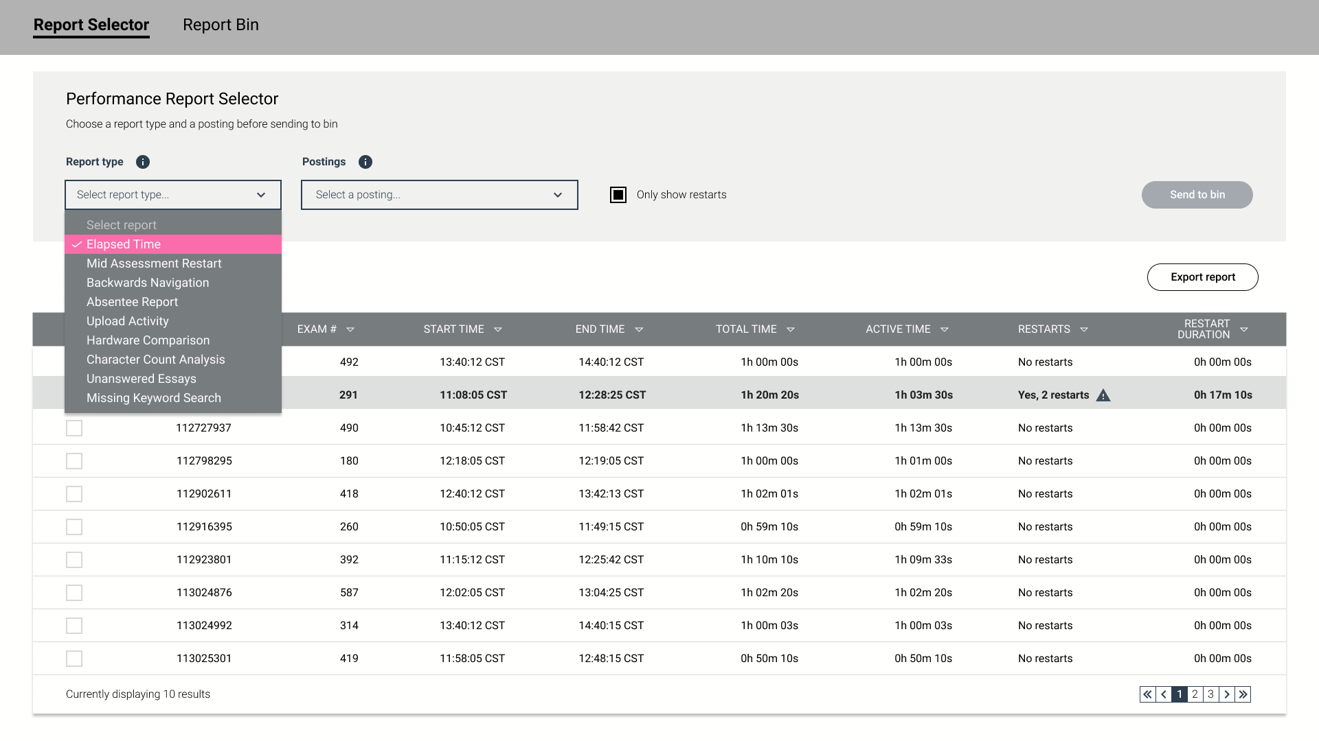
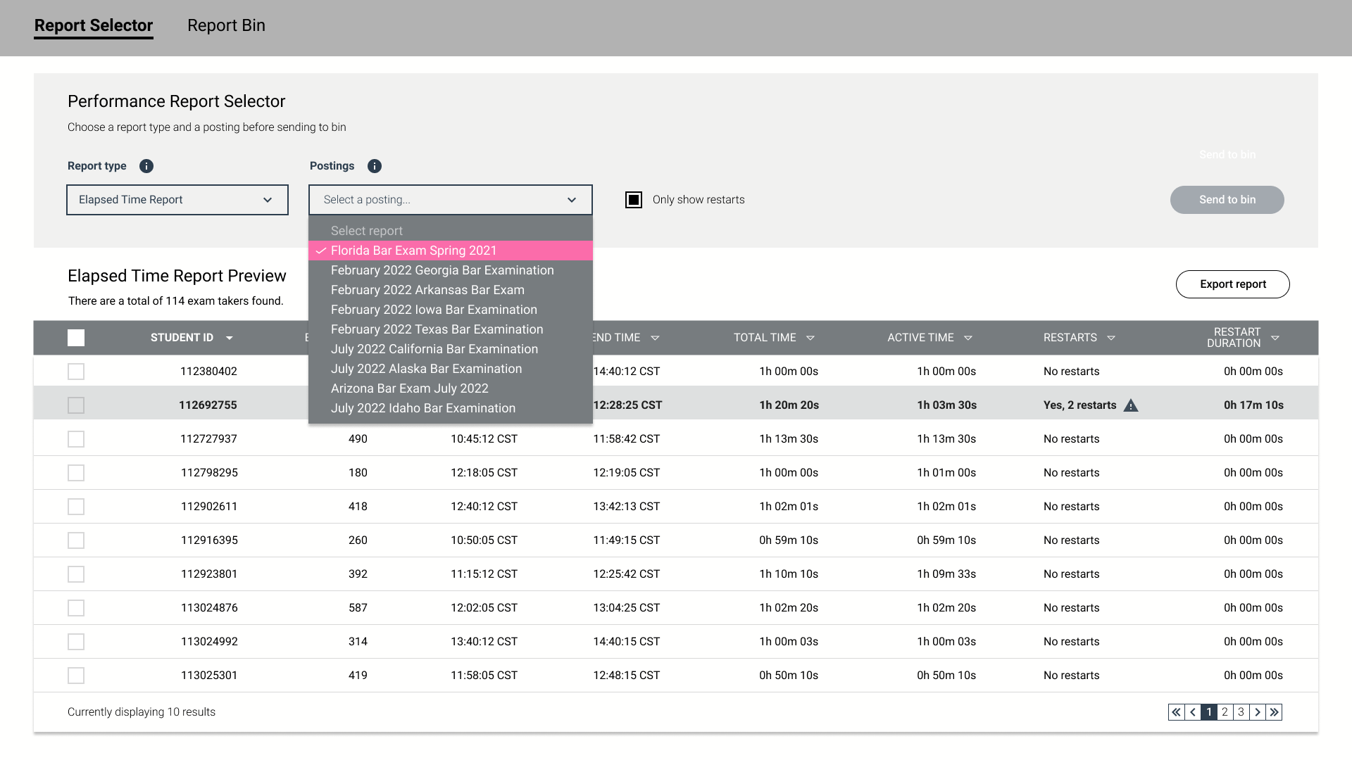
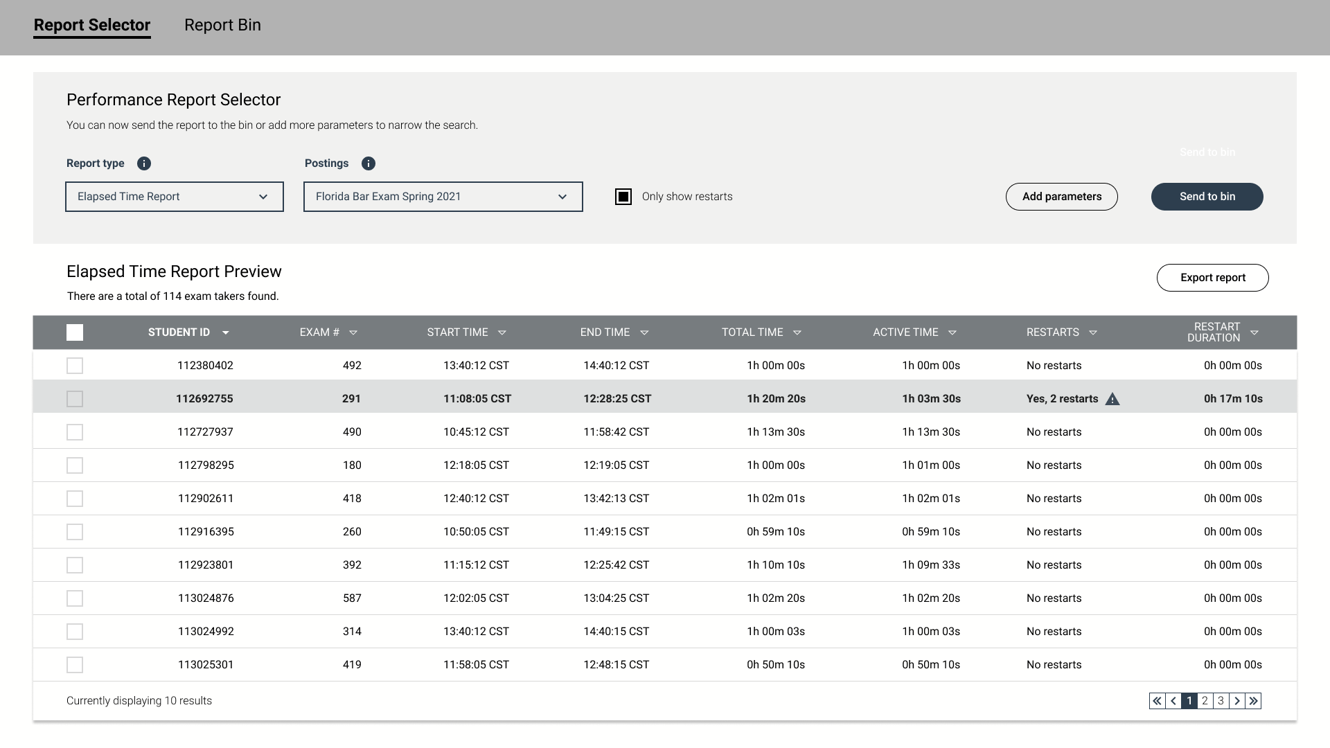
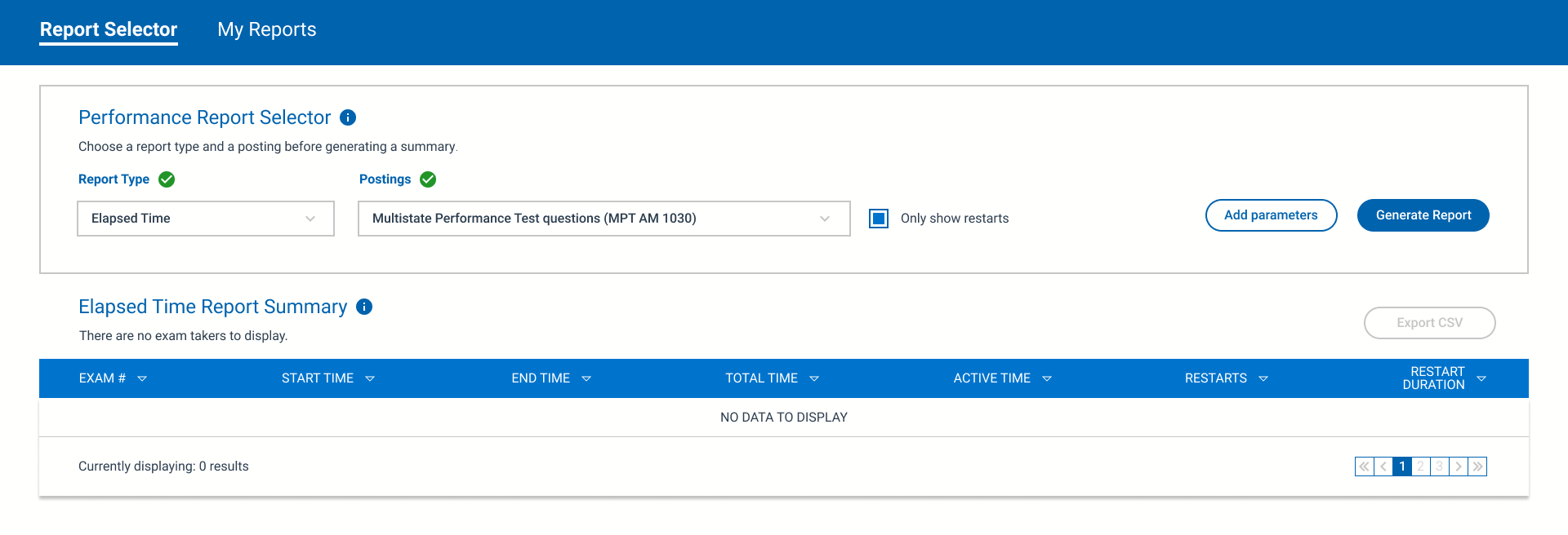
The first solution I designed, featured above, utilizes tabs in tandem with a wizard like feel to minimize the cognitive load as much as possible. It was a complete compromise between being a champion for the user while pacifying the product owner. It was this design that ultimately worked the best after taking into consideration what the users had to say.
User Validation
Working remotely for the duration of this project presented some logistical challenges. Thankfully, the support team made themselves available as much as possible so I could extract insights using Zoom. Working collaboratively with the product owner and customer support management team, we conducted several interviews attempting to understand how the feature was being used and what we could do to improve the experience. As part of the support management team, Leslie stated she preferred the tab structure because it was more familiar to her. Eventually. we realized providing this particular feature to enterprise users was only a temporary fix for a problem that was much larger than anyone anticipated.
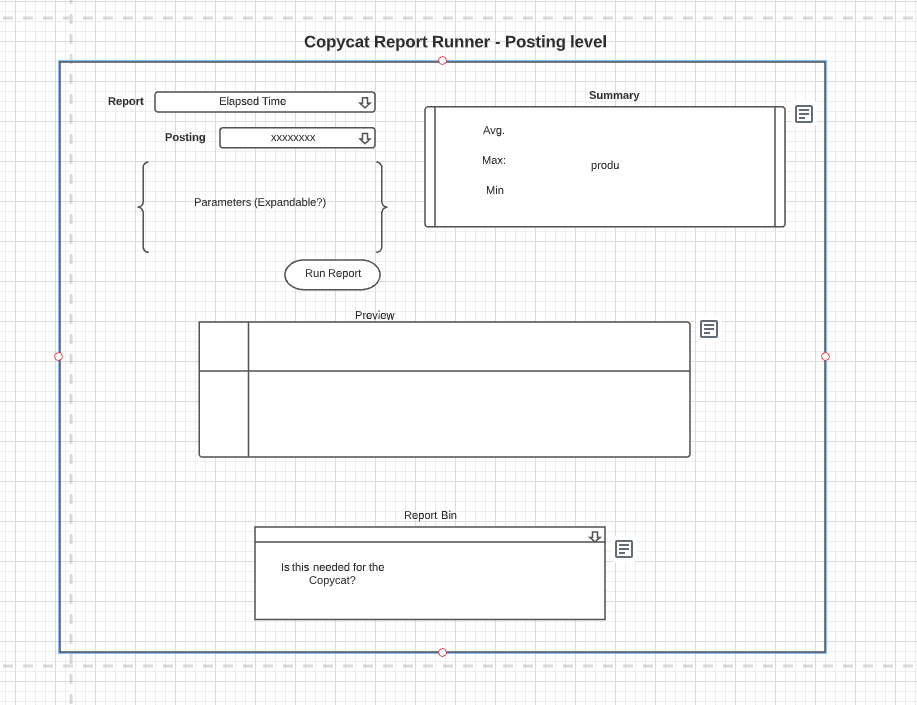
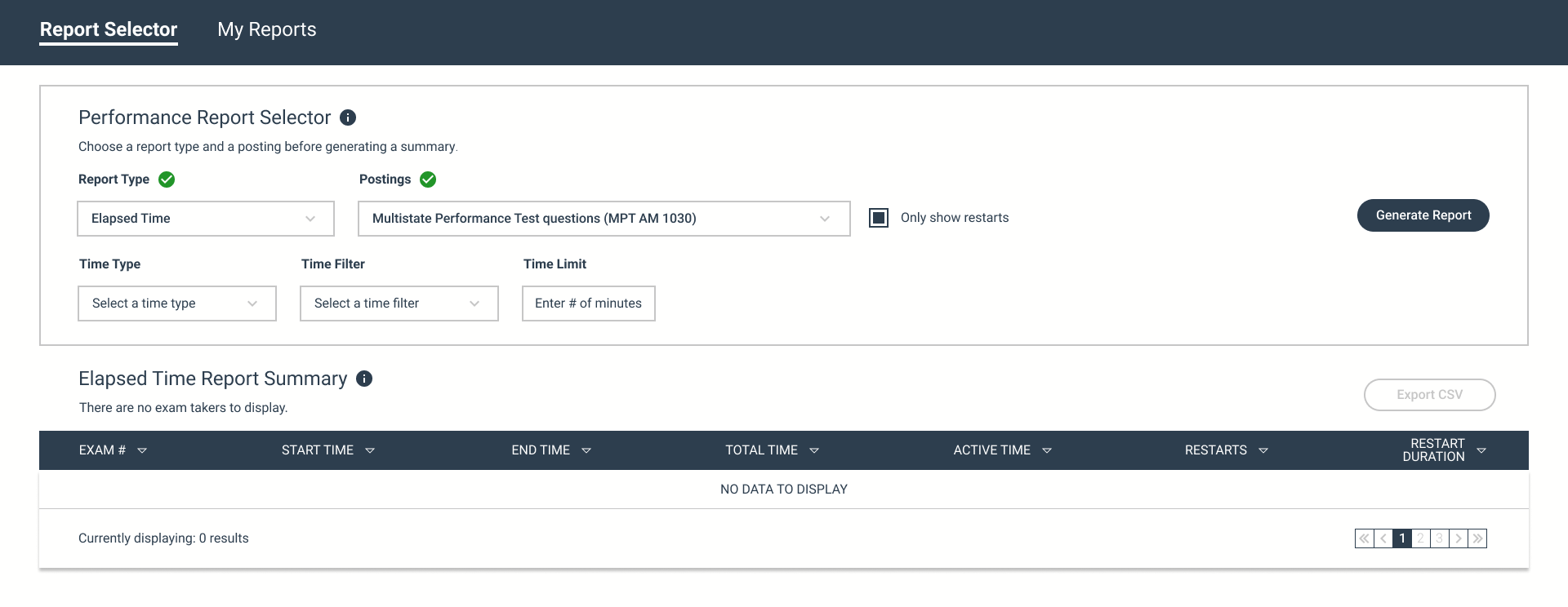
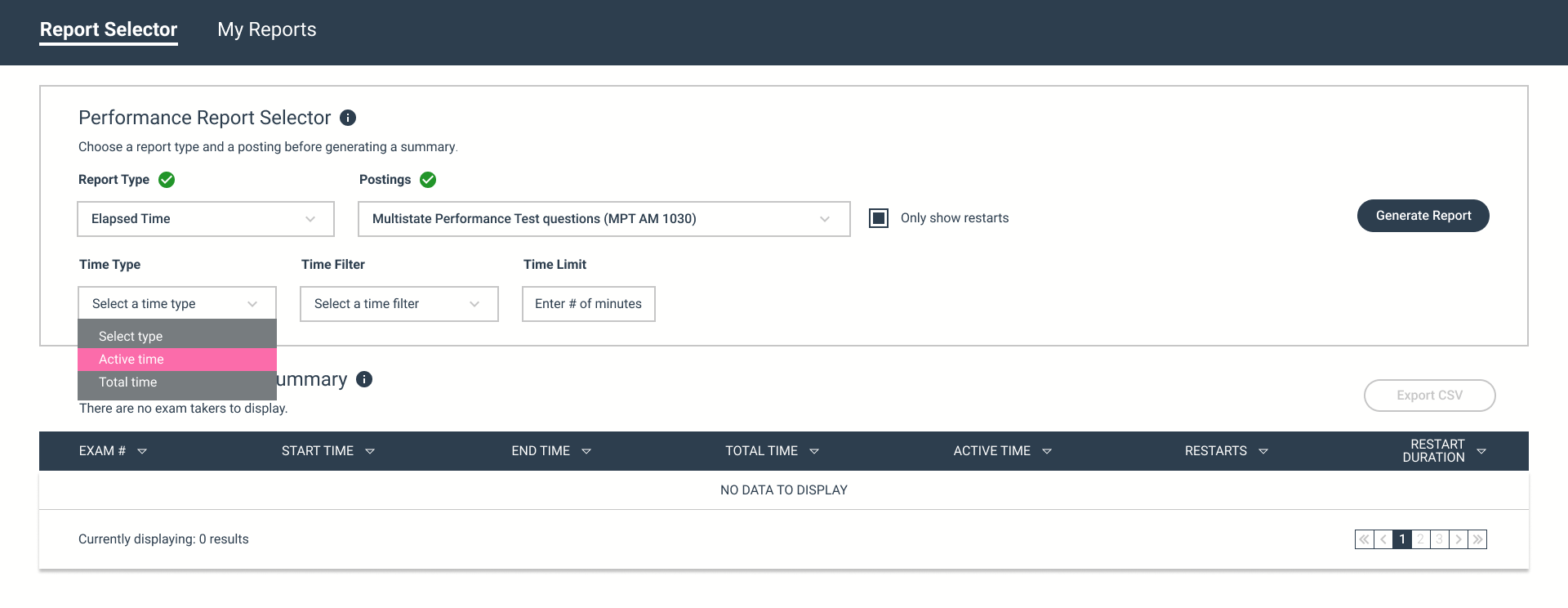
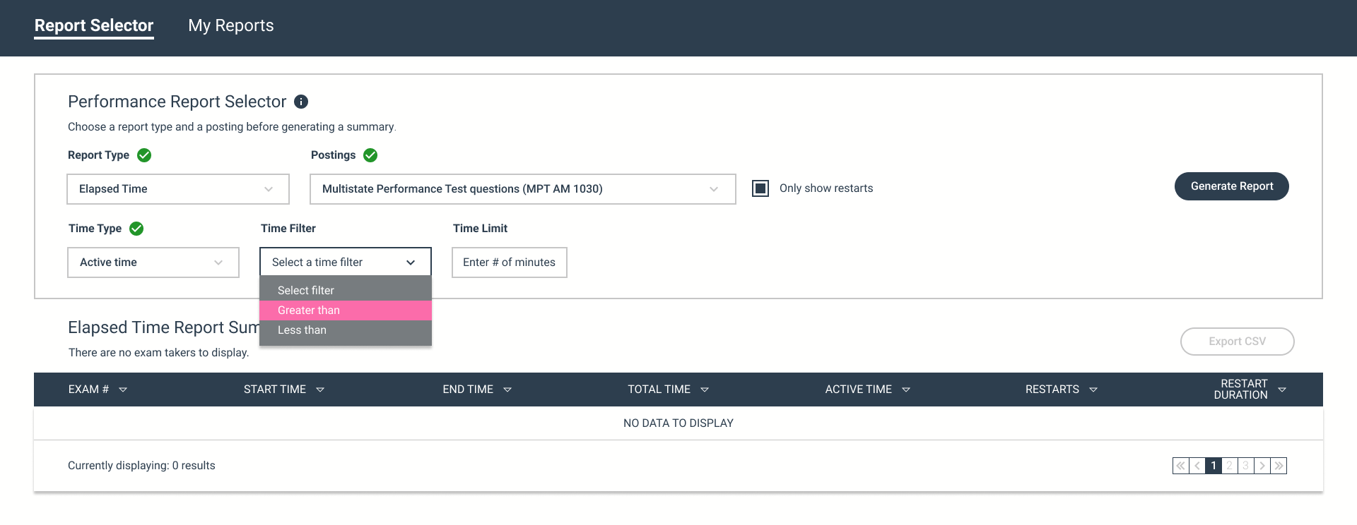
Refined Wireframes
After speaking to Leslie on Zoom, I felt ready to present my findings to the product team. The qualitative session provided me with confirmation of my bias. The analytical insights I cultivated and validated during the call gave me the confidence I needed to backup my design decisions. The mock up posted below would be made available to the UX collective for review.
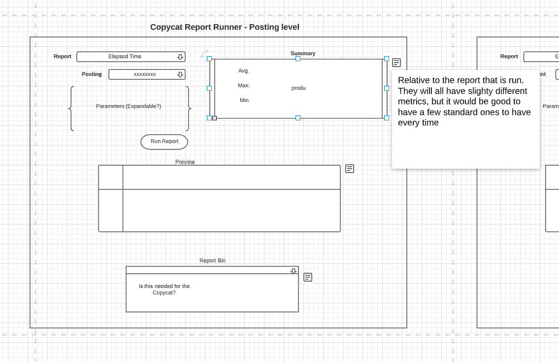
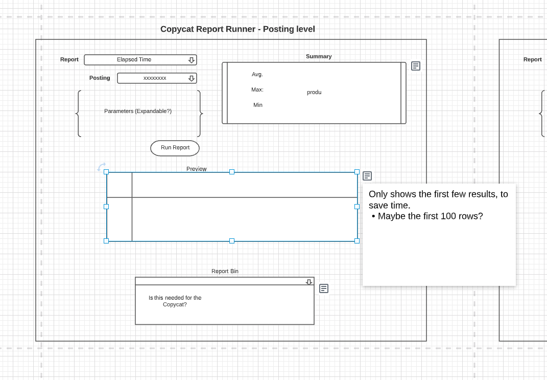
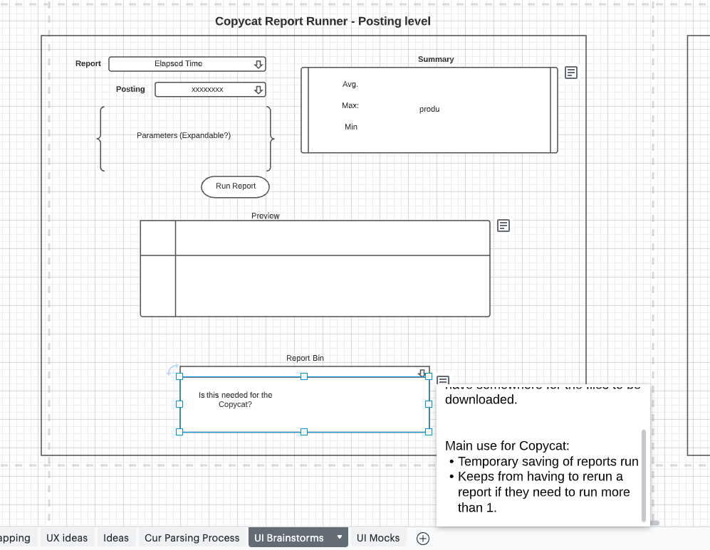
UX Design Team Feedback
Following company protocol and process, my design was presented the entire UX collective prior to delivery to the development team. It should be noted that the product team was not allowed to attend or influence the review sessions. Having said that, three separate sessions took place over a month to determine if my layout offered the best possible experience. More than anything, it provided an opportunity for our content writing team to have a say in the matter and provide direction in terms of vocabulary. Using Figma comments, each session was documented and reviewed by the product team prior to development. A summary of the feedback has been compiled and is available for review below.
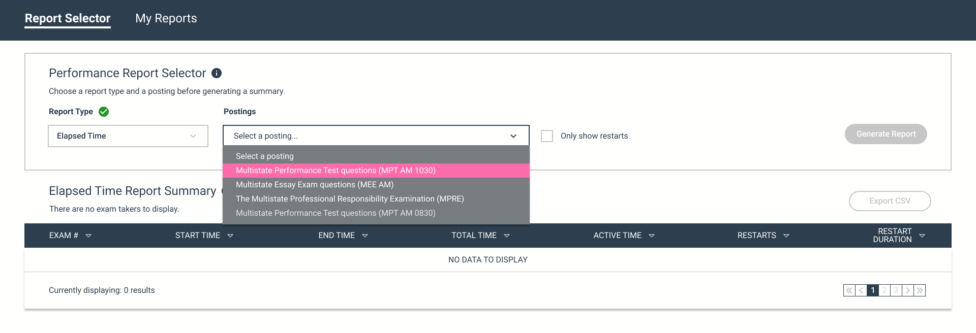
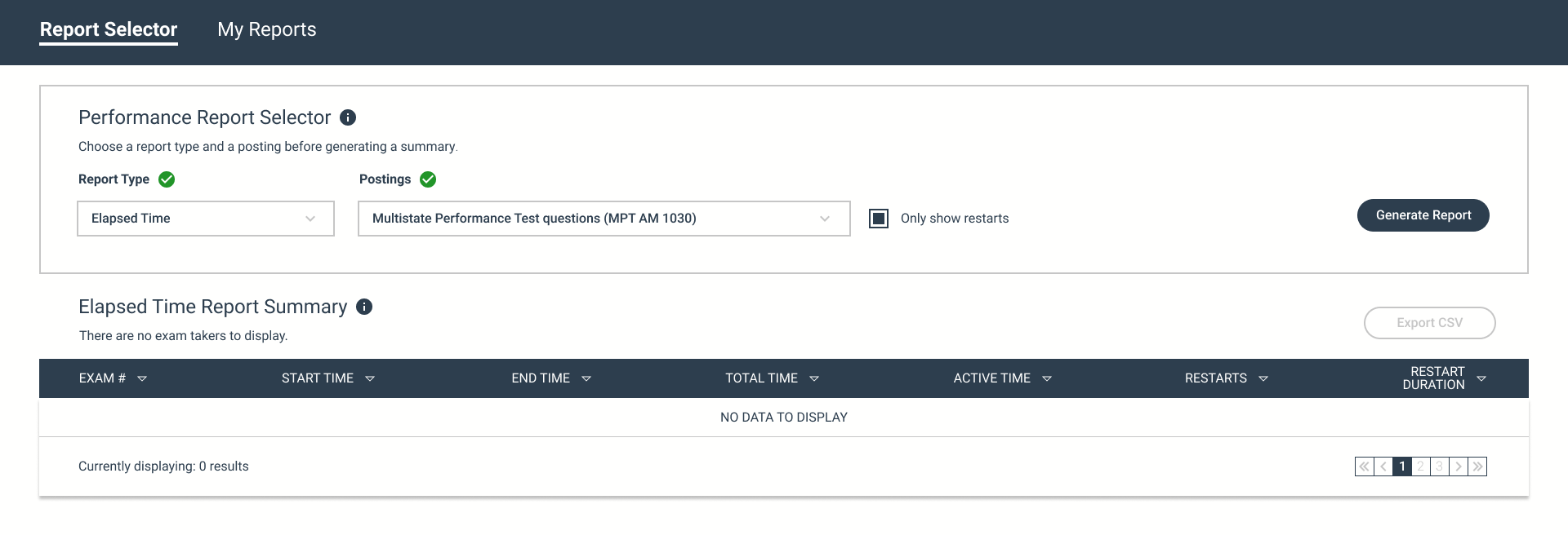
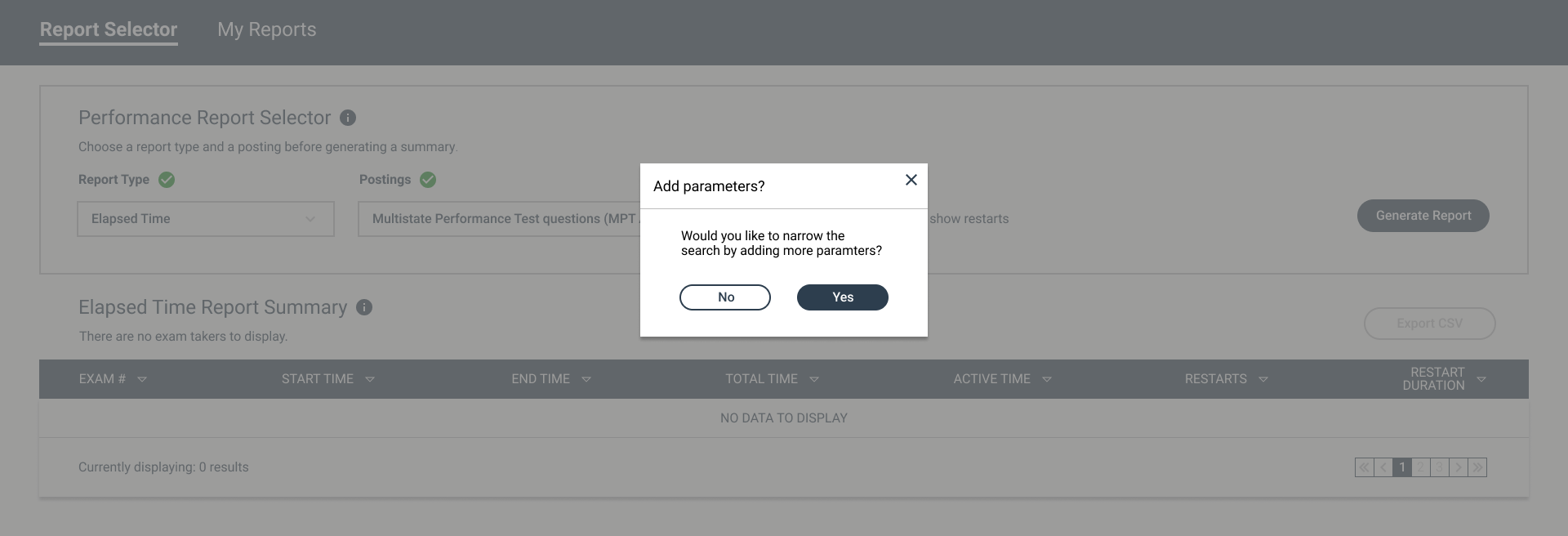
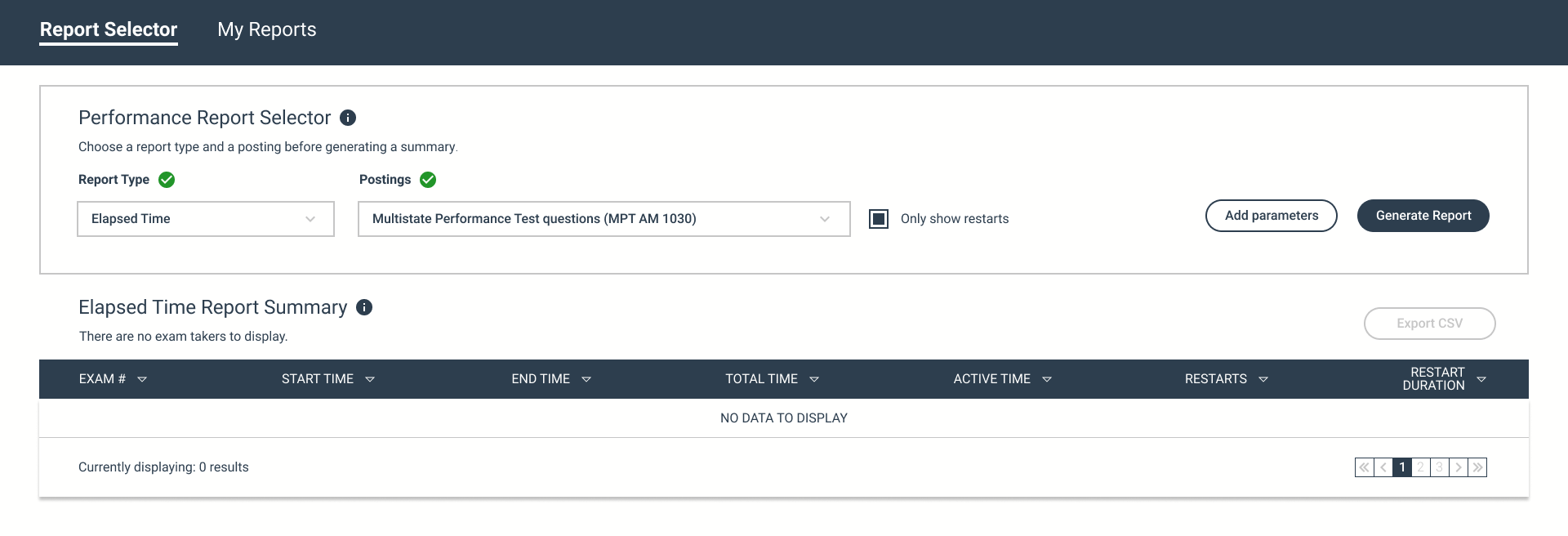
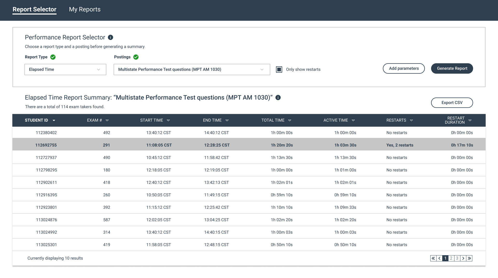
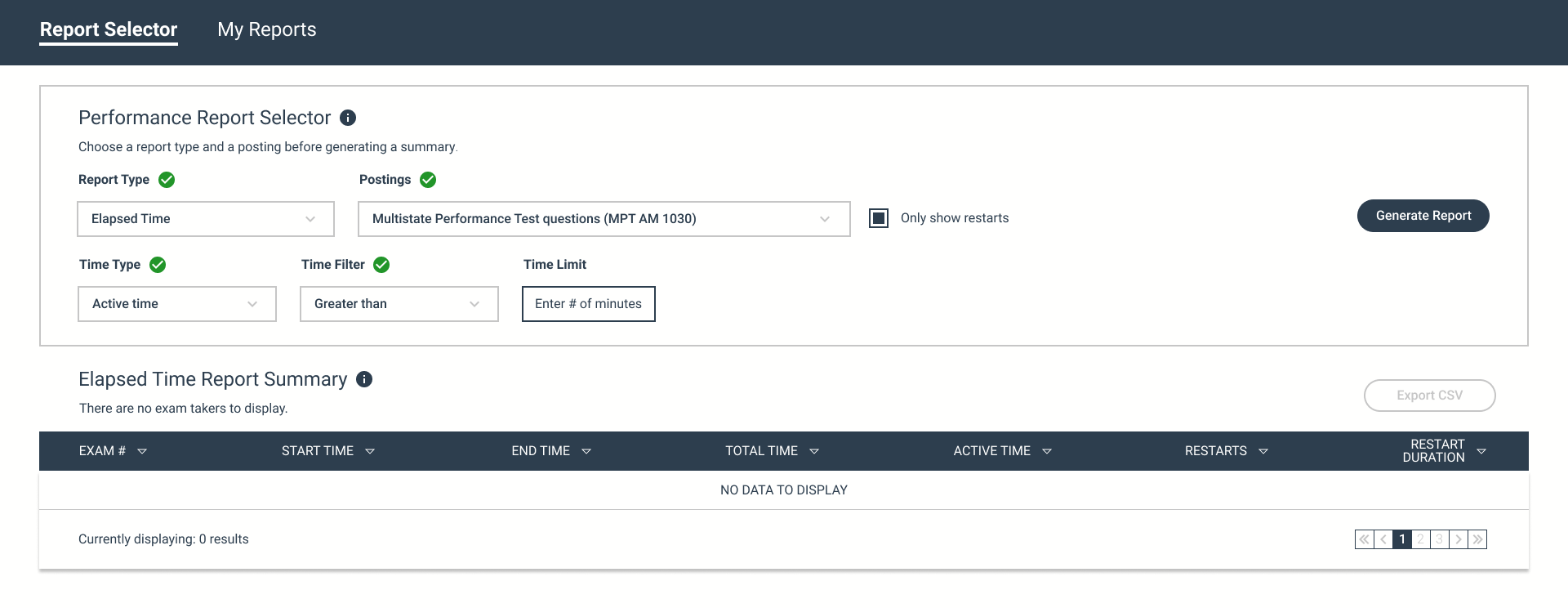
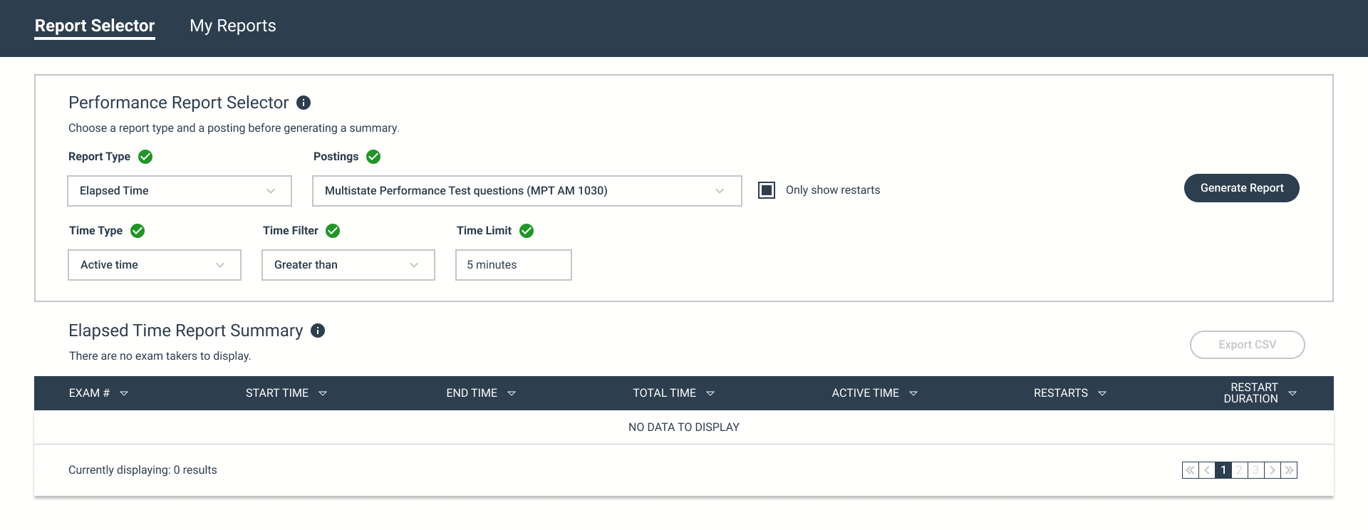
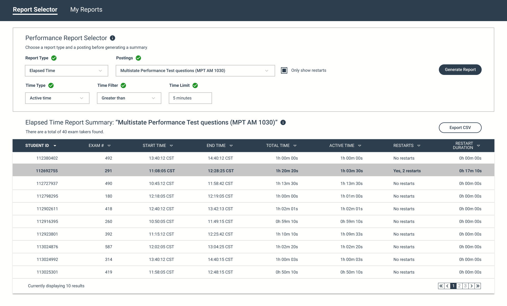
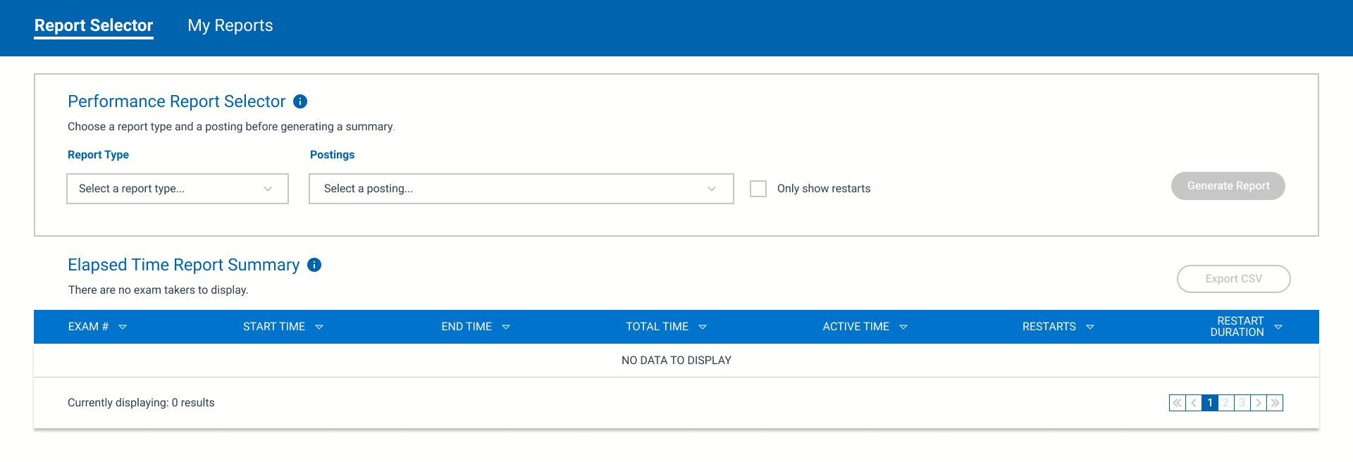
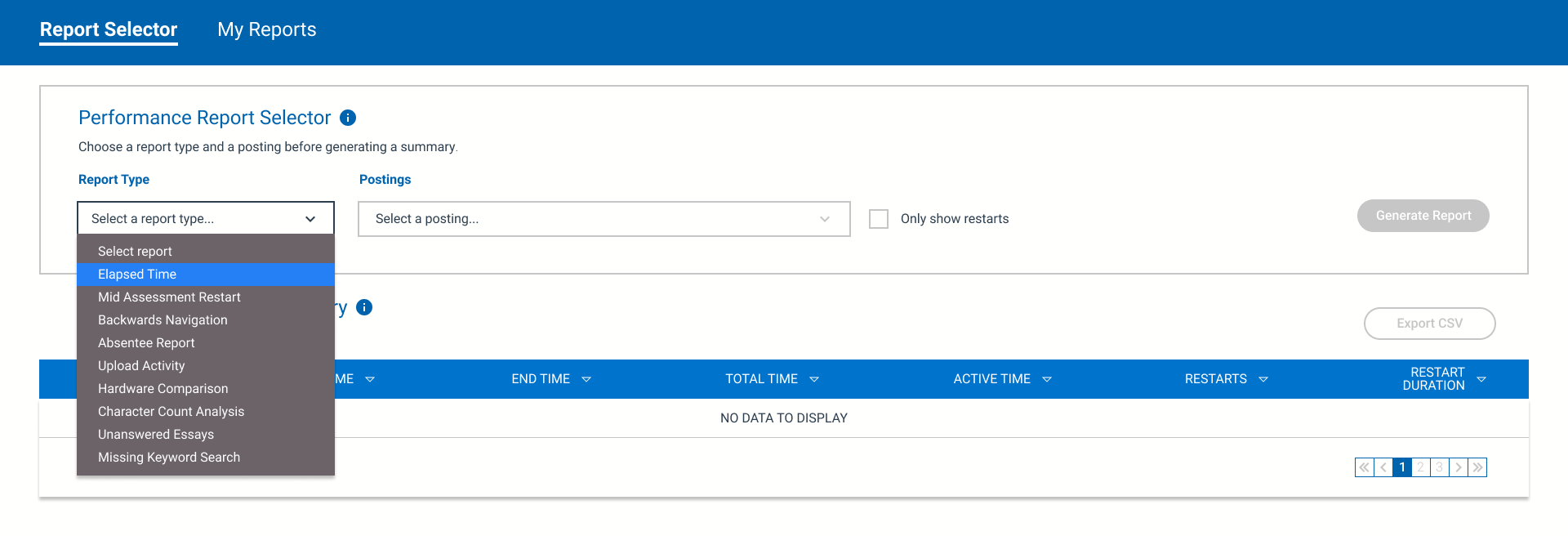
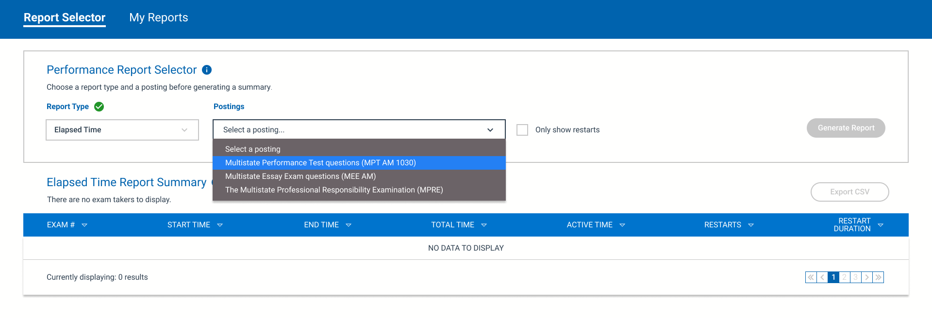
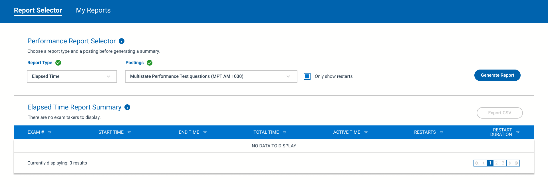
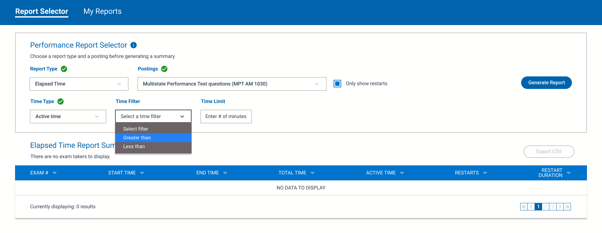
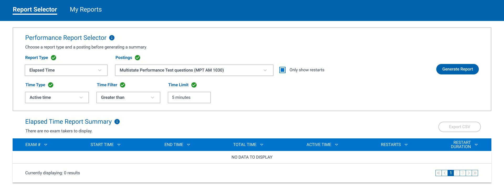
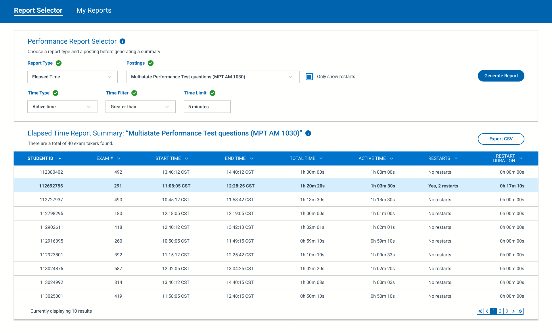
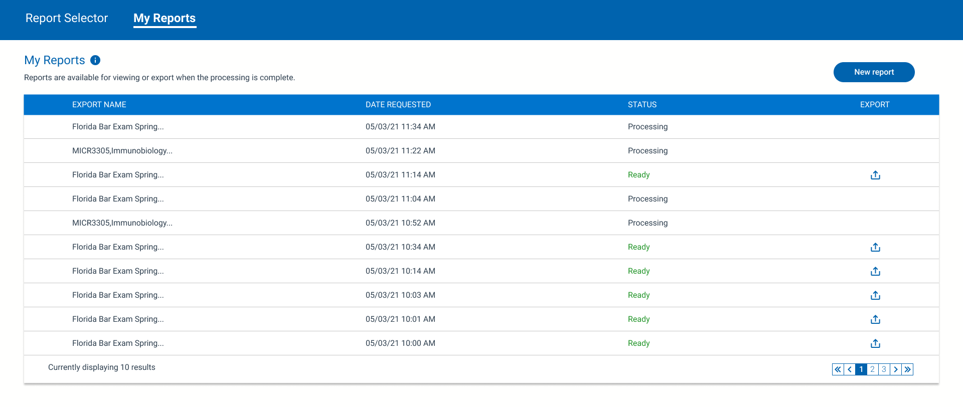
High Fidelity Mockups
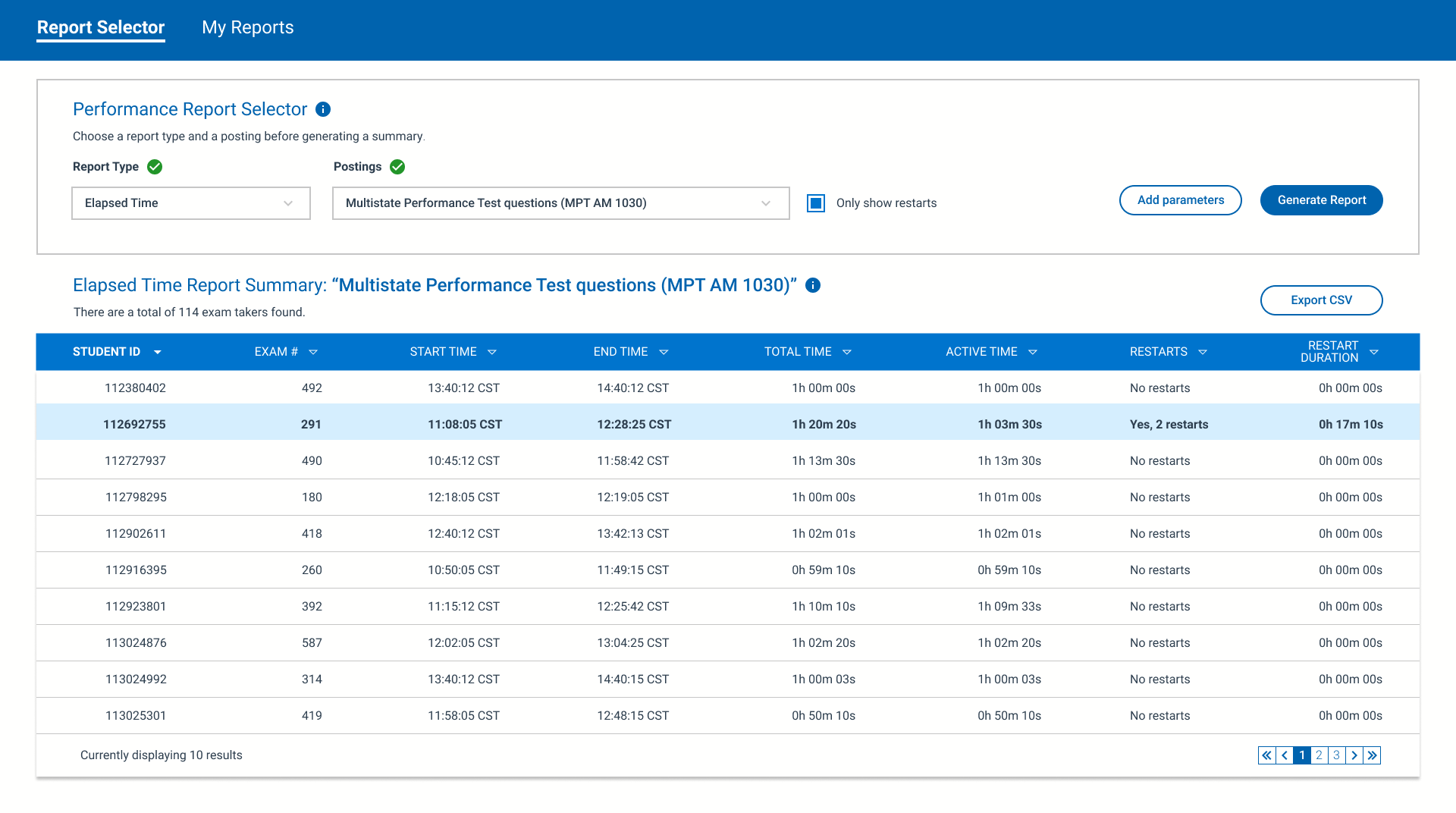
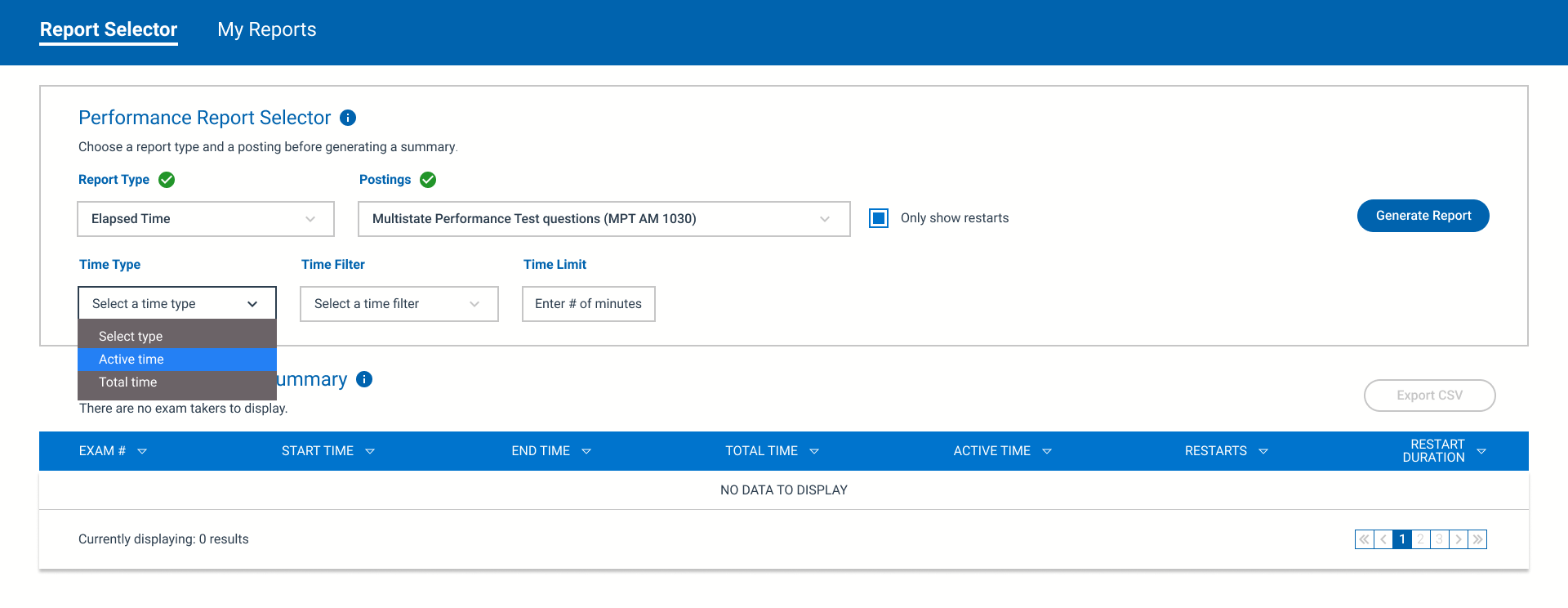
Once the design team had a chance to quantify the insights cultivated during the qualitative interviews, I revised the text as needed. This ensured I was using terminology familiar to the user and avoided any internal jargon that may have diminished the experience. The high fidelity mockups posted below were delivered to the development team after being approved by the product team.


Business Outcome
In terms of how success would be measured, there were several metrics taken into consideration. The goal of the business was to migrate existing customer accounts to the updated enterprise system. Ultimately, this would greatly decrease operational costs from a DevOps perspective. The other major business goal was to increase the number of incoming calls taken by the customer service representatives while reducing the duration time for each support case. Once the feature was made available to users, the Director of Customer Success confirmed a 15% increase of client accounts successfully adopting the enterprise platform. In addition, the director was able to confirm call duration dropped by 24%, which allowed agents to service 32% more calls.