HP’s Hardware Diagnostics Tool
Revamping the Legacy Experience
When my career began with Sogeti, my first project was working with the Hewlett Packard team. At the inception of the project, I was the only designer allocated to the client. Having said that, I conducted of all the research, lead the user experience strategy, performed all of the visual design duties, and cross collaborated with the other resources. During the kick off call, the Field Diagnostics Manager, Product Owner, and Lead Engineer introduced me to the issue at hand. The legacy experience at that time was in dire need of an upgrade. In essence, I was expected to take this project from inception to final handoff with very little direction and no additional design support. The project brief is available for viewing or download by clicking the button below.
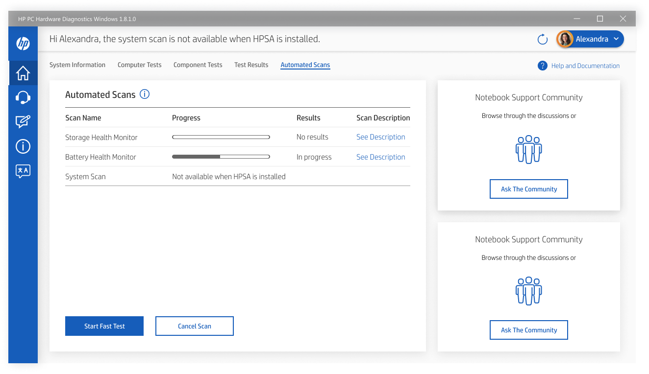
The image above is a high fidelity mockup of one of the final Figma screens.
Competitive Analysis
As with any project, the first week entails a bunch of waiting around to get access to resources and obtain a computer from the client. During that idle time, I saw an opportunity to bring value to the team by performing competitive analysis and documenting the legacy experience. This due diligence helped me to understand how the space could be divided in terms of composition and hierarchy. Feel free to glance at the screenshots I captured during this aspect of the journey.
Documenting the Legacy Experience
This is the home screen for the legacy diagnostic tool.
As soon as my HP laptop arrived, I was able to access the existing internal solution that came standard with older hardware. During our kickoff call, the Field Diagnostics Manager told me that the legacy experience was built for engineers and did not resonate well with the consumer persona we were designing for. In short, we needed to take inspiration from the current HP customer support experience and implement the same navigational pattern. Screenshots from the legacy experience are available for viewing below.
Understanding HP’s Customer Support Tool
From the very beginning, the ask was to take direct design inspiration from the existing customer support tool. As part of the initial research process, I closely examined the support tool and explored every screen. Doing this got me familiar with the brand and also gave me perspective on how to arrange the interface for the target user. Screenshots from this part of the project are available below.
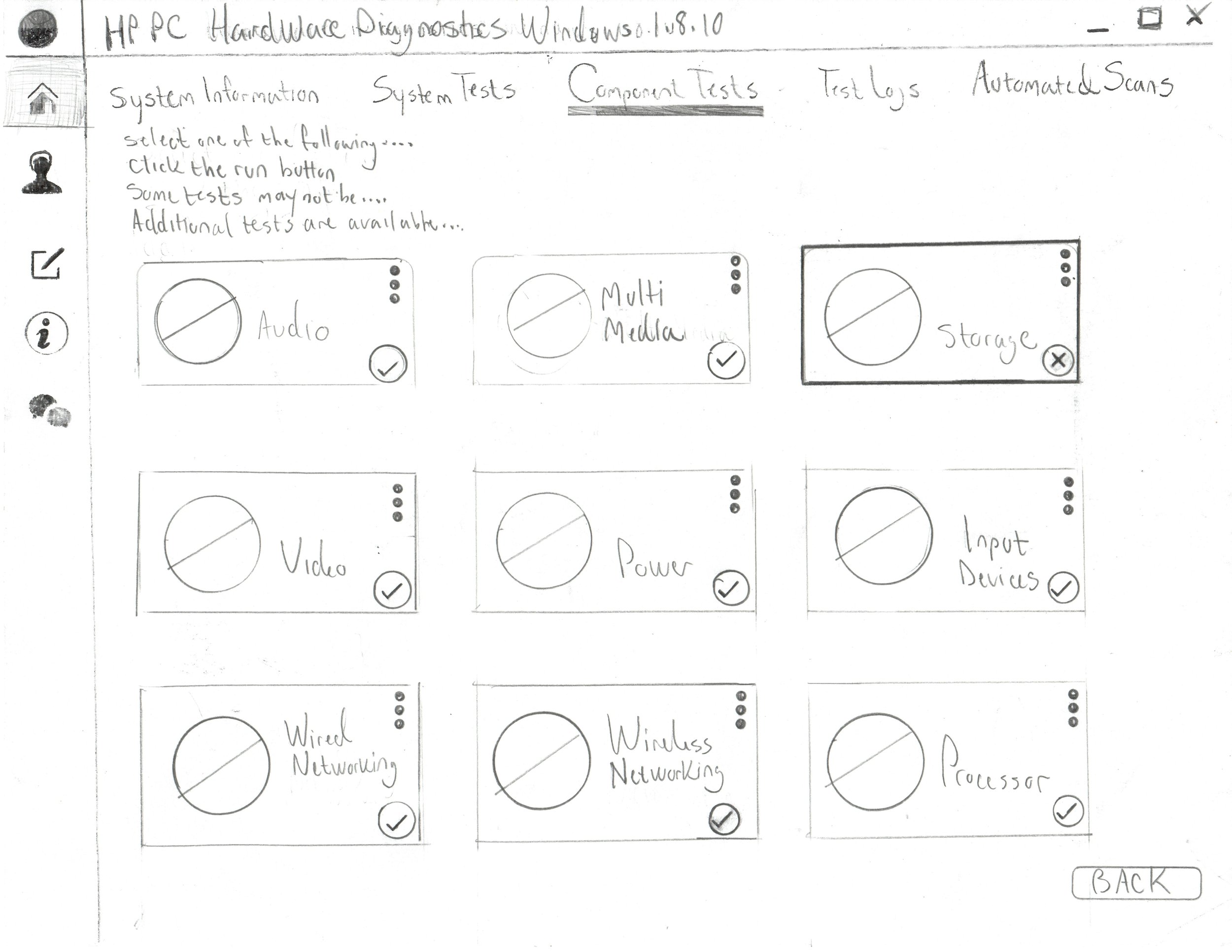
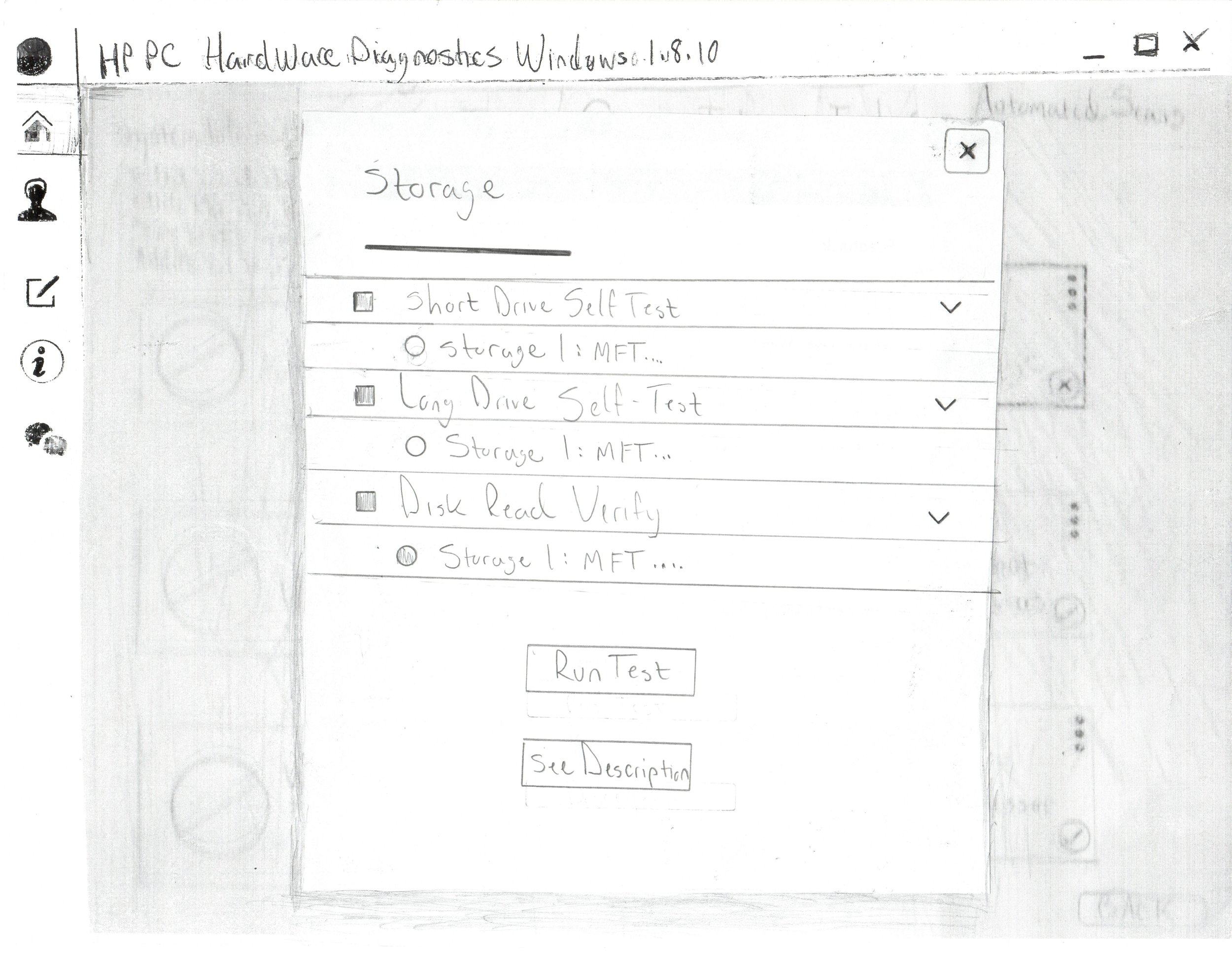
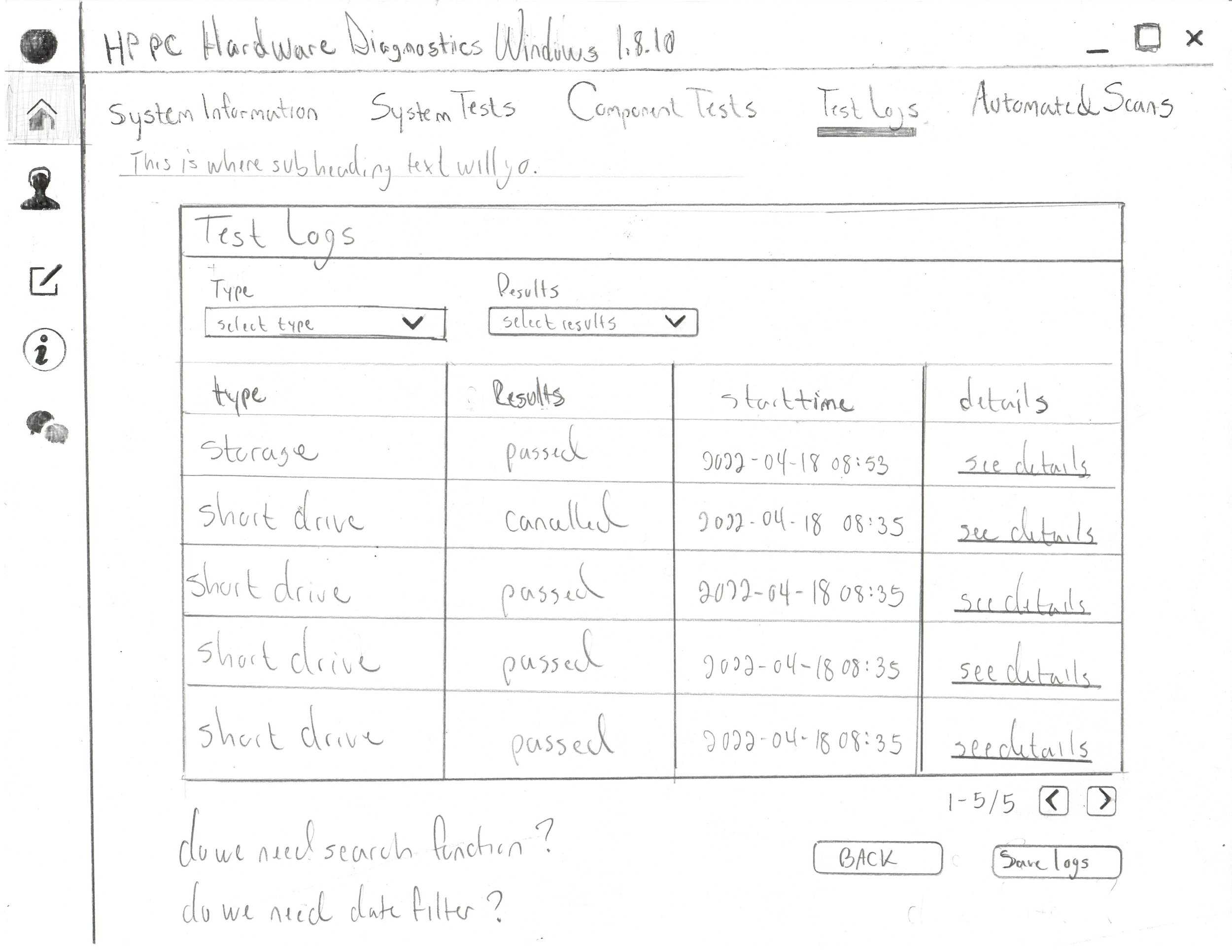
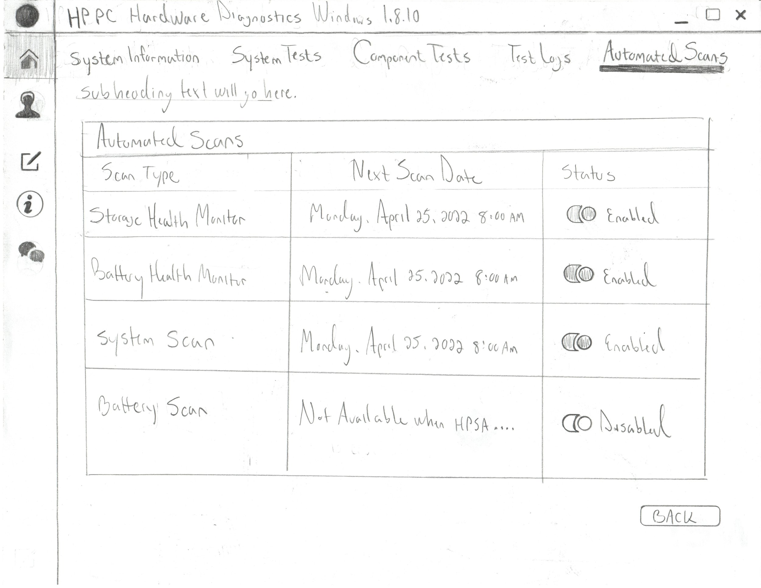
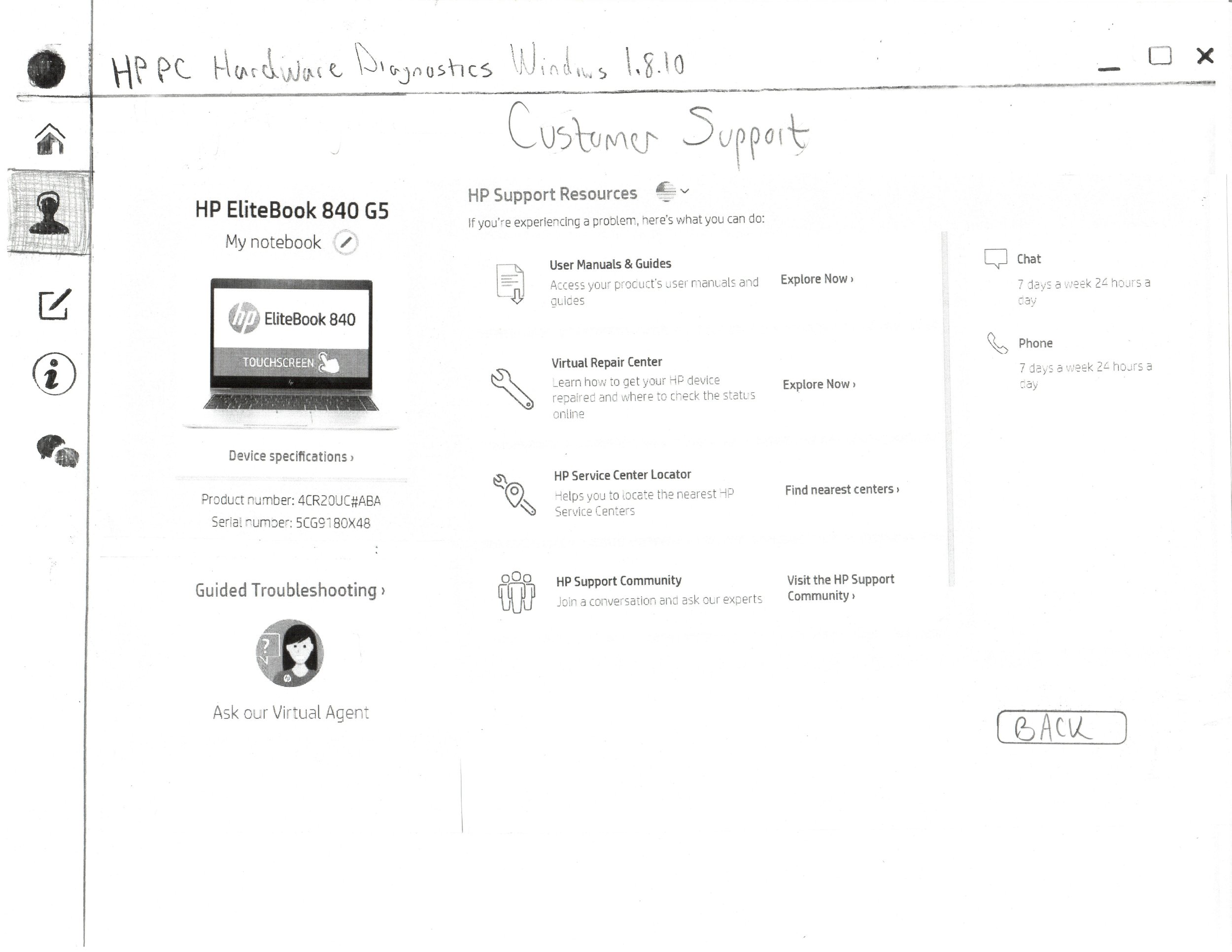
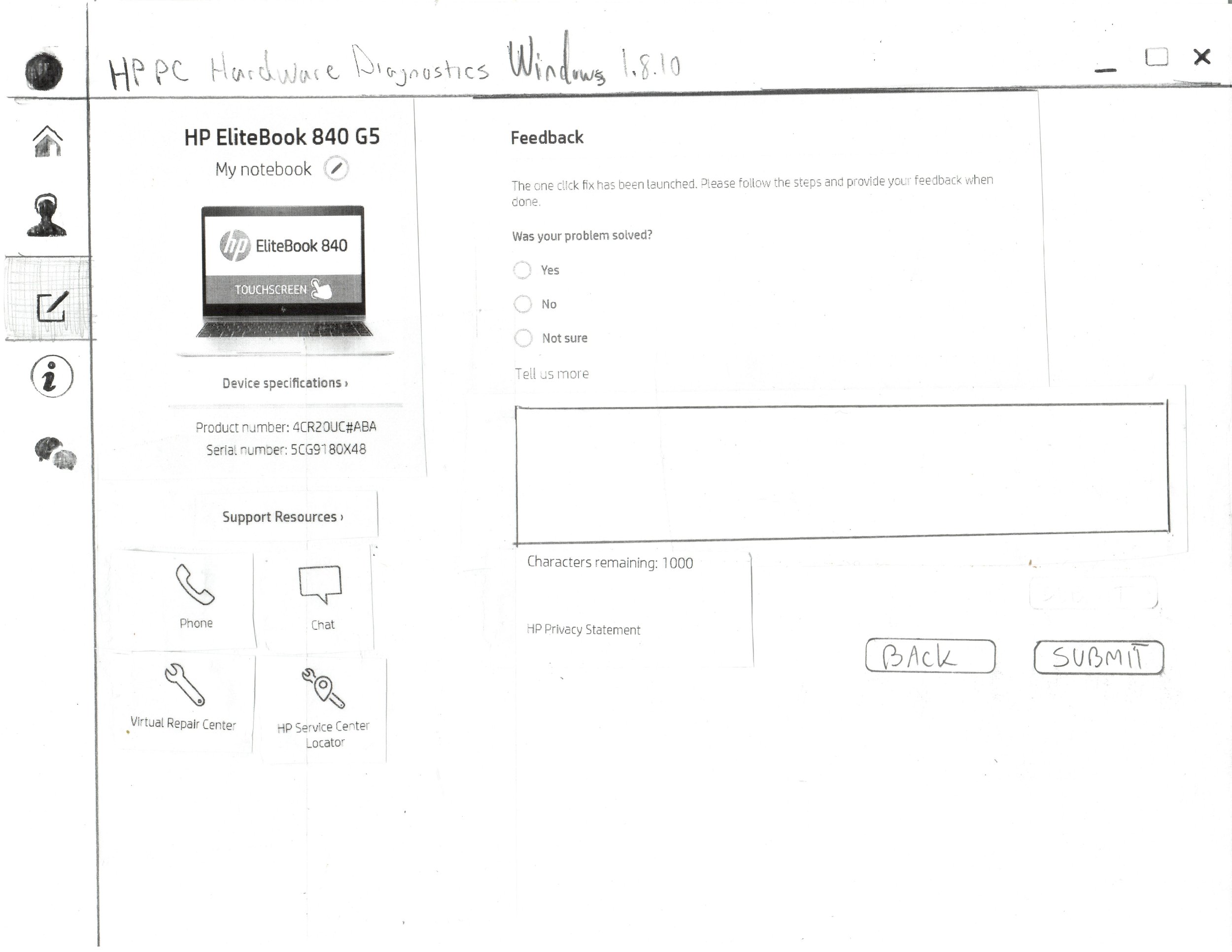
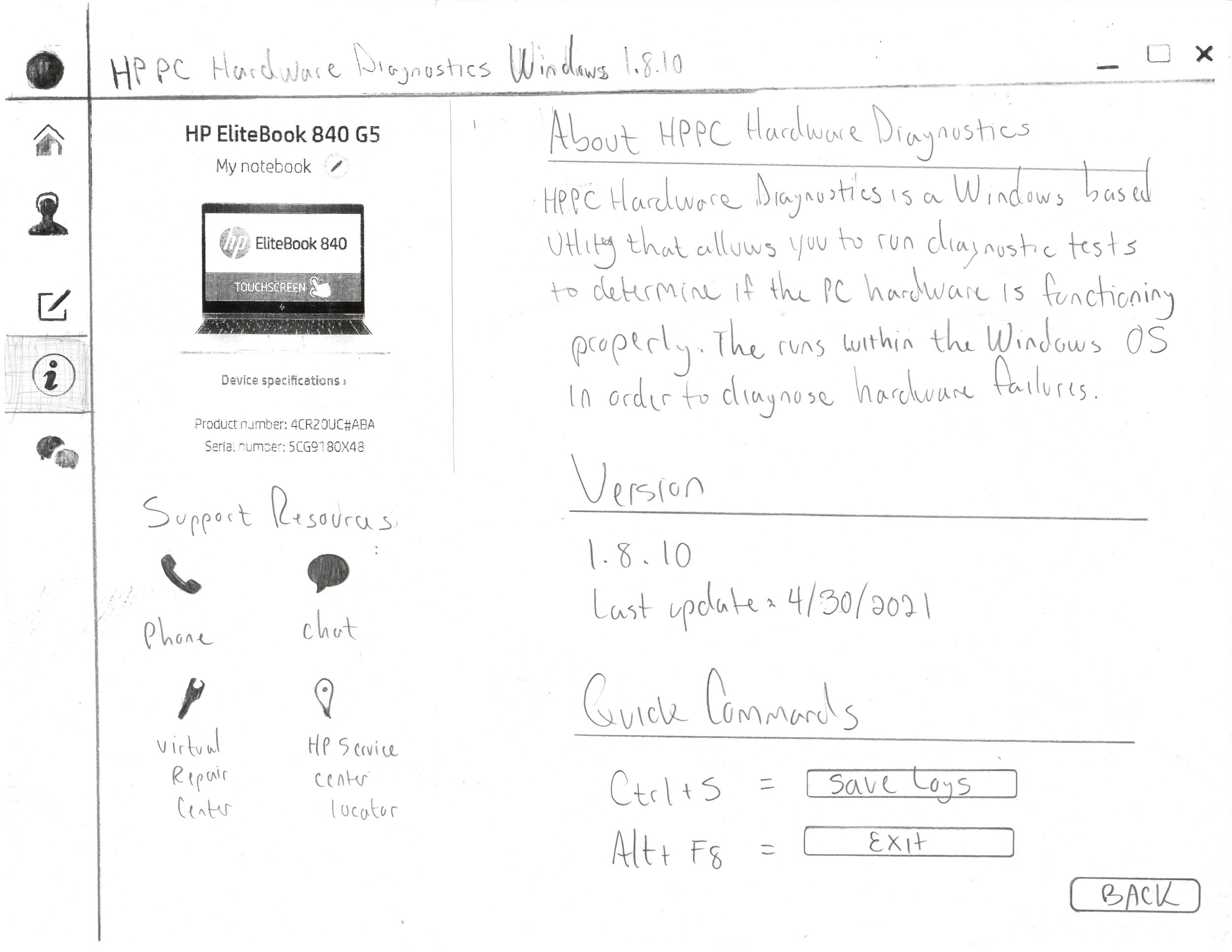
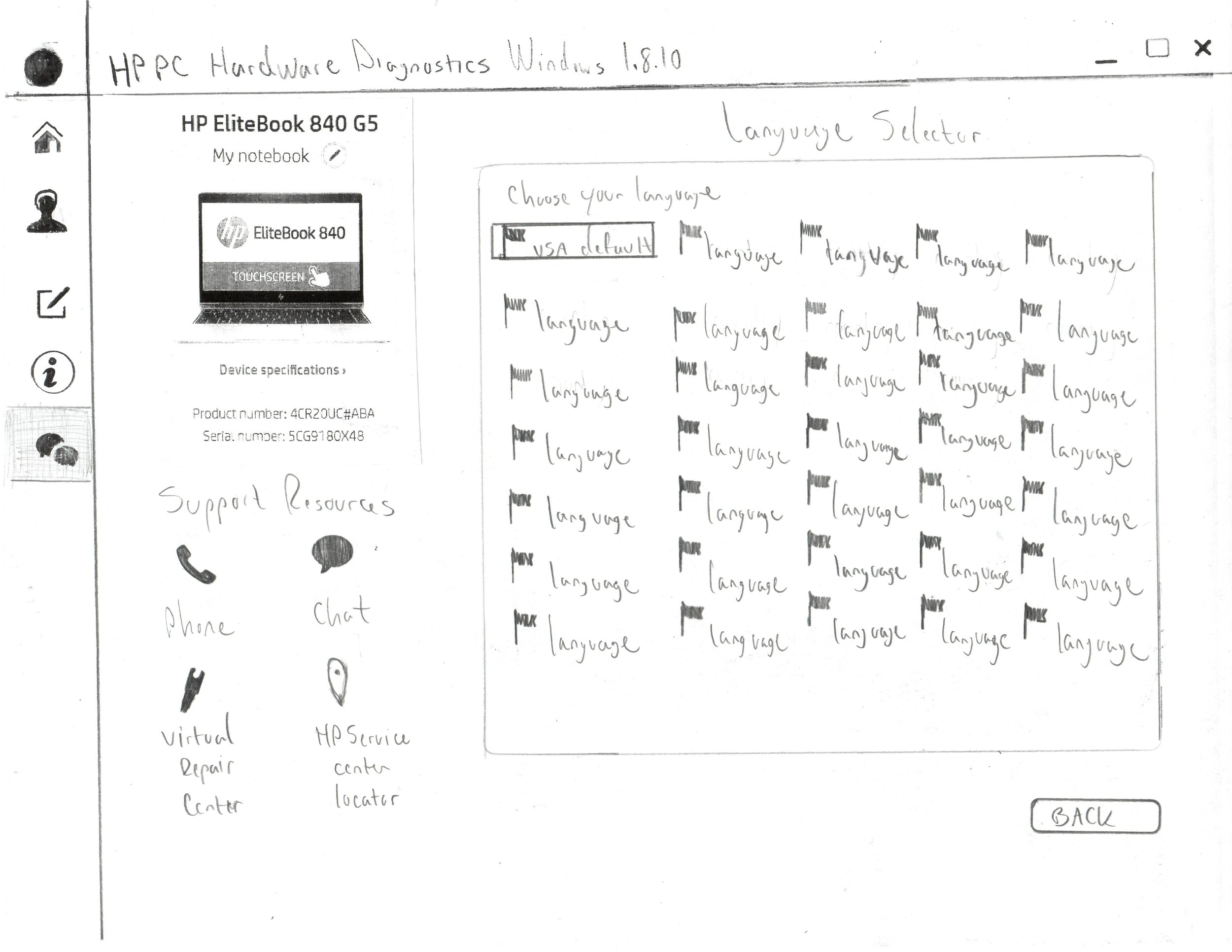
Layout Sketches
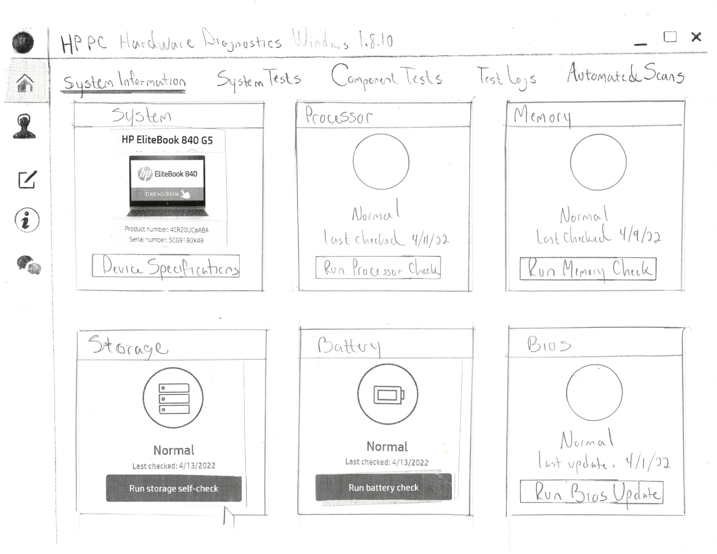
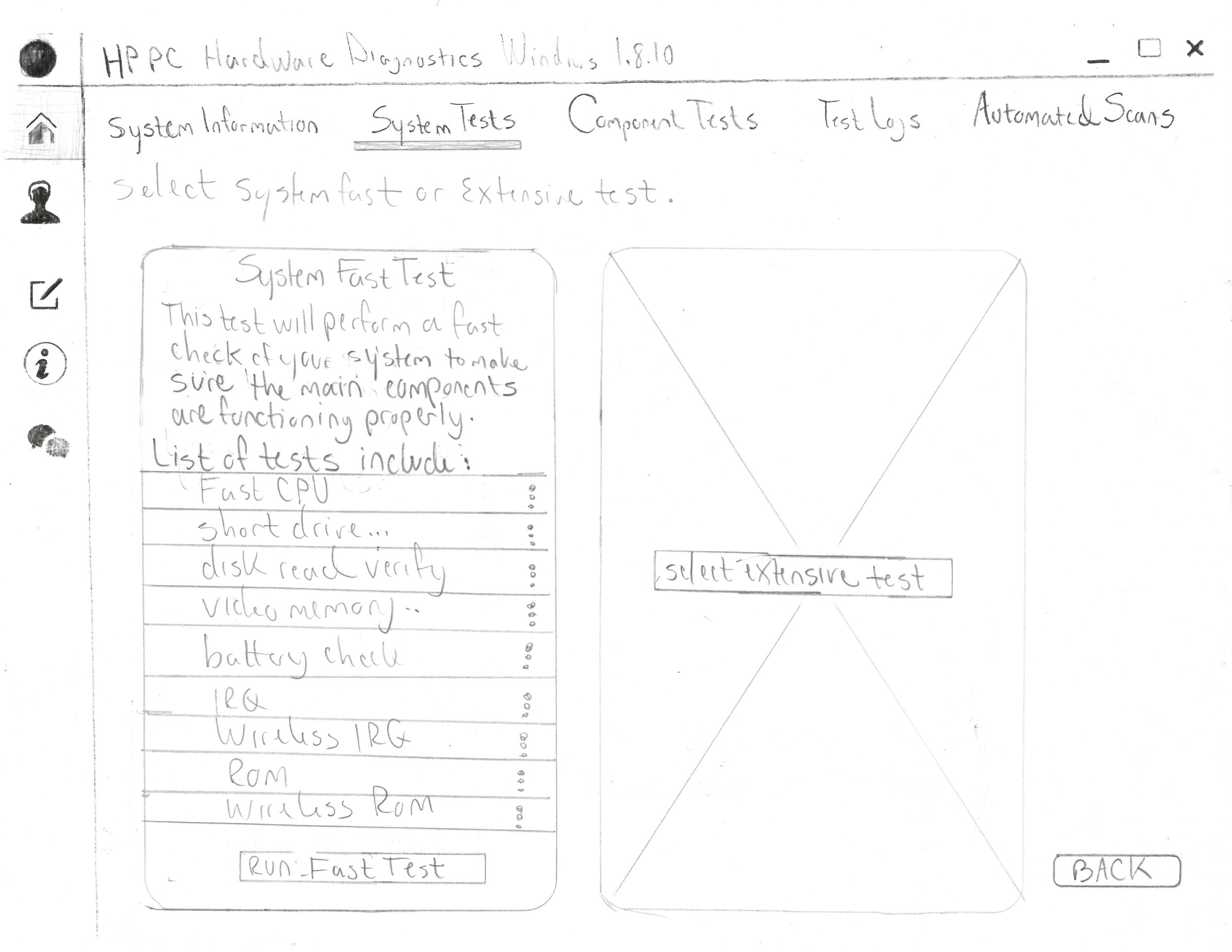
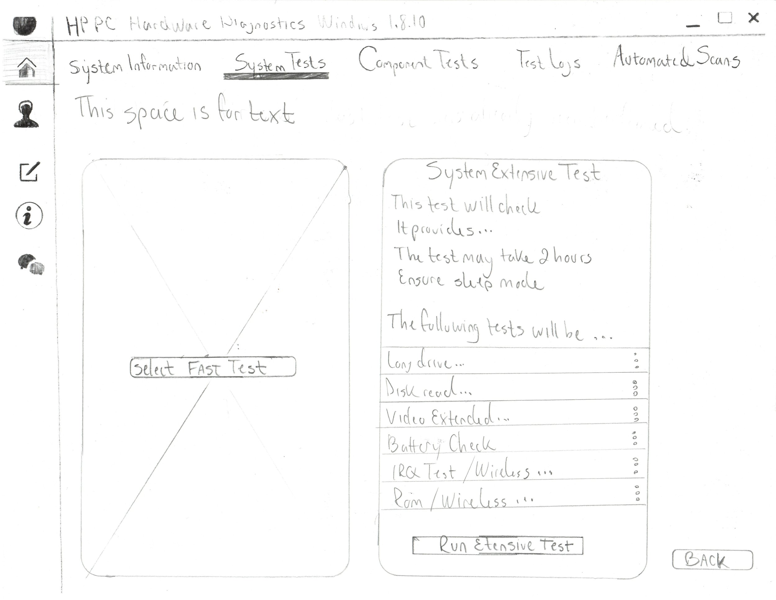
While I was waiting to get access to the Figma ecosystem, I felt compelled to bring value to the team. In doing so, I put pencil to paper and composed some sketches to help me organize the space. In the end, I mapped out the entire experience using paper prototypes. These were presented to the stakeholders and I was praised for keeping our time constraints under consideration.
POC Wireframes
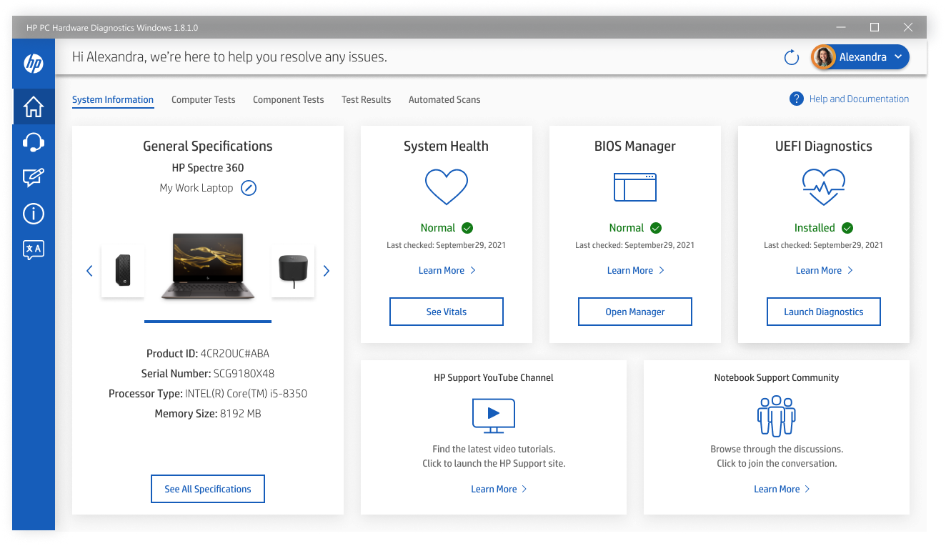
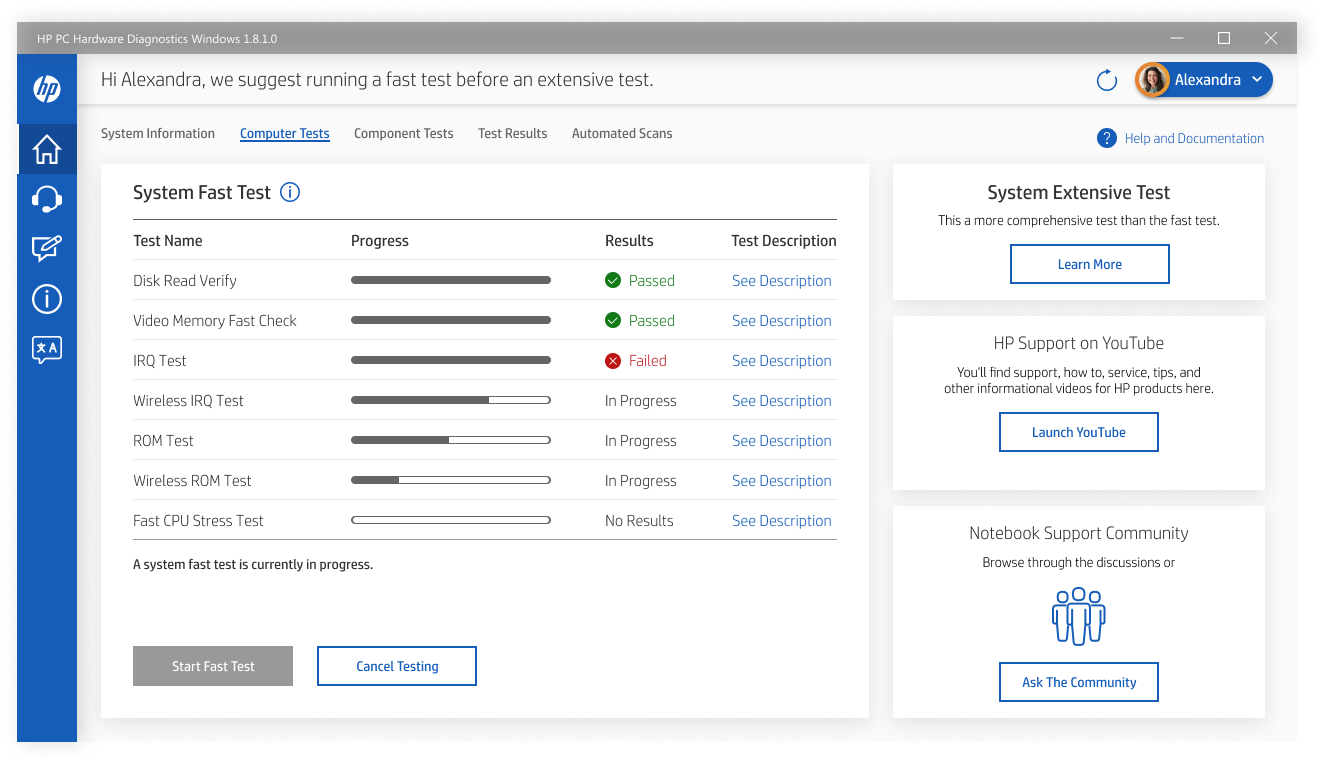
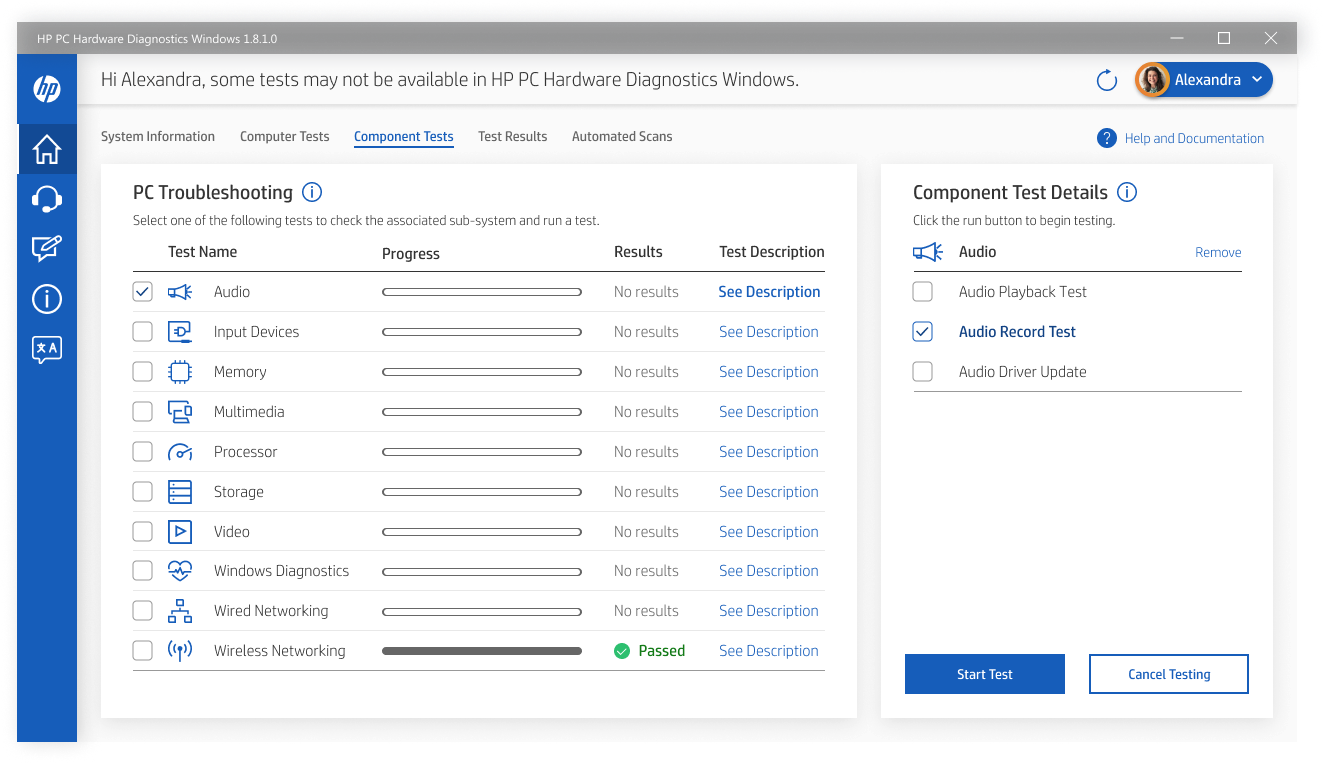
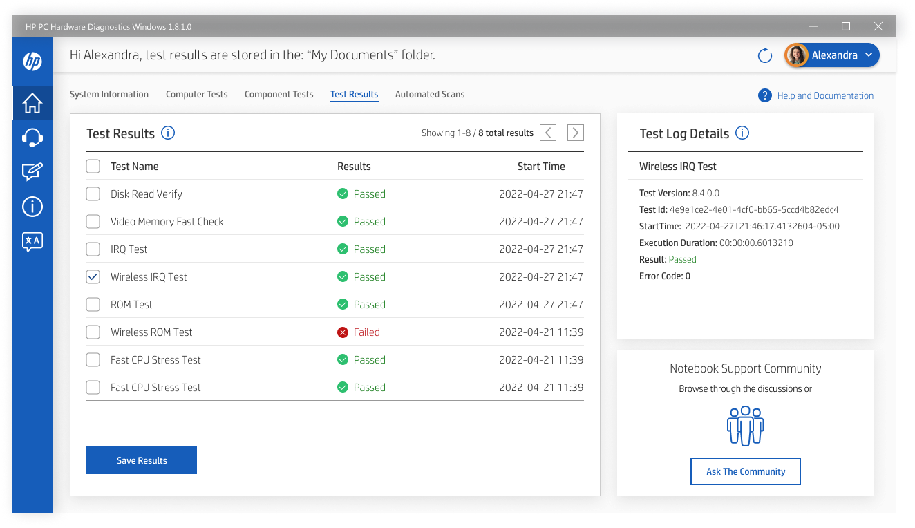
Once I gained access to the Figma ecosystem and HP’s marketing assets, I was able to design the first set of wireframes. These wireframes were executed after I got feedback from the paper prototypes from the stakeholders. With such tight timeline, I was inclined to deliver wireframes that were higher in fidelity and adhered to the branding guidelines.
Moderated User Testing
During the final stretch of the project, I was tasked with sourcing real Hewlett Packard laptop users. Five sessions were recorded and the research proved that the average user was able to successfully navigate the screens to accomplish any given task. One of the testing sessions is posted below.
Final Delivery
Shortly after user testing was finished, I relayed the results to the stakeholders and we confirmed our previous assumption that the existing navigational pattern taken from the support tool was good for the user experience. Ross, the product owner, made a few more suggestions regarding the interface and I quickly fleshed out the Figma files to reflect the feedback collected. A video recording was mode of the final prototype and has been made available for review below.
Business Outcome
In June of 2024, I reached out to the Platform Development Manager to learn more about the impact to the business. Ross Adams, the same product owner I originally worked with, was able to confirm the software addition added to the new UI gave a 53% deflection rate in service calls. In essence, this saved Customer Support a significant amount of time and money while vastly improving the overall customer experience. The successful launch of this project was a milestone moment when my design work became part of the official release. The updated diagnostic tool has shipped with every new HP computer since.
