Integrated Home Audio
Creative Brief
Your home has an integrated audio system that allows you to customize your experience in each room. As you move about your dwelling, you will want to set the mood for each room and have the ability to change volumes accordingly. How would you control the music experience from your phone?
The Design Challenge
This challenge required a user flow showing how a user would go about controlling the music experience in multiple rooms. In addition, I needed to design the UI for this flow and deliver wireframes to the stakeholders. High fidelity mockups demonstrating a pragmatic and balanced visual aesthetic were created using InVision.
Foundation Research
The first thing I wanted to do was understand what it was like to be a user. This lead me to look online for existing products that were currently on the market. Sonos and Bose came to mind once I spoke to two of my associates. Both are users and understand the intricacies of each respective ecosystem. After interviewing both by phone, I gained empathy for their pain points and wanted to sketch possible layouts that addressed those issues. Each interview is available for download below.
Layout Sketches
The following sketches were created with the user’s recent feedback. Automation on the front end of the xperience was an issue I address in this particular project. These sketches are sample layouts for the home screen, music player, and the main music menu.
User Flow
Users can accomplish the task in four screens once streaming services are imported on the back end. As users move between rooms, they can easily use the bottom navigation or select text links to accomplish the desired settings. Click the button below to download the map in full detail.
Wireframes
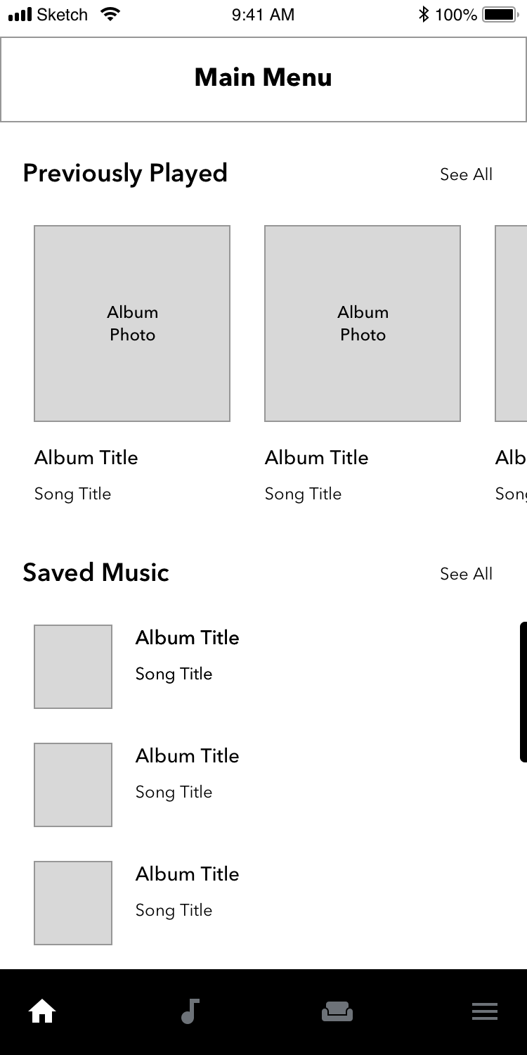
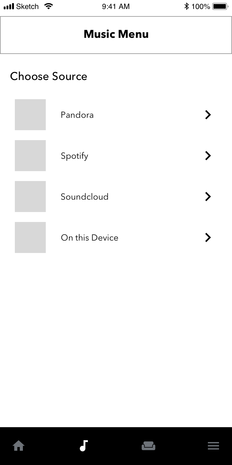
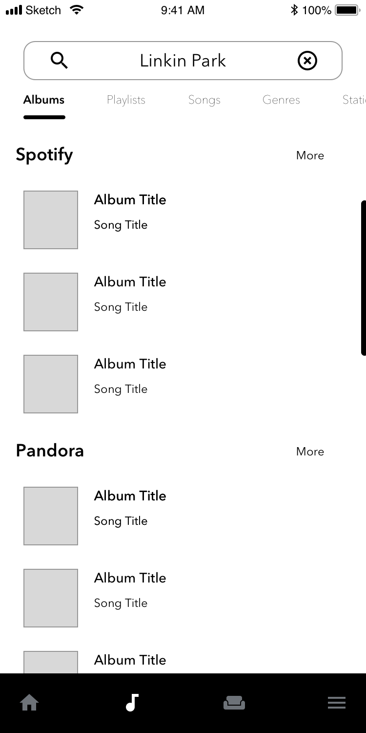
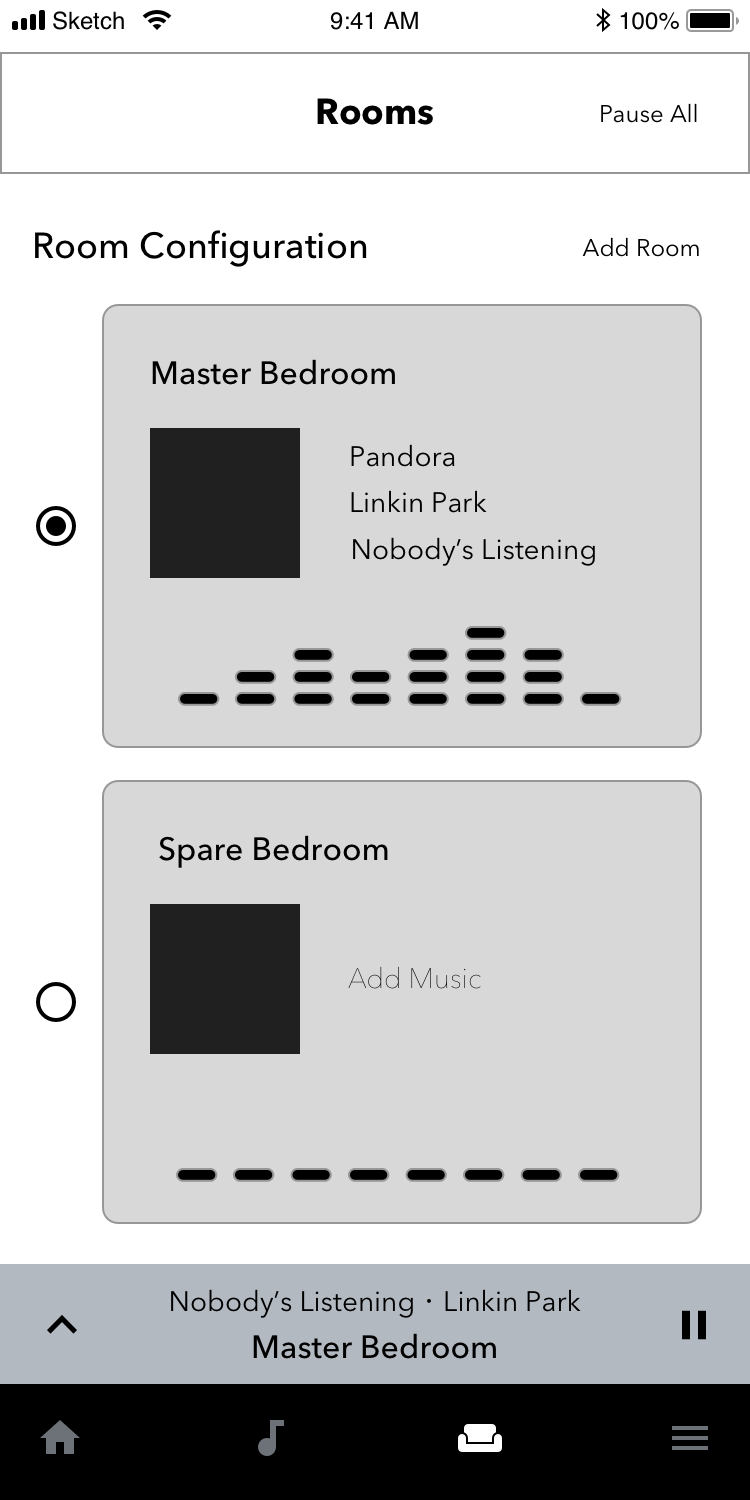
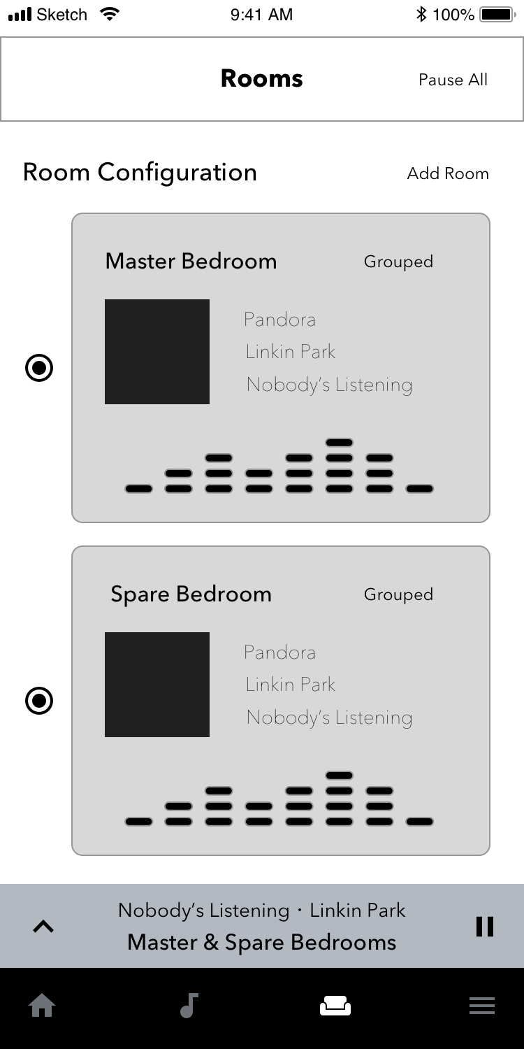
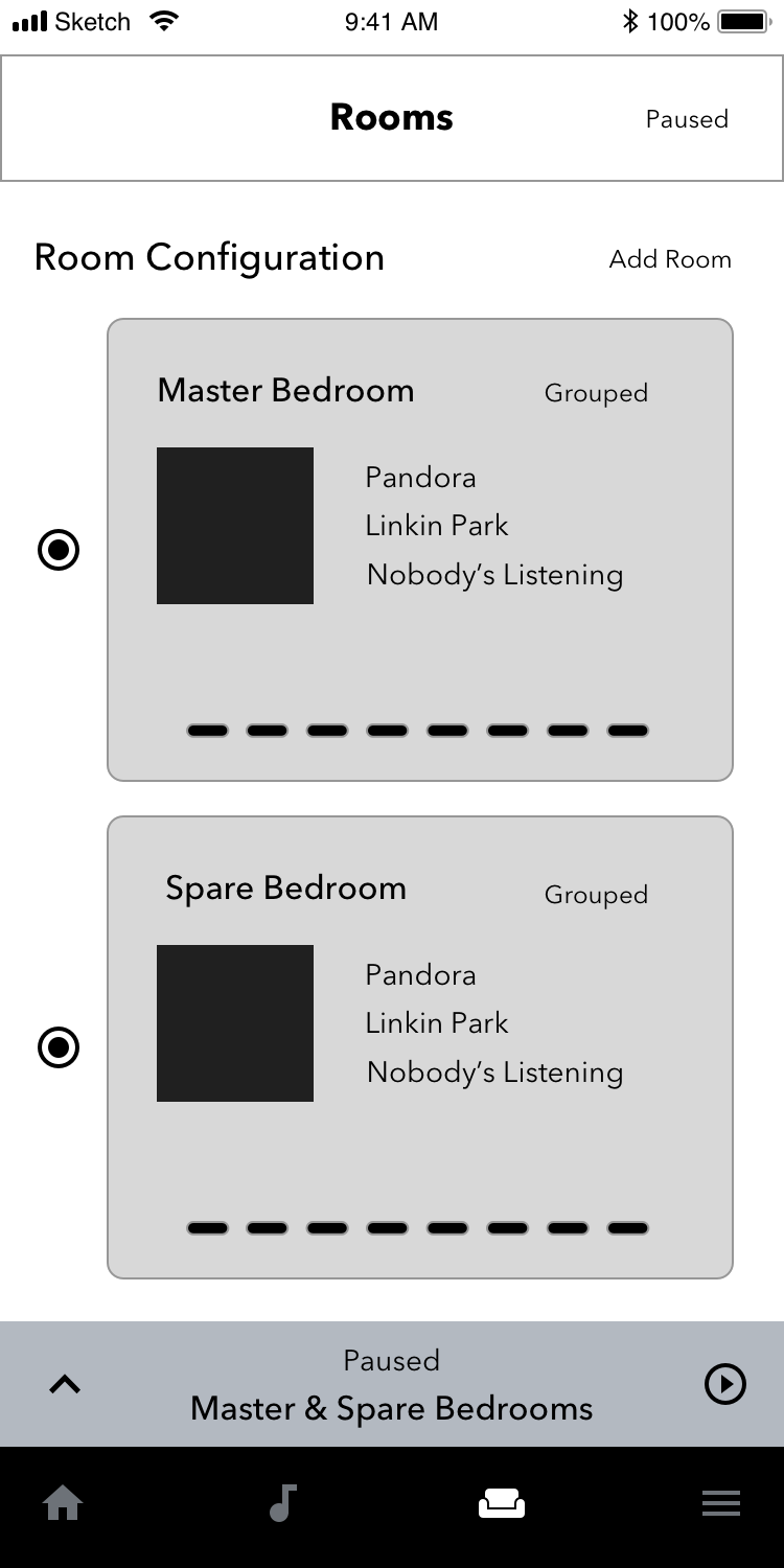
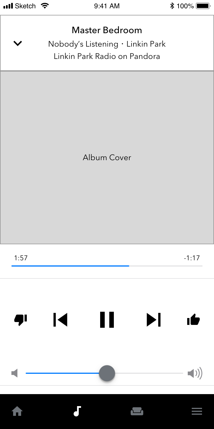
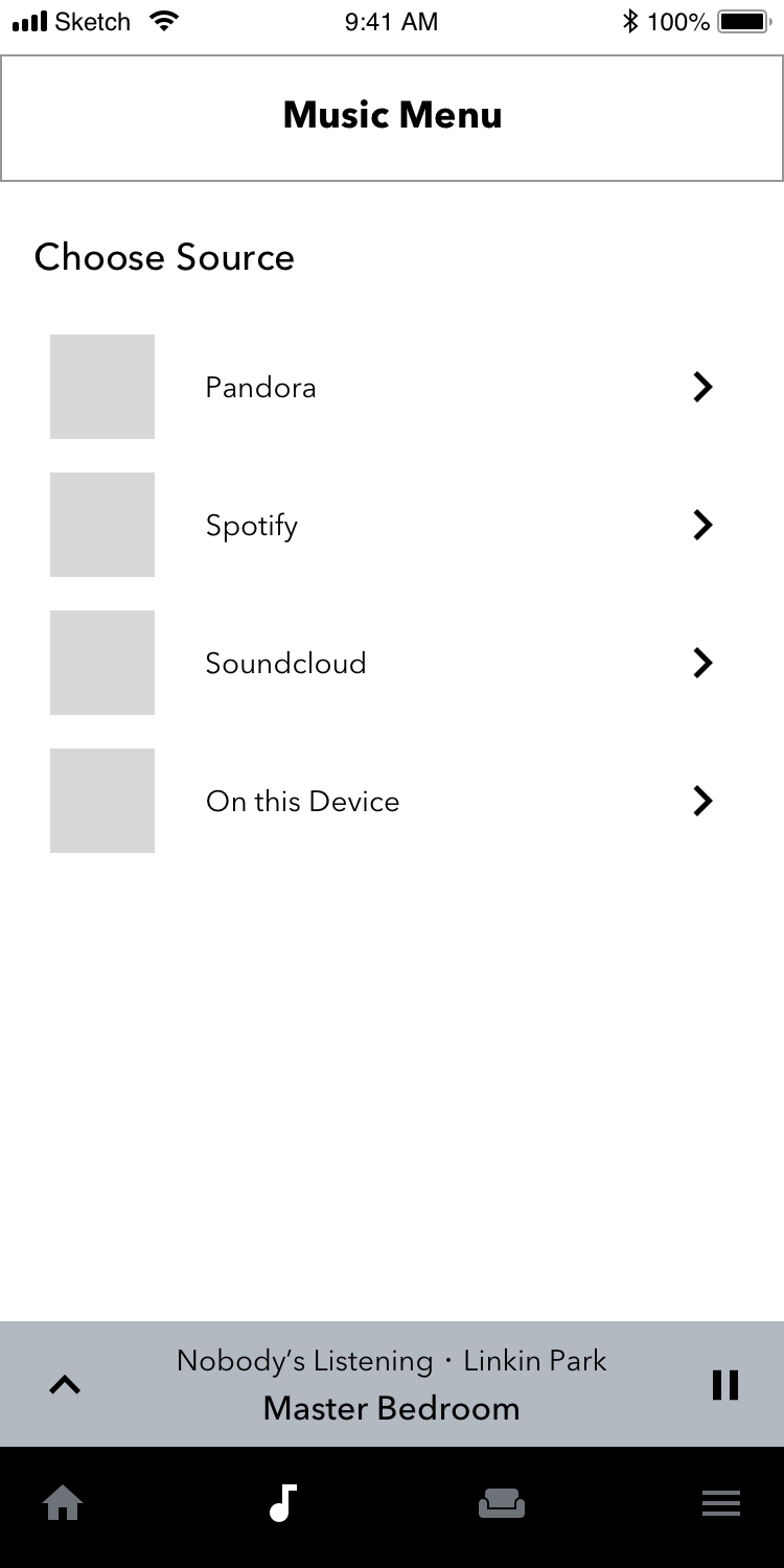
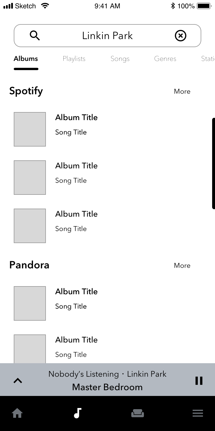
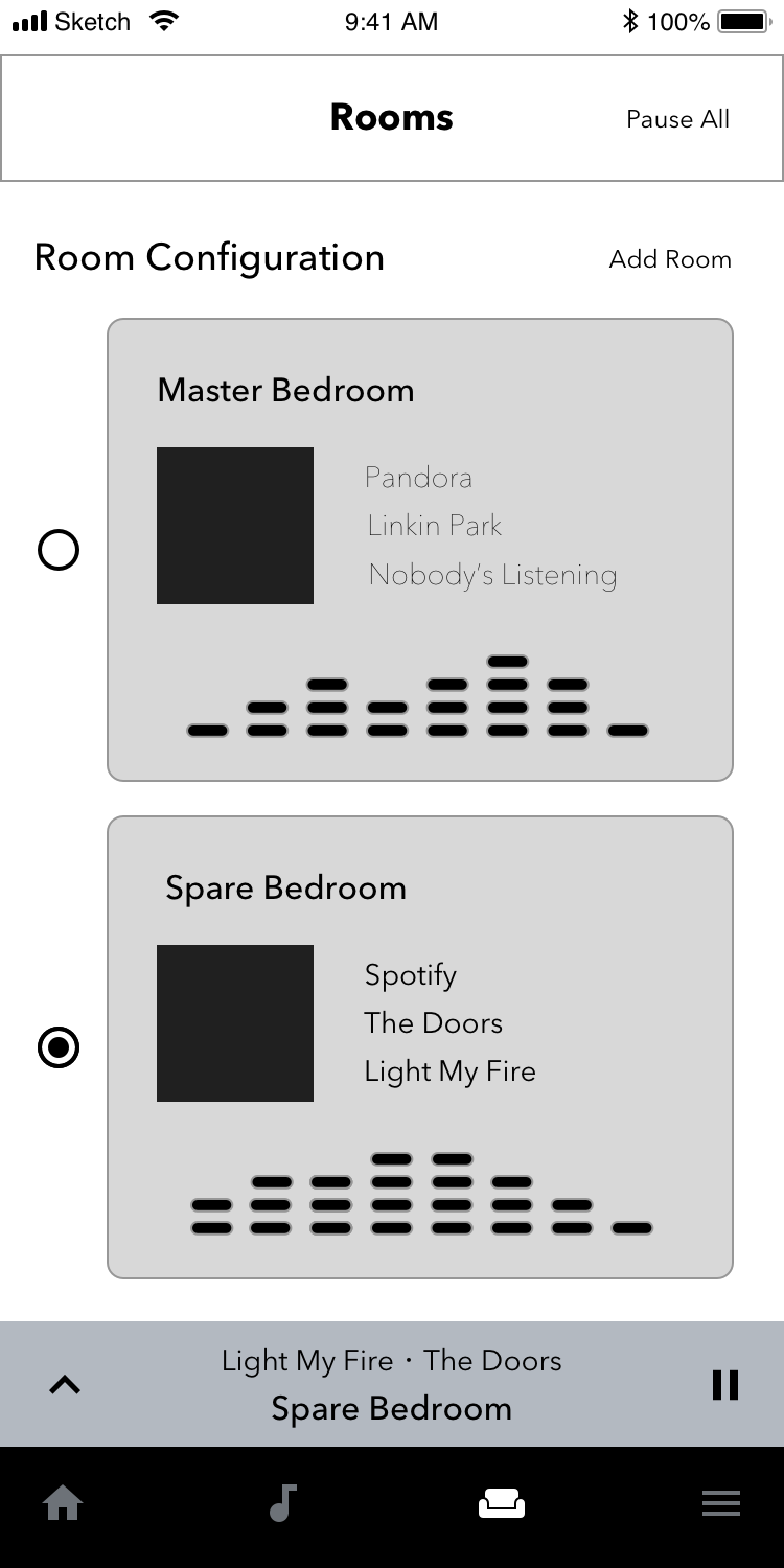
Since the home screen would be dynamic on the back end, it will display previously played files and any saved playlists from any current streaming service. The music menu is the second screen in the experience and features a search function. Next in the series is the room configuration screen where users can customize the experience for multiple areas in the home. Last in the series, the music player is the final screen of the sequence. Once a track is playing, volume controls will remain visible just above the bottom navigation.
High Fidelity Concepts
In four screens or less, users can customize their music experience. Volume controls are located just above the bottom navigation. Testing the wireframes revealed the room configuration UI was not optimized. Instead of making add a room functionality, I missed an opportunity to give the user a clear indication of direction. By using a customize text link, I concluded the interface was much easier to navigate.


