Consumer Insights
The client is a major player in the consumer packaged foods industry.
Who are we designing for?
The consumer packaged goods industry is the target audience. Examples of clients include Anheuser-Busch and Kelloggs. These clients use the flagship product known as Insights. It enables them to answer their business questions via a suite of unique reports that cover demographic, shopper, brand, and category analysis. Users are split into two broad groups, power users and casual users. Power users frequent the platform and are typically in supporting roles within the organization. On the other hand, casual users are often senior leaders with more influence over strategic initiatives and budgets.
What is problem we are trying to solve?
Since casual users are less engaged in the product, they are less likely to consider Insights as an essential part of their organization’s toolkit. The goal is to increase the duration of platform engagement with casual users by proposing a solution that makes it easier to obtain information that is relevant to them.
What does the user think?
Bringing the user into the conversation at the beginning helped me to learn more about this use case. After the interview, I had empathy for the user and understood how they engaged with the platform. This ultimately helped me visualize how I could improve the current experience. During the discovery phase, I sourced a user by reaching out to them using a social media platform and sent them a copy of the discussion using the messaging feature. Once I got a response, I was able to continue my research and progress further into the discovery phase. A copy of the interview is available for review below.
What does a day in the life of a user look like?
Before, I could design a solution, I had to understand the daily life of the casual user. To accomplish this without conducting interviews, I researched blogs posted by other senior leaders in similar roles. They went into detail describing how fast life moved for them. After some contemplation, I elected to storyboard a day in life of an executive so I could avoid designing based on my own bias.
7 am - 9 am
Check the news
Check work email
Eat breakfast
Get kids to school
9 am - 12 pm
Catch up with Teams messages
Daily standup and internal planning
Provide feedback on strategy
Connect with customers to resolve issues
1 pm - 6 pm
Confirm and welcome new customers
Evaluate business trends
Provide forecast of regional sales
Generate reports per quarter
6 pm - 9 pm
Take son to soccer practice
Have dinner with the family
Help kids with homework
Spend time with life partner
How can we increase user engagement?
This part of the assignment required me to learn a great deal about customer engagement. In short, I had to research what the current best practices are so I could begin to understand how to design a solution. There are so many proven methods to increase product engagement. After researching the users behavior, I am proposing four methods that I feel will accomplish the goal.
1) Focus on the ideal onboarding experience
Effective onboarding is the hook that leads to long term engagement and effects the entire customer journey. Users should have the option to walk through key features or bypass that aspect if they so choose. Ultimately, the goal is to help the user realize the product’s core value proposition as soon as possible. By displaying a simple progress bar or checklist, good design can give users a boost of positivity for completing this task.
2) Utilize notifications properly
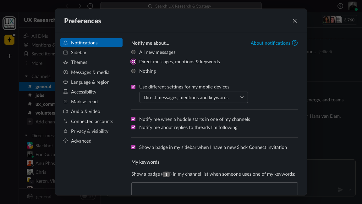
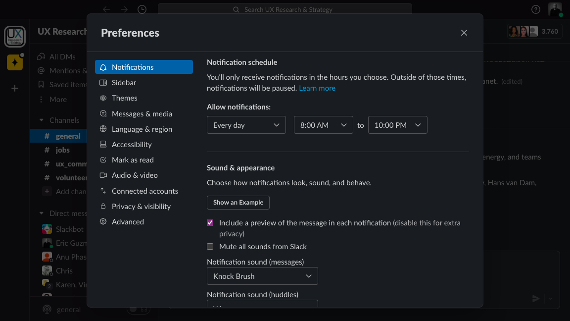
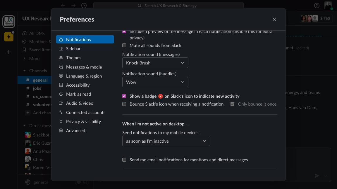
Focusing on the in-app messaging experience will grant the user the freedom to customize their preferences. This can definitely lead to increased platform engagement when executed properly. Slack does a great job of allowing users to decide how much engagement is enough for them.
3) Offer amazing customer support in-app
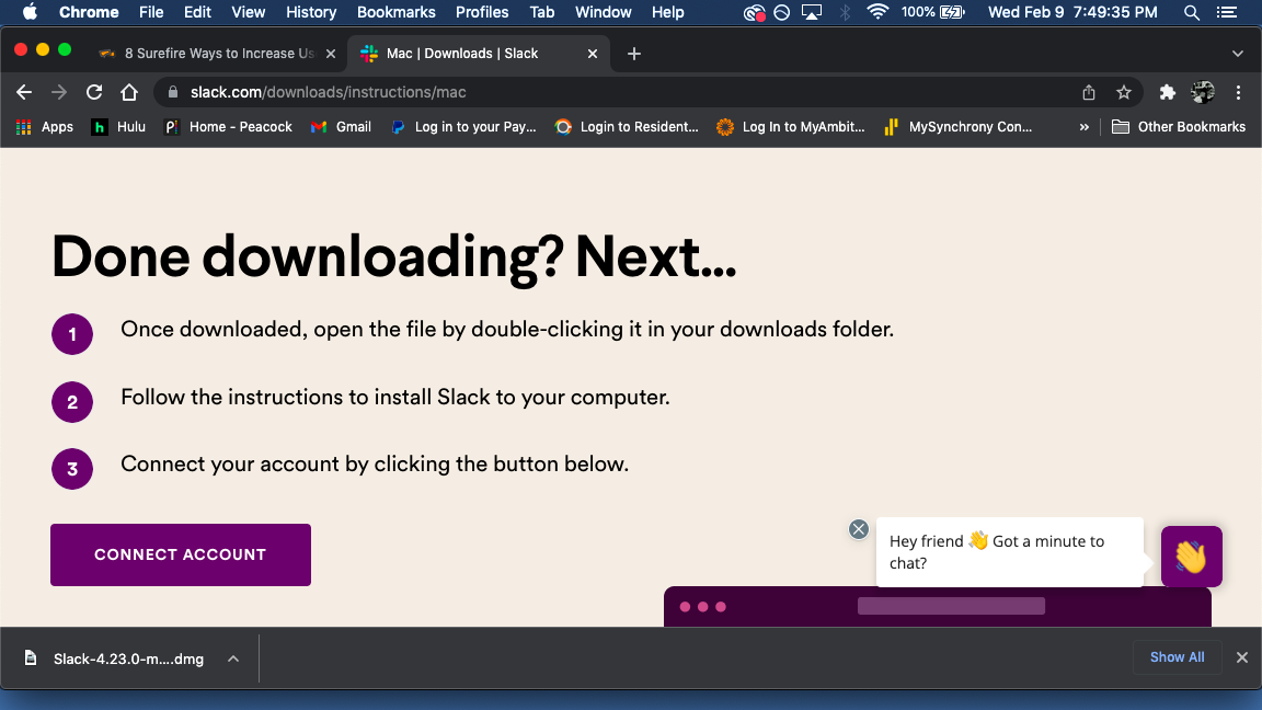
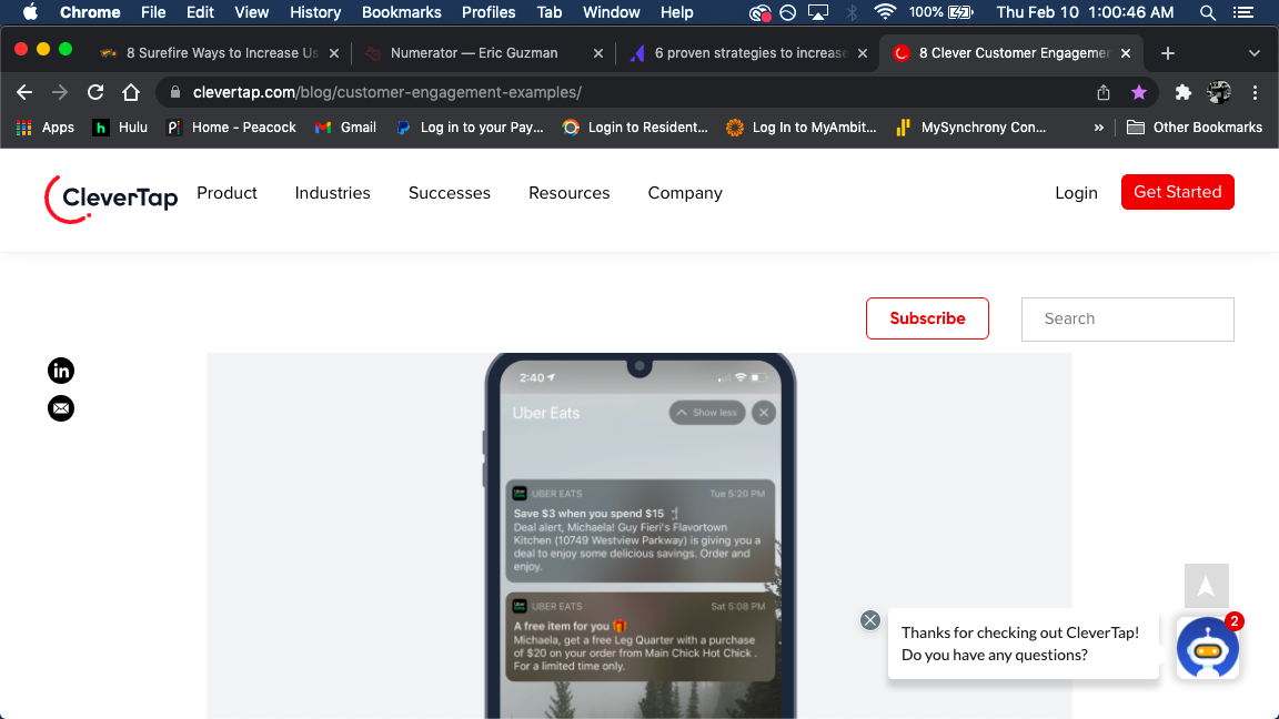
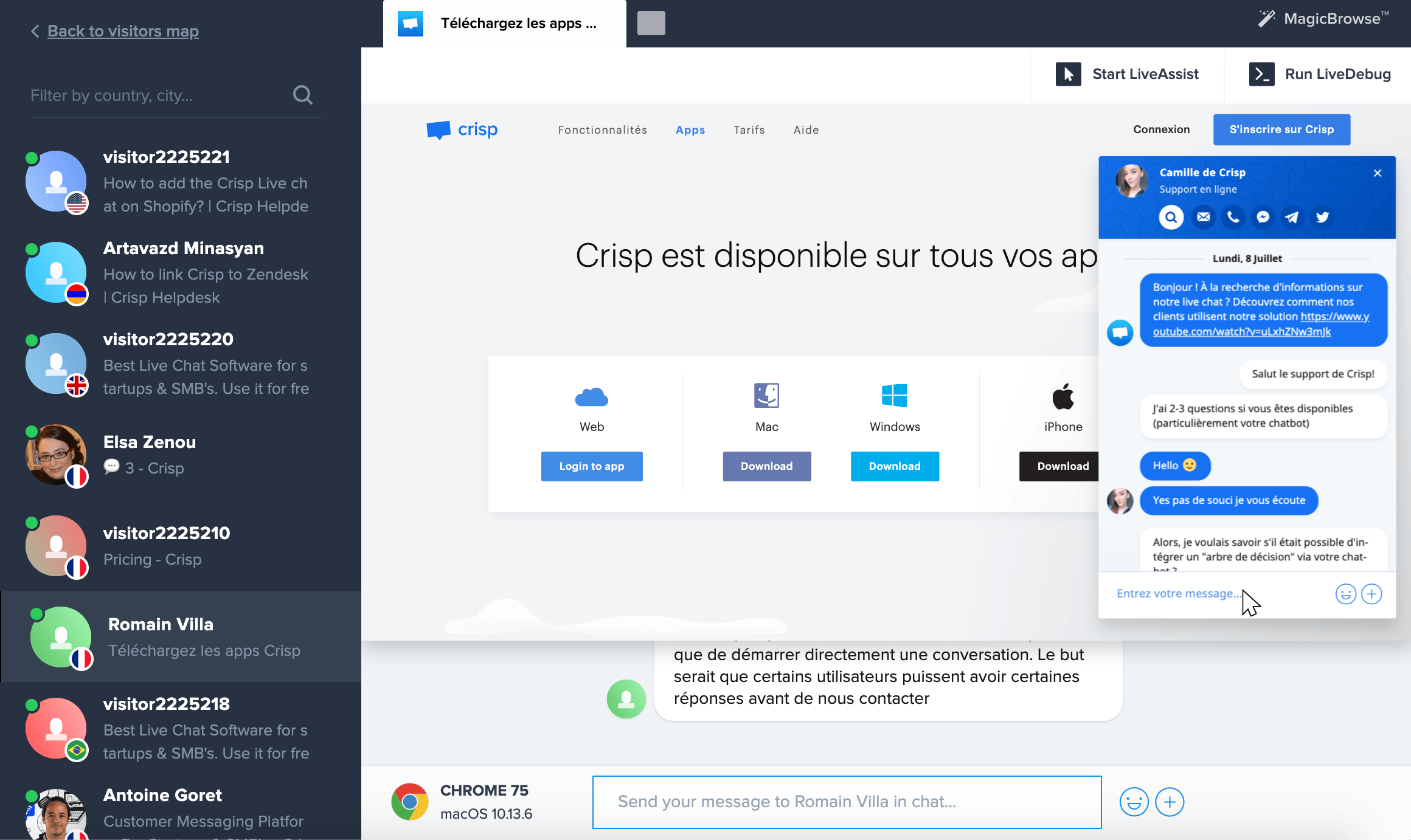
By providing live chat agents increases user engagement because it facilitates the fastest response time. On the other hand, co-browsing takes customer service to the next level by providing a collaborative medium for customer support agents to interact with users in real-time.
4) Personalize the omnichannel experience
Simply put, personalized conversations will lead to lead to increased user engagement. By collecting feedback through real-time engagement, we can learn more about the user and understand communication preferences. In essence, it is essential to integrate personalization with an omnichannel communication approach.
What does the competition have to offer?
As with most of the projects I have taken on, I had to research and see what profit and loss reports look like. I was not familiar with sales growth charts either so I compiled some screenshots for inspiration. A compilation of various screenshots taken from different online sources is available for download below.
Proof of concept: Low Fidelity Sketches
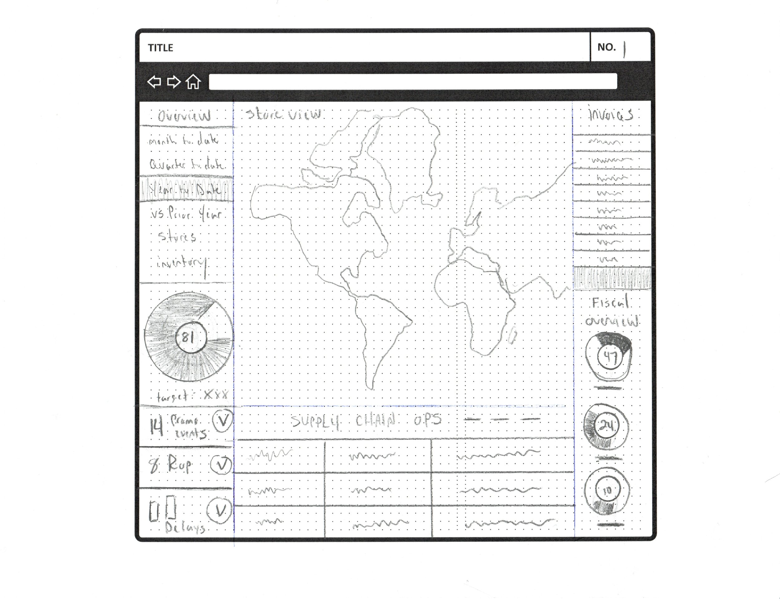
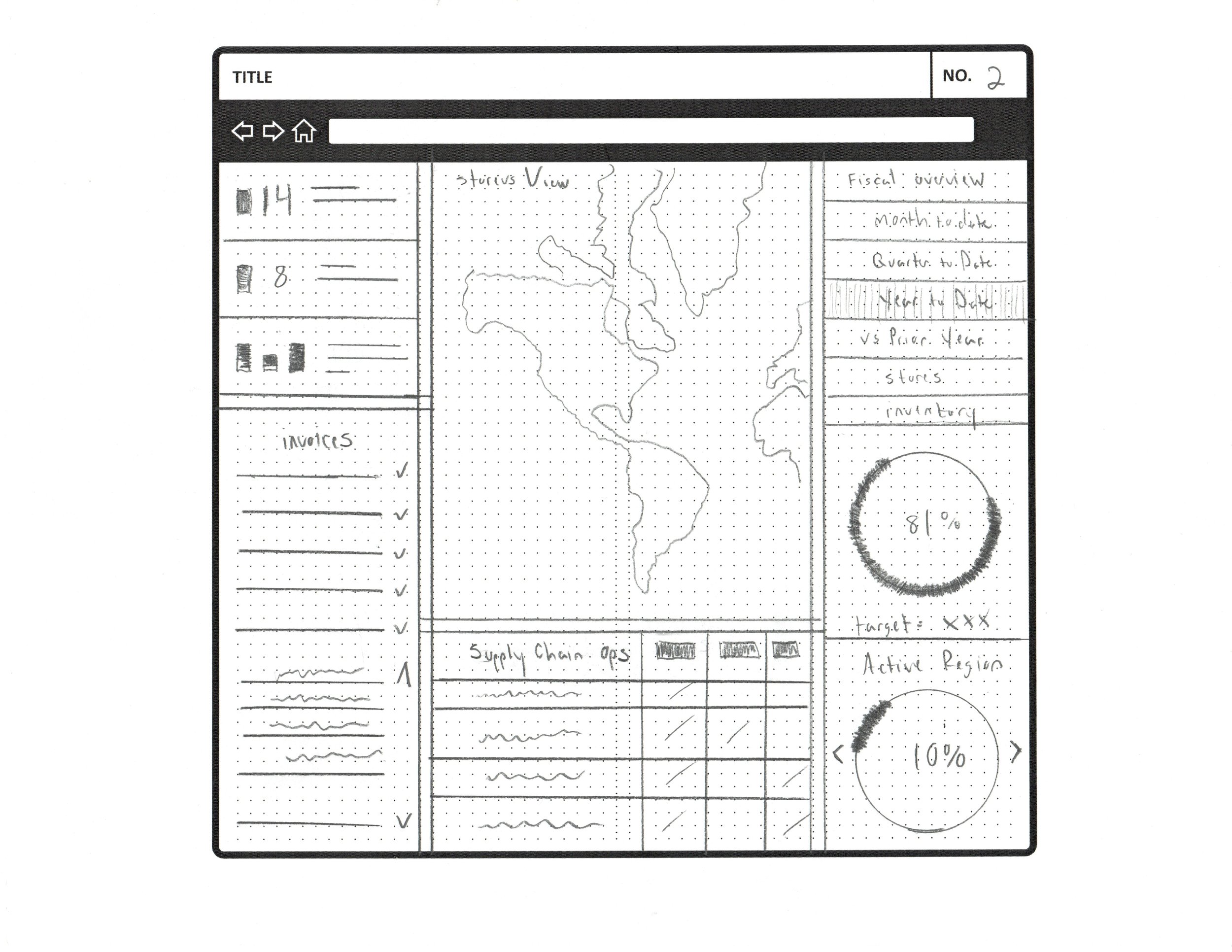
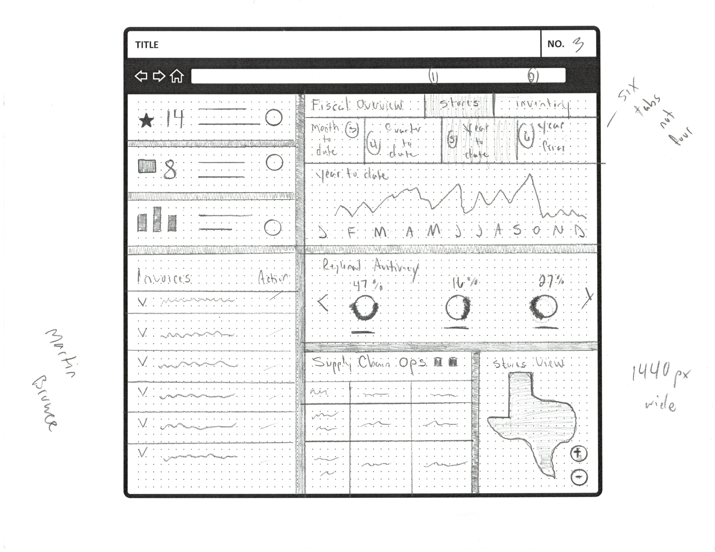
After completing the competitive analysis, I realized that data visualization was handled in many different ways. For the most part, there was too much information in some of the examples that I found. On the other hand, some examples did a great job of only showing the user less information. However, those examples also allowed the user to choose which data sets were relevant to them. In essence, I realized that my backend constraints would not allow the user to save their preferences which is not the ideal situation. Therefore, I would need to start off by having all of the data sets visible for the time being.
Proof of concept: High Fidelity Wireframe
This high fidelity sample screen shows what live chat support could look like.
Next Steps?
My next steps would be to present this solution to a smaller set of casual users to qualify my design decisions. Then, I would iterate based on the feedback received. Once those changes were executed, I’d collaborate with a content writer to ensure the choice of words is correct. If possible, I would also seek feedback from any other internal designers before taking it back to the user for one last review.
