
Float Fest

Creative Brief
Float Fest is a music festival that takes place in Martindale, Texas along the San Marcos River. Now in its fourth year, the design challenge is to increase brand awareness by pairing conceptual type selections with a visually engaging trademark. Enhancement of the user experience was executed by showcasing the expansion of the brand with a redeveloped website, appropriate deliverables, and a comprehensive mobile application.
Logo Development
The logo for Float Fest uses the image and letterform substitution method. In place of the letter, an inner tube completes the word and captures the whimsical spirit of the annual festival while also appealing to the target audience. Obvious imperfections within the form of the float and icons reflect the easy going nature of the activities taking place onsite.
Branding Identity
Music festivals offer limitless opportunities to apply the branding identity. Everything from the website, mobile application, social media promotion, and festival merchandise are standard for the typical music festival.

Typography
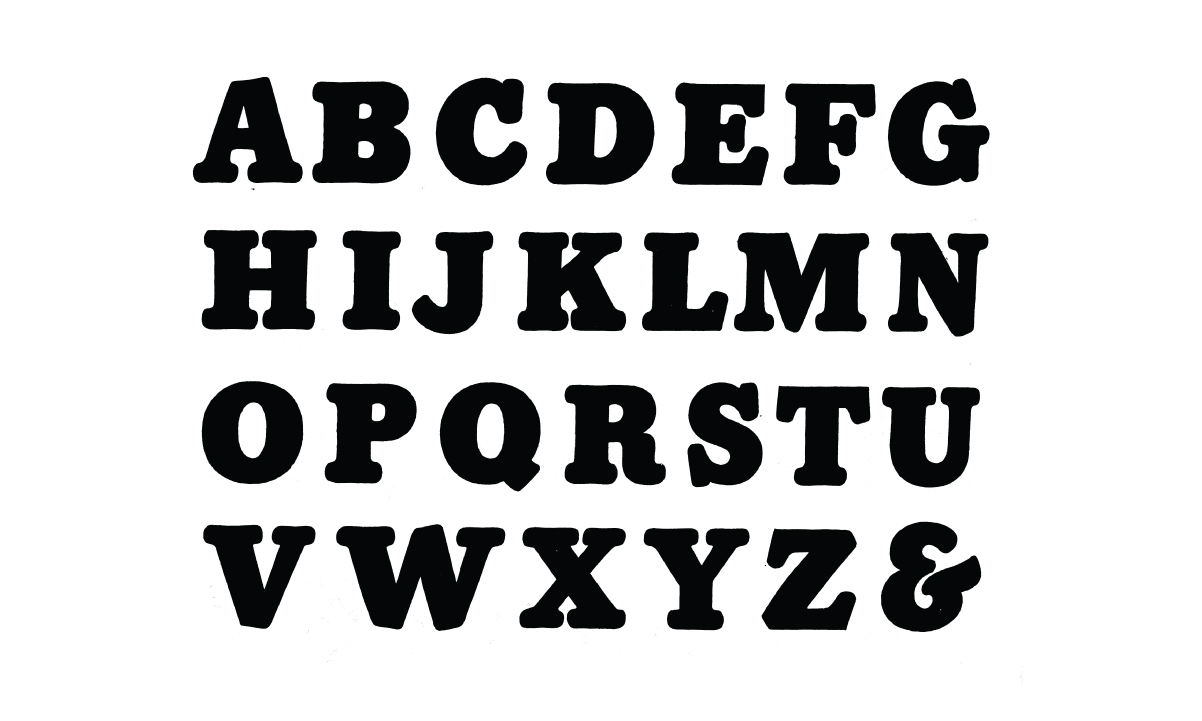
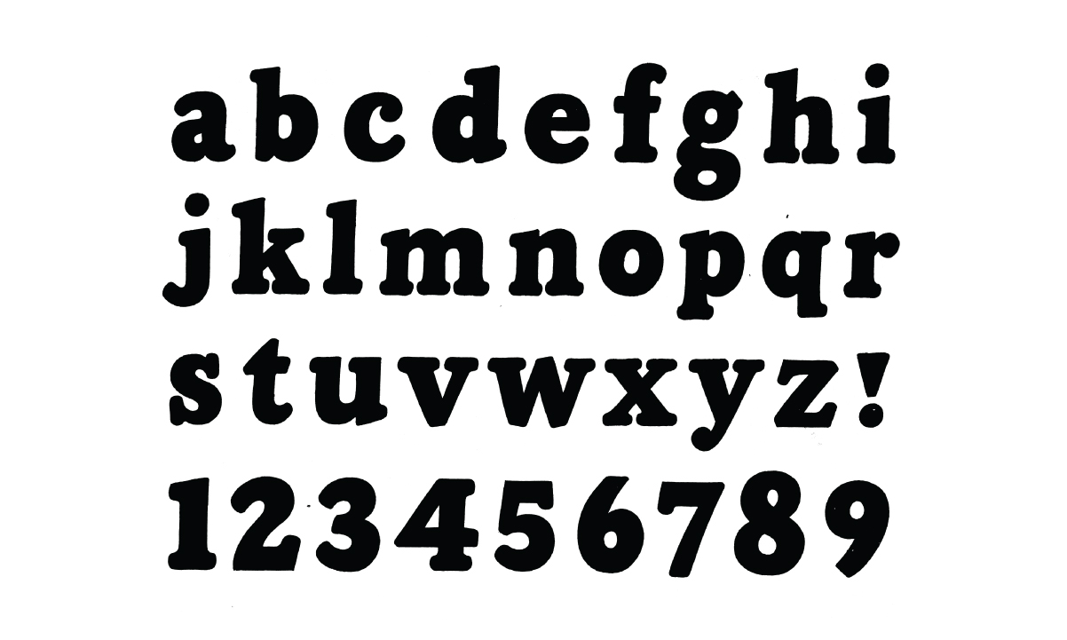
Albert Cavanagh’s book: “Lettering and Alphabets” is the source of the rounded slab serif faced type used for the logo. Heavy lettering was chosen since it stands out from far away and because the hand written aesthetic reflects the casual nature of the music festival.
Franklin Gothic URW comprises the other half of the lettering that makes up the logo. This grotesque sans serif typeface was selected because it was created during the same era that the hand rendered type was developed and because it offers so much in terms of contrast. All of the body copy for the website and mobile application is comprised of various cuts from the Franklin Gothic family.

Icon System
Icons were developed to solidify the user experience in terms of navigation through the festival grounds. Most frequently, they will be displayed on the environmental signage and posted in strategic locations making it easier for festival attendees to find their way. Several interactive maps in the mobile application feature the icons and enable users to easily recognize areas of interest.
Color Selections
Blue was selected are the primary color for this branding campaign because of it is associated with water. Since a portion of the festival takes place on the river, contrasting hues of blue were implemented to make signage and the website easy to read.

Design Challenge
Float Fest has yet to develop and offer a mobile application that would enhance the user's experience at the festival. Aside from traditional environmental signage, festival attendees had no means to keep track of the schedule without having to lose track of time. The Float Fest application gives users the ability to find the information they are looking for quickly while saving precious battery life.
Research Through Interviews
Facebook provided a means for me to reach out directly to festival attendees and inquire about their experiences. During my research, I learned that some of the people interviewed are loyal to the brand. They've attended the festivals in the years previous and welcome the idea of having an app at their disposal to enhance the experience.


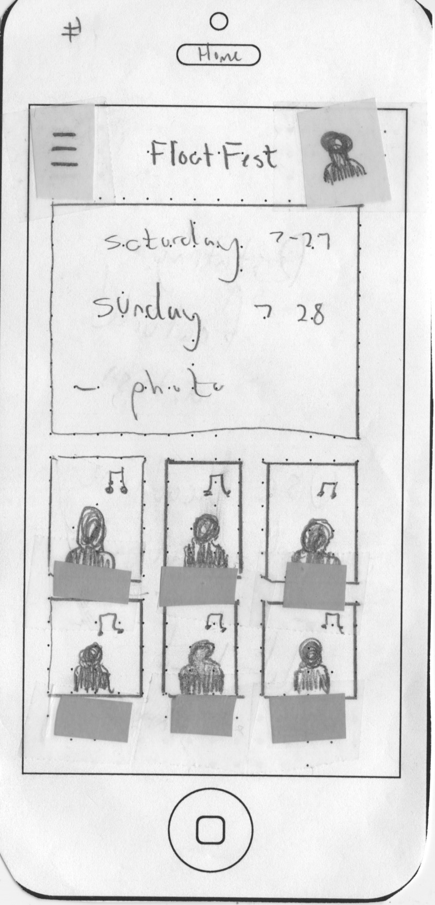
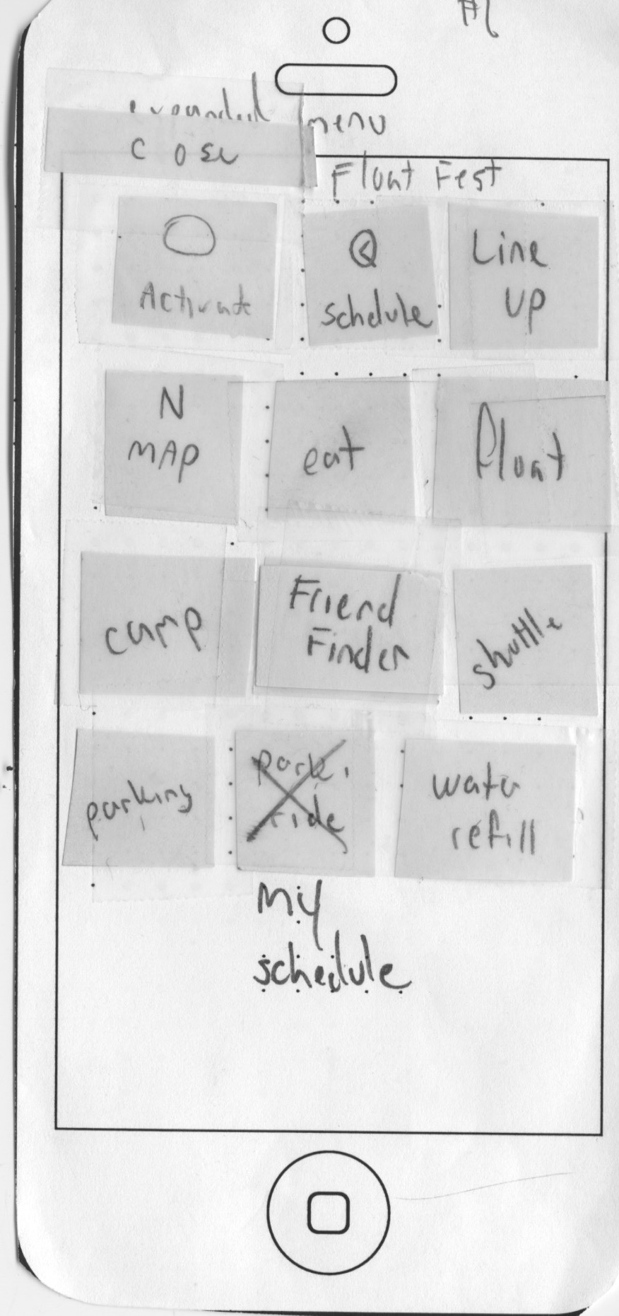
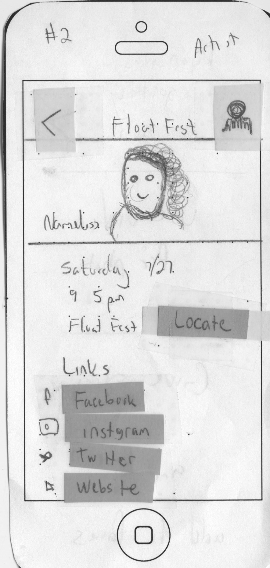
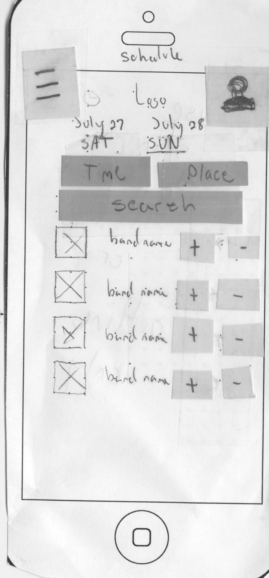
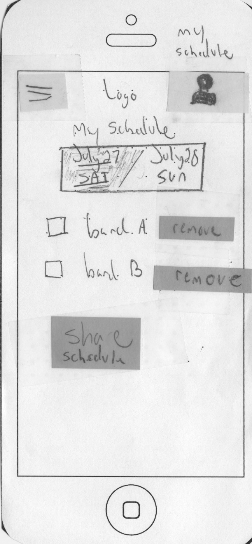
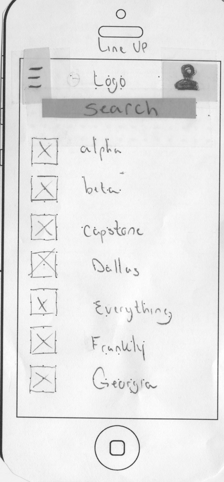
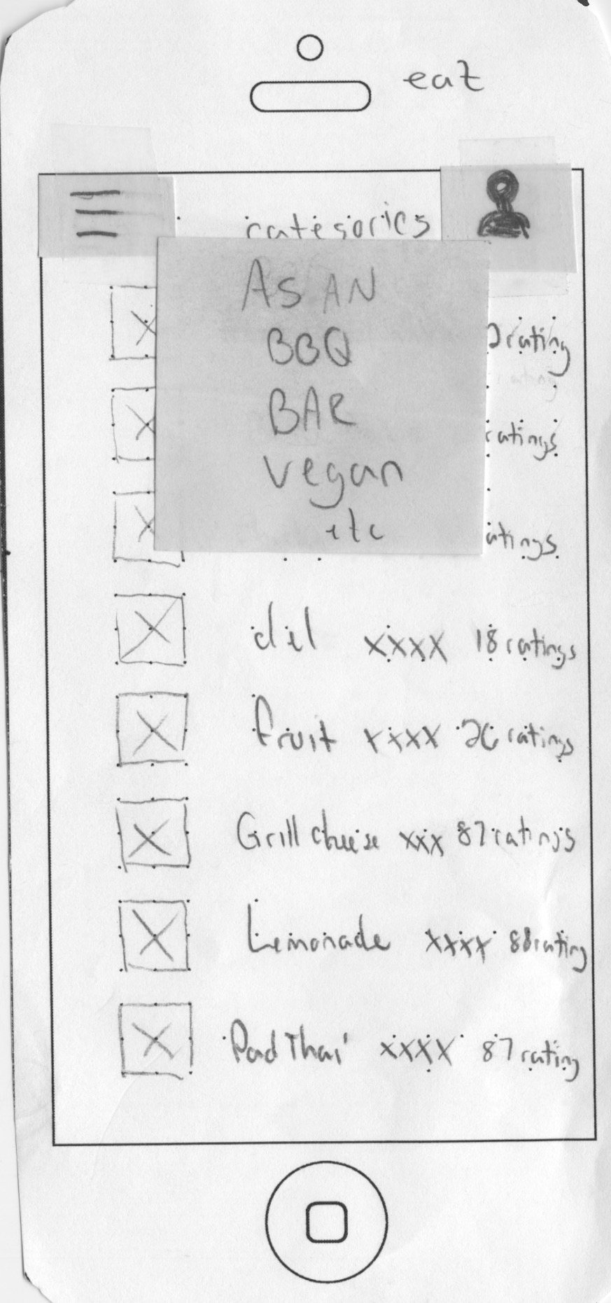
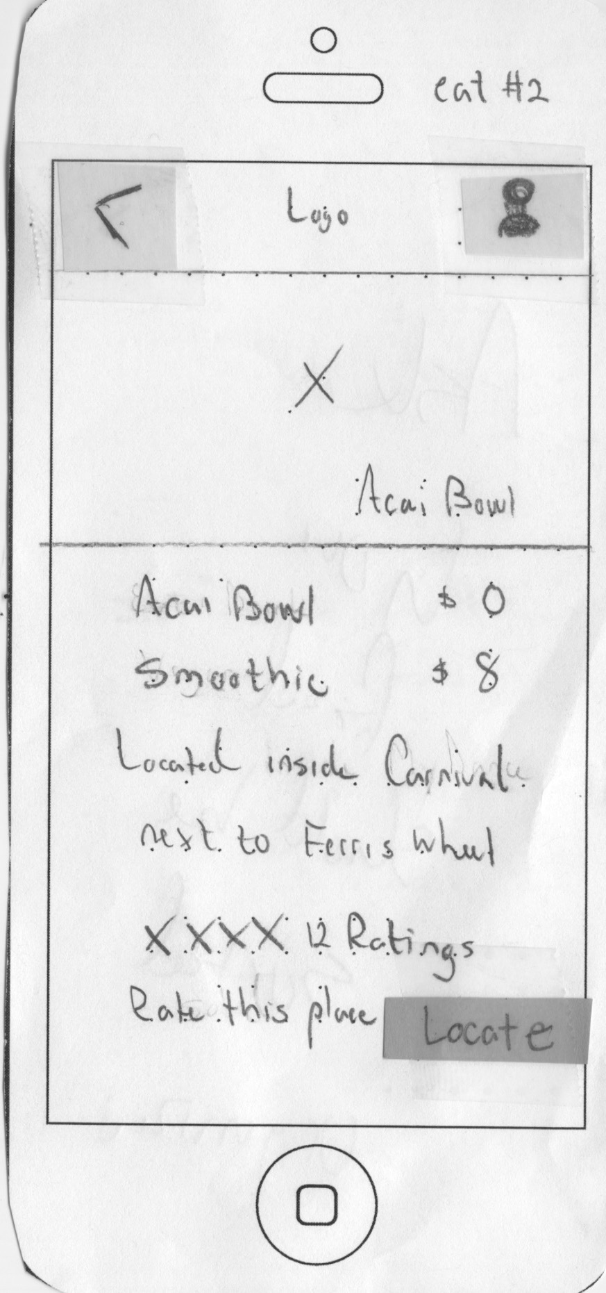
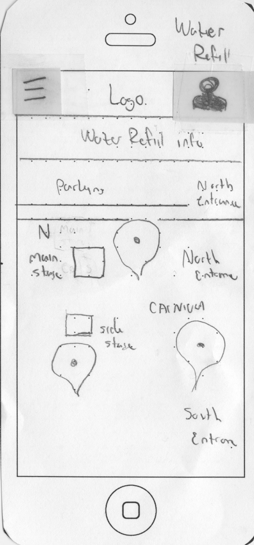
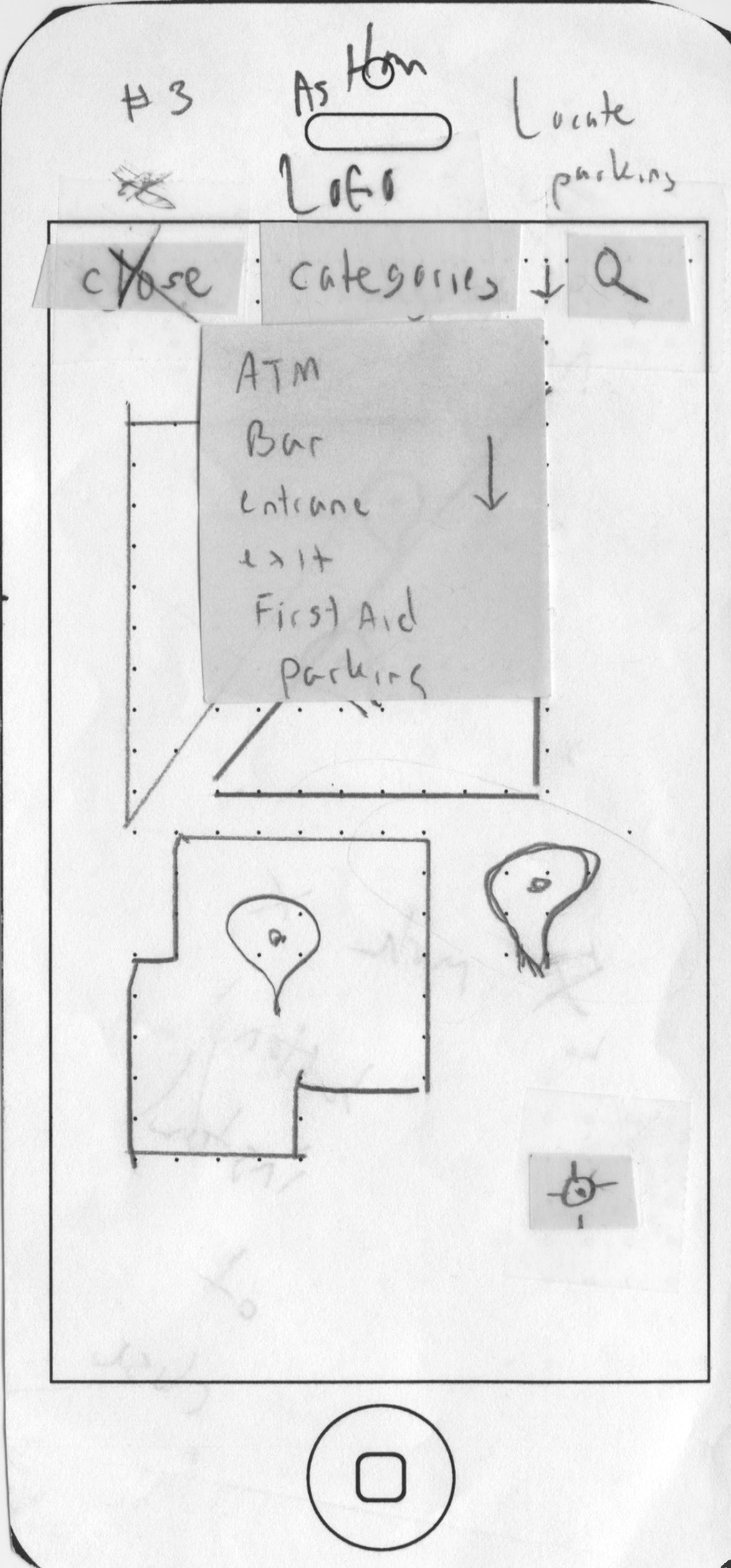
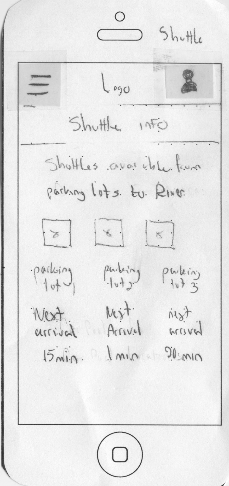
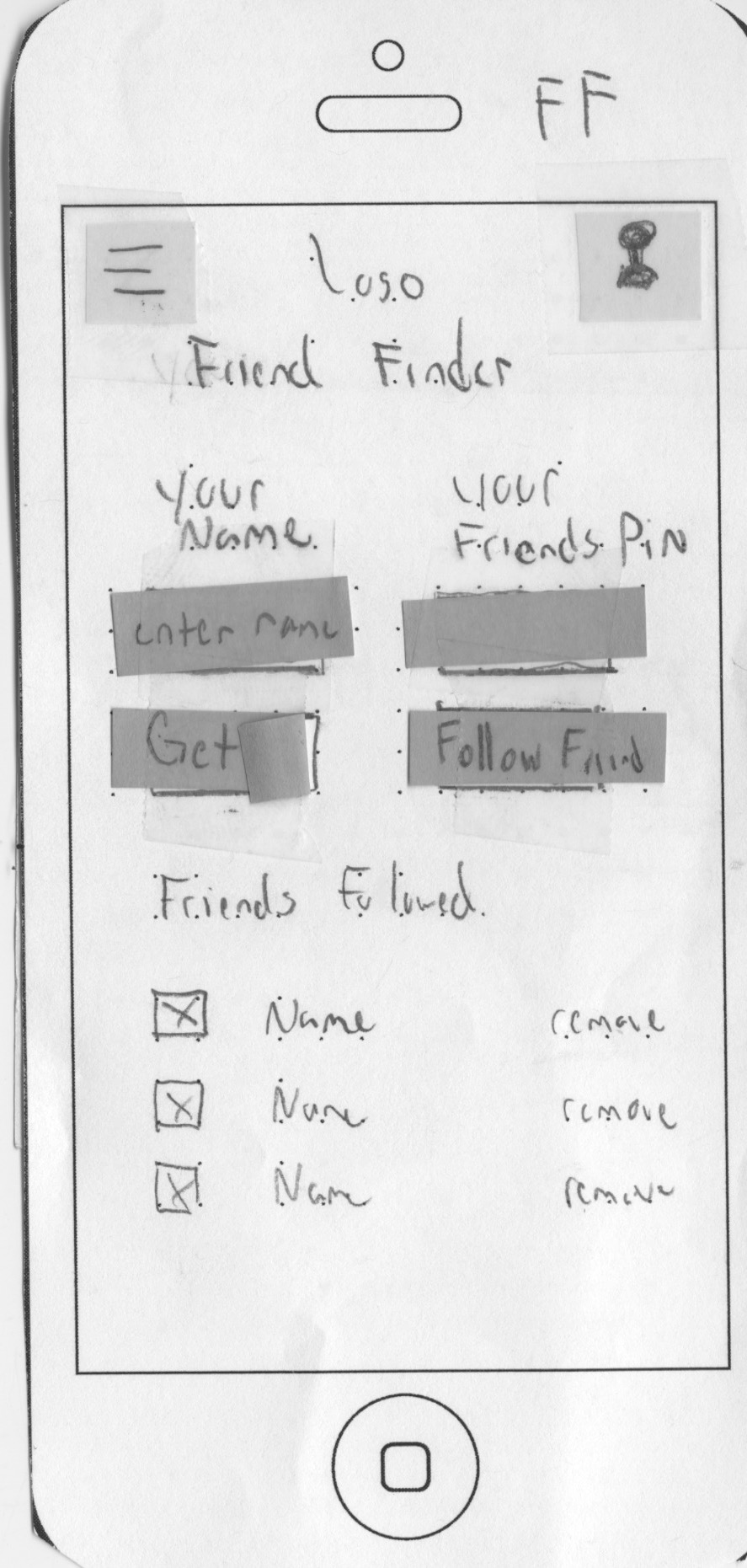
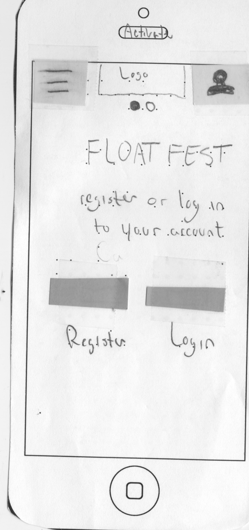
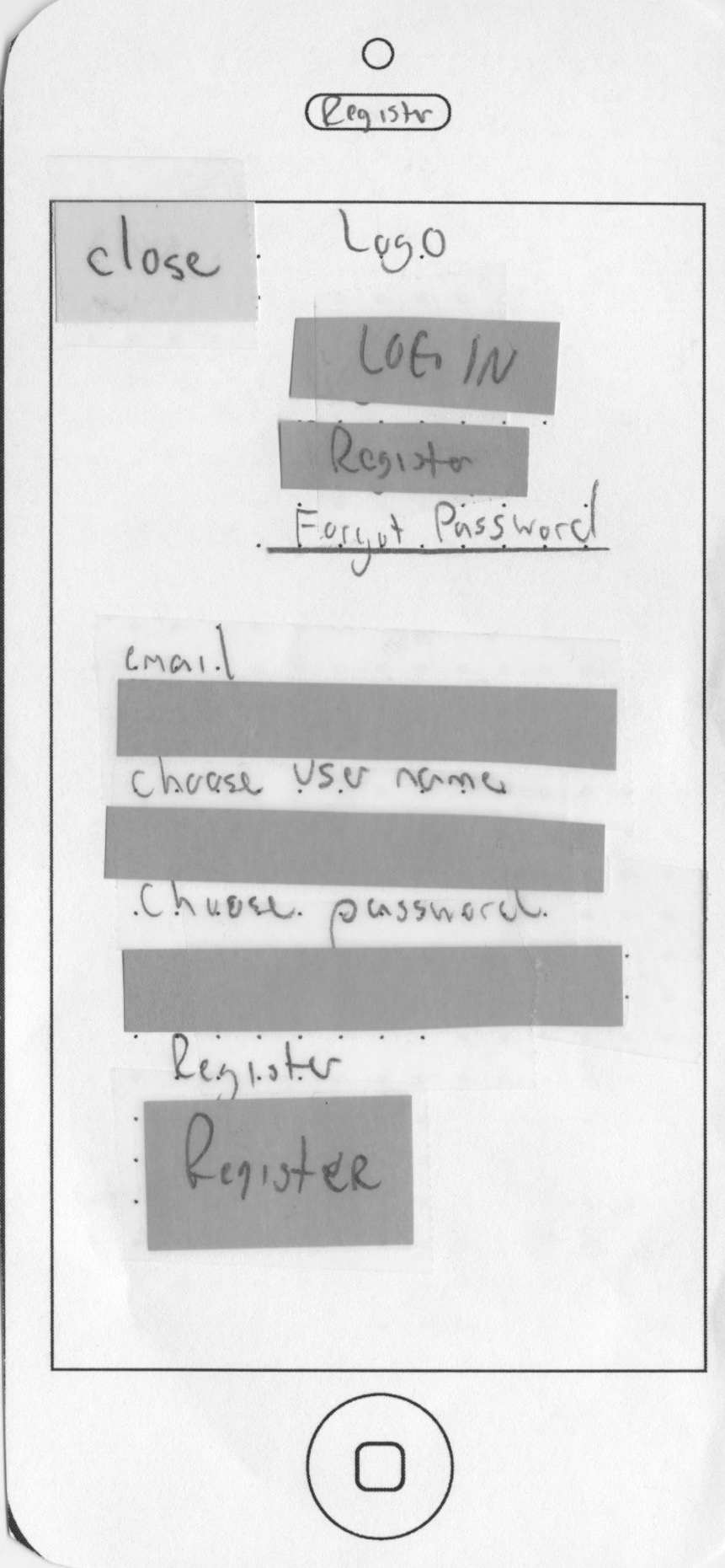
Paper Prototypes
This stage of the design process required me to take into consideration the pains of the festival attendees. Users needed to be able to find the band or food vendor they were looking for without hassle. After studying similar festival apps, I combined features from various sources that are relevant to this particular user experience.
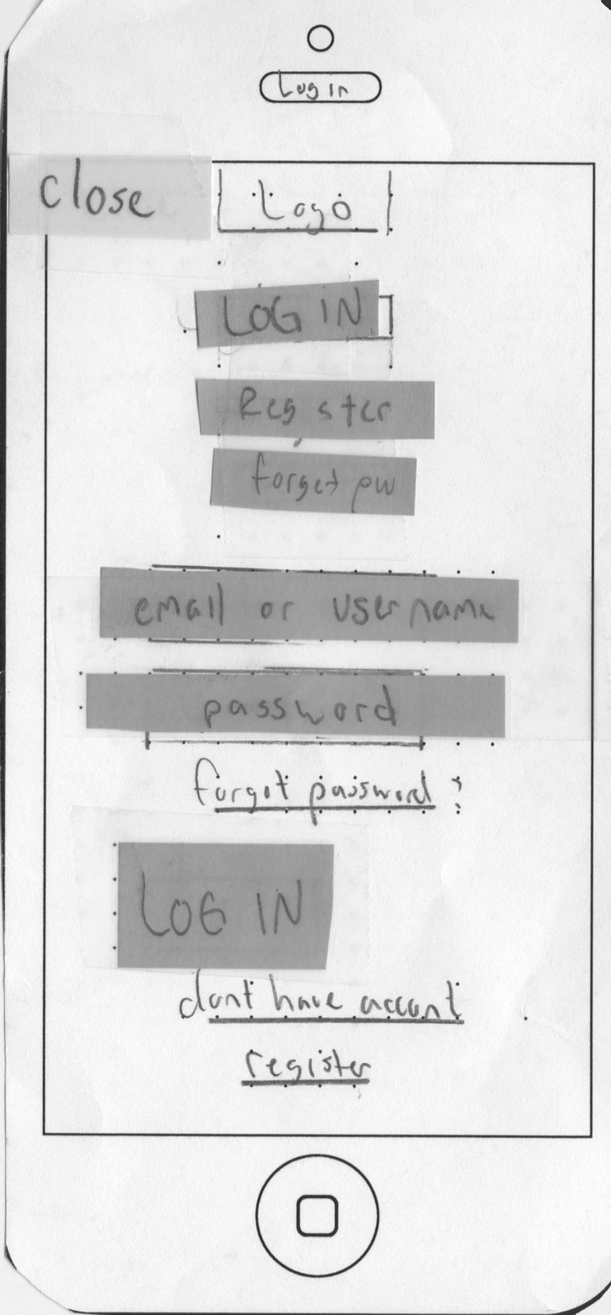
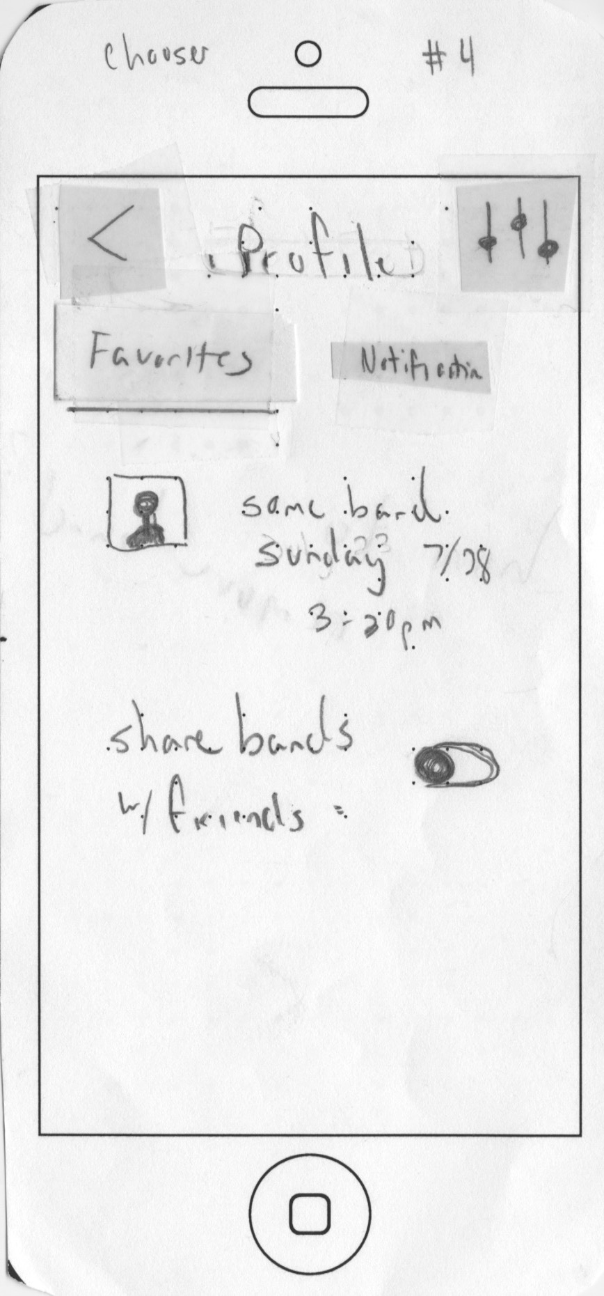
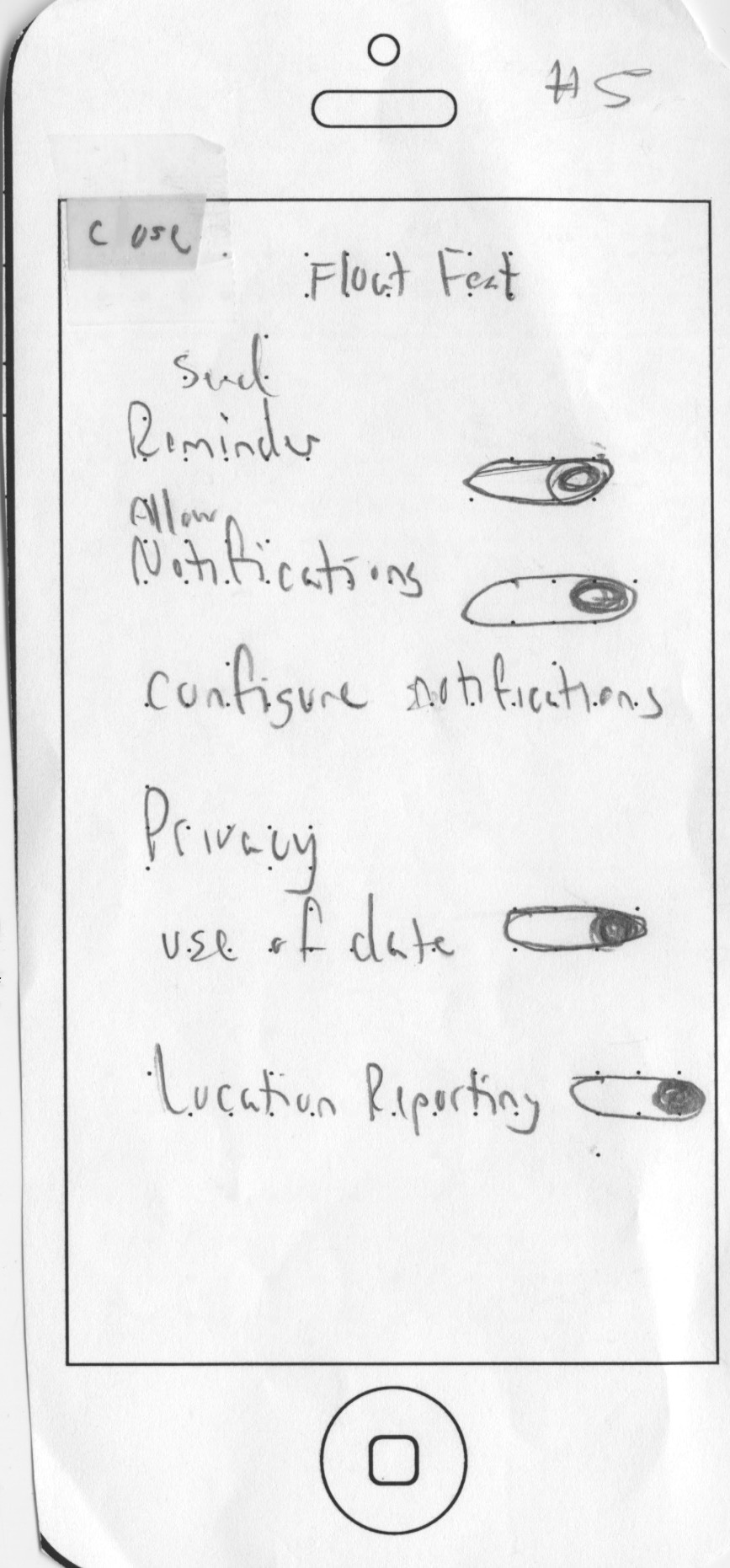
User Testing
Five user tests were conducted and the most meaningful one is posted here. During this phase of the project, I noticed flaws in the design and learned that I needed a solid navigation bar along the bottom of the screen.
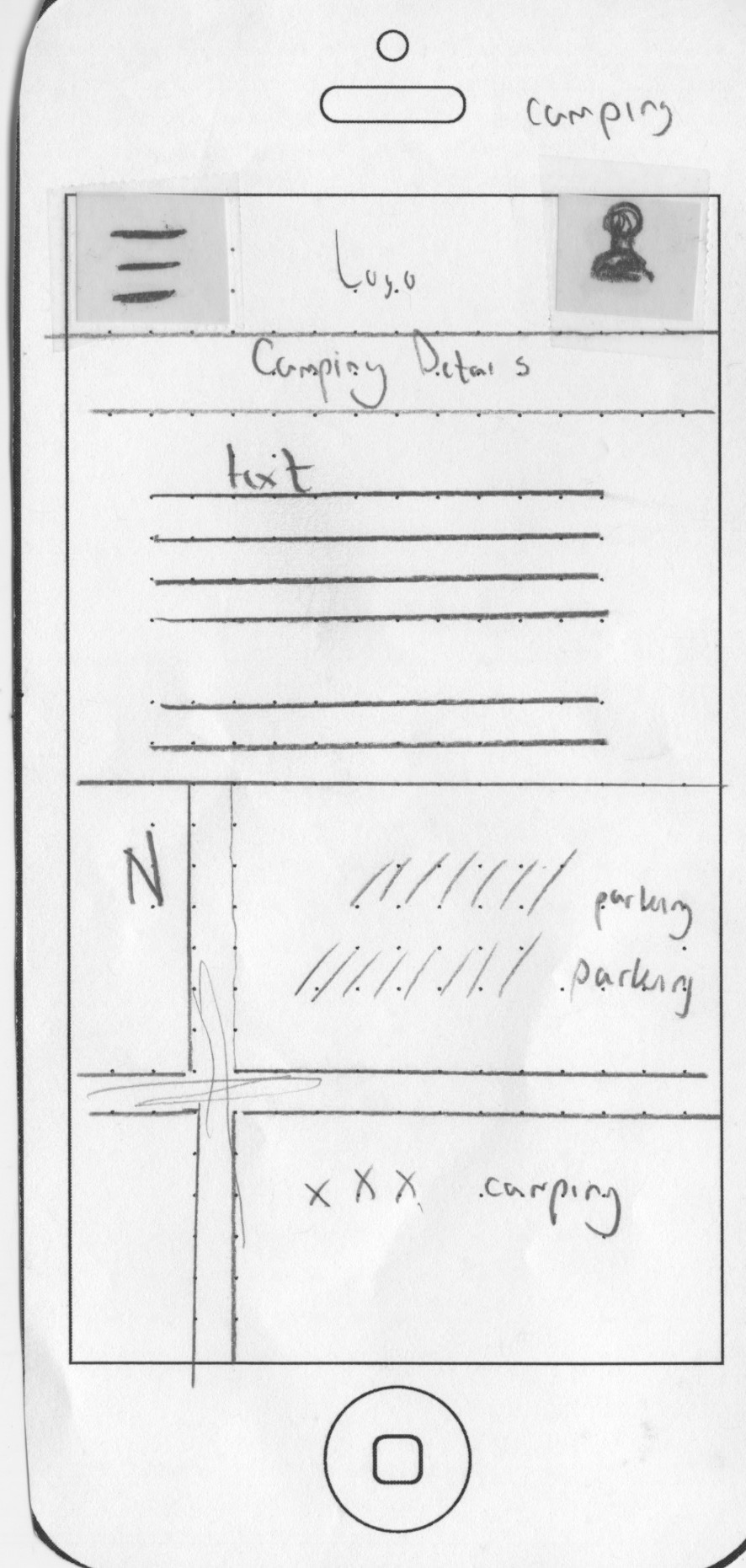
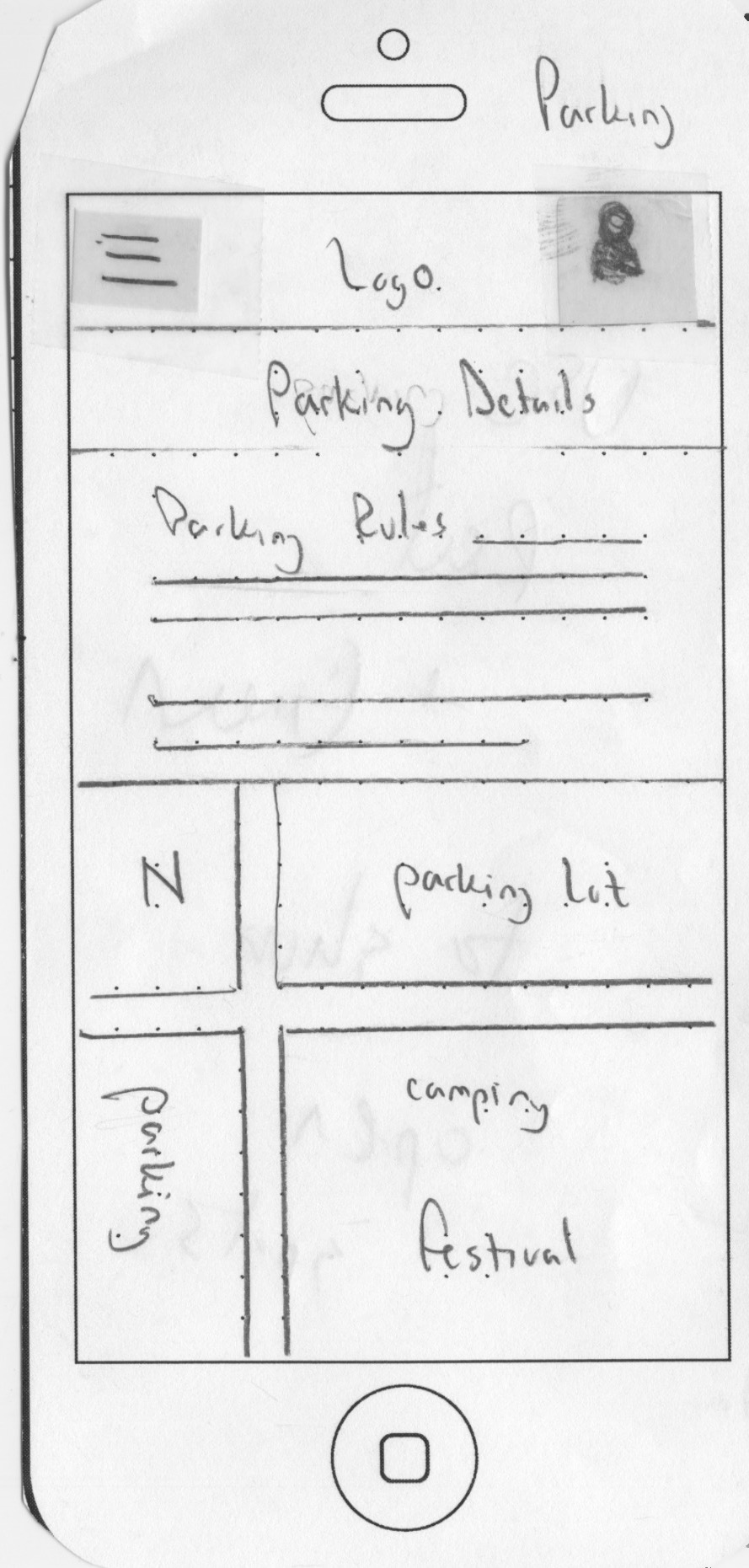
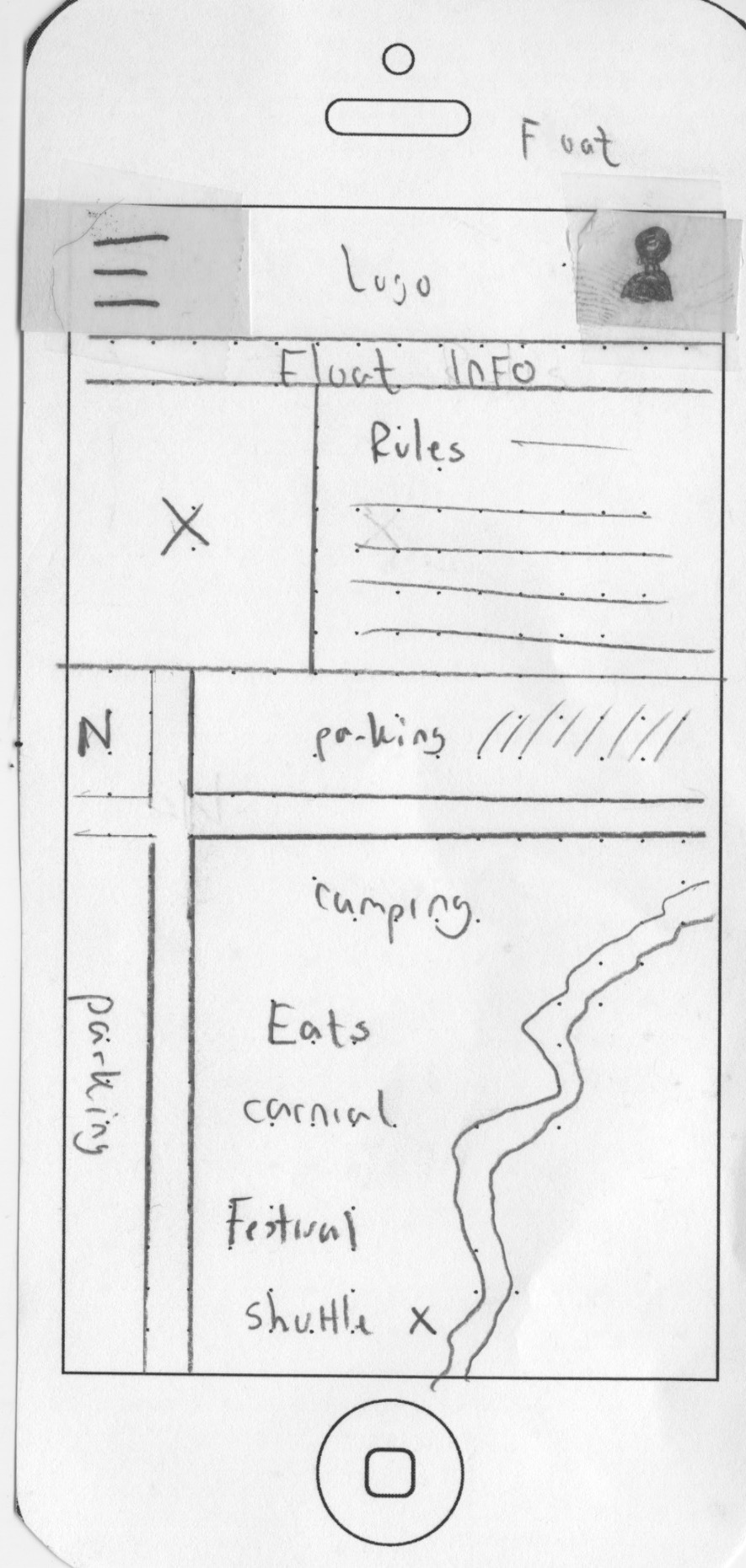
Wireframes
It was at this stage that I was able to visualize a flow that would satisfy the needs of the user while minimizing the number of screens in the process.


Branded Music User Flow
This user flow caters to Amanda's request to find information about her favorite band. According to the chart, Amanda will have to navigate through four screens to find her location in relation to the band.

Branded Food Vendor User Flow
Lauren wanted the application to provide her information on the food vendors at the festival. The user flow displays how quickly the information she is requesting to be obtained and provides her with a map that points her in the right direction.

High Fidelity Prototype
Web Presence
In theory, the user's first experience with the brand will take place online or on a phone via the website. Since first impressions are essential to captivate the target audience, a simple layout with straightforward navigation entices customers to engage with the brand.

Float Fest Home Page
The final layout enables users to perform searches from the header and navigate the site easily. All of the information is presented in an organized fashion and pract adheres to the principle of hierarchy.

Social Media Promotion
Promotion of the festival brand requires a healthy social media campaign to spread the word of mouth advertising that is critical to any festival.

