Star Staffing
Creative Brief
Star Staffing is a temporary employment agency that specializes in recruiting administrative, industrial, and medical staff. The business has branch locations in Texas, California, and New York. When I interviewed the owners, it was obvious they needed a website that was user friendly. Potential applicants and employers need an interface that is simple to navigate.
Design Challenge
By designing an easier website to navigate and implementing a new logo identity, users will have an improved experience. Applicants will find jobs faster and be able to apply using existing social media platforms. Potential employers will enjoy the ease of finding a professional to help them meet their staffing needs.
Field Research
The research for this project is composed of interviews conducted with the management team of the agency. During the interview process, the owner stated that the company logo needed to be replaced with something better. Each of the managers suggested that improving the functionality of the website was the primary objective. At the client's request, the responses from these interviews will be kept confidential.
Logo Development
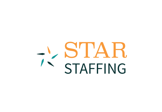
Since the company has been in business for less than five years, their corporate identity is just now taking shape. When I was asked to come up with a new design, I selected Superclarendon and Source Sans Pro because both paired well together. The color palette selected offers vibrancy to the brand that was missing before.
Word Listing
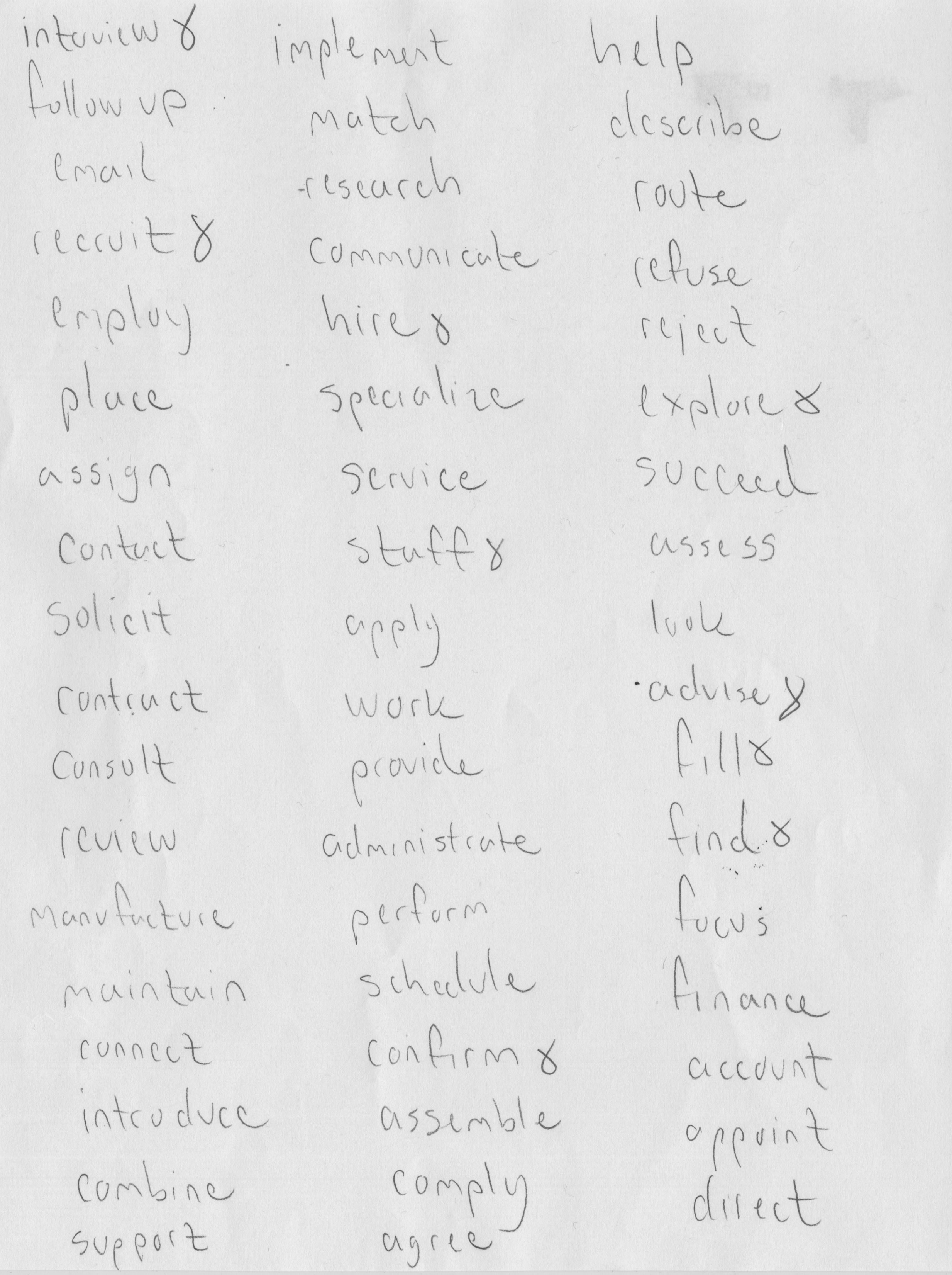
Before I could design the logo, I had to list out key components about the business and establish a connection between nouns and verbs.
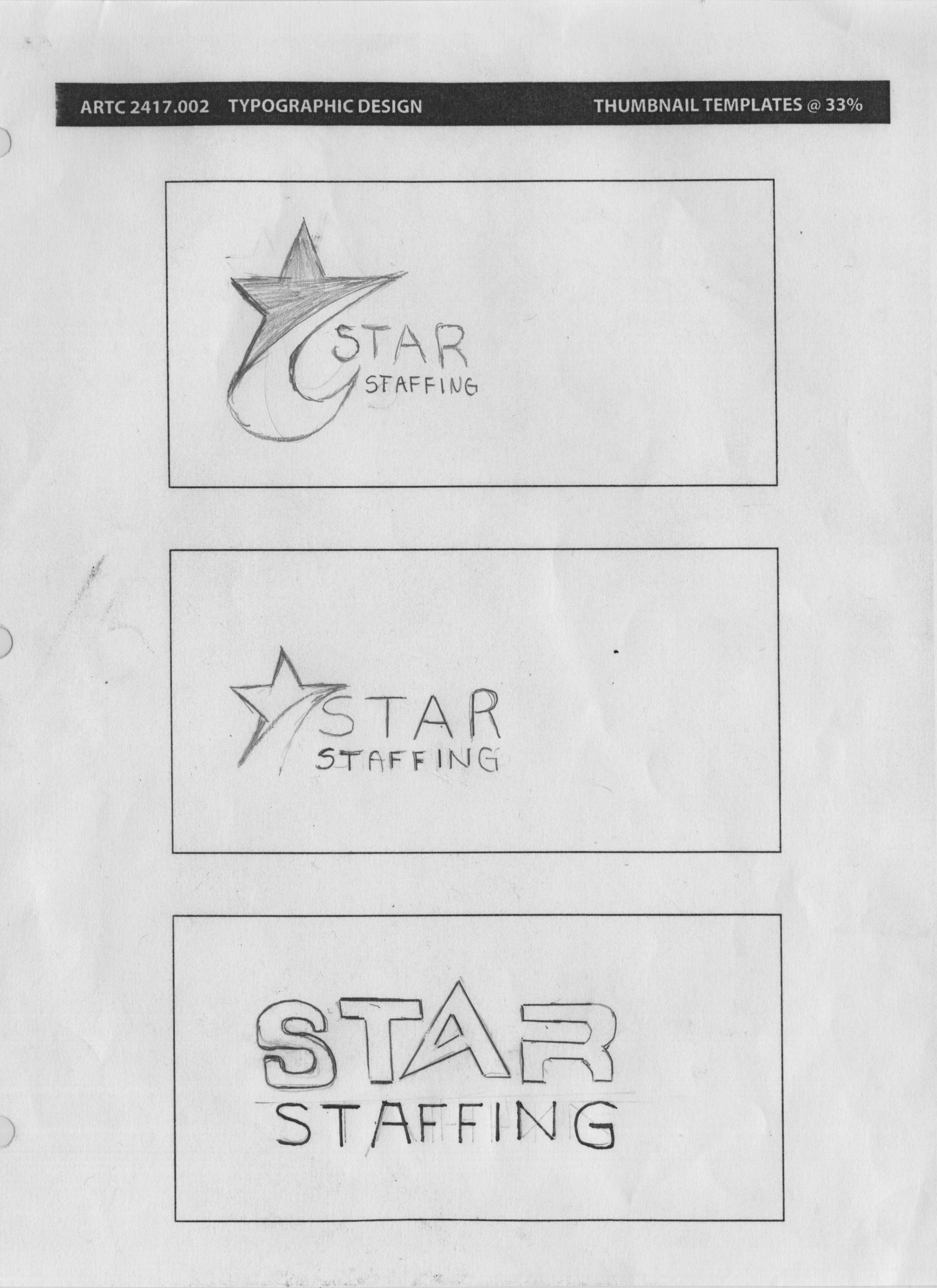
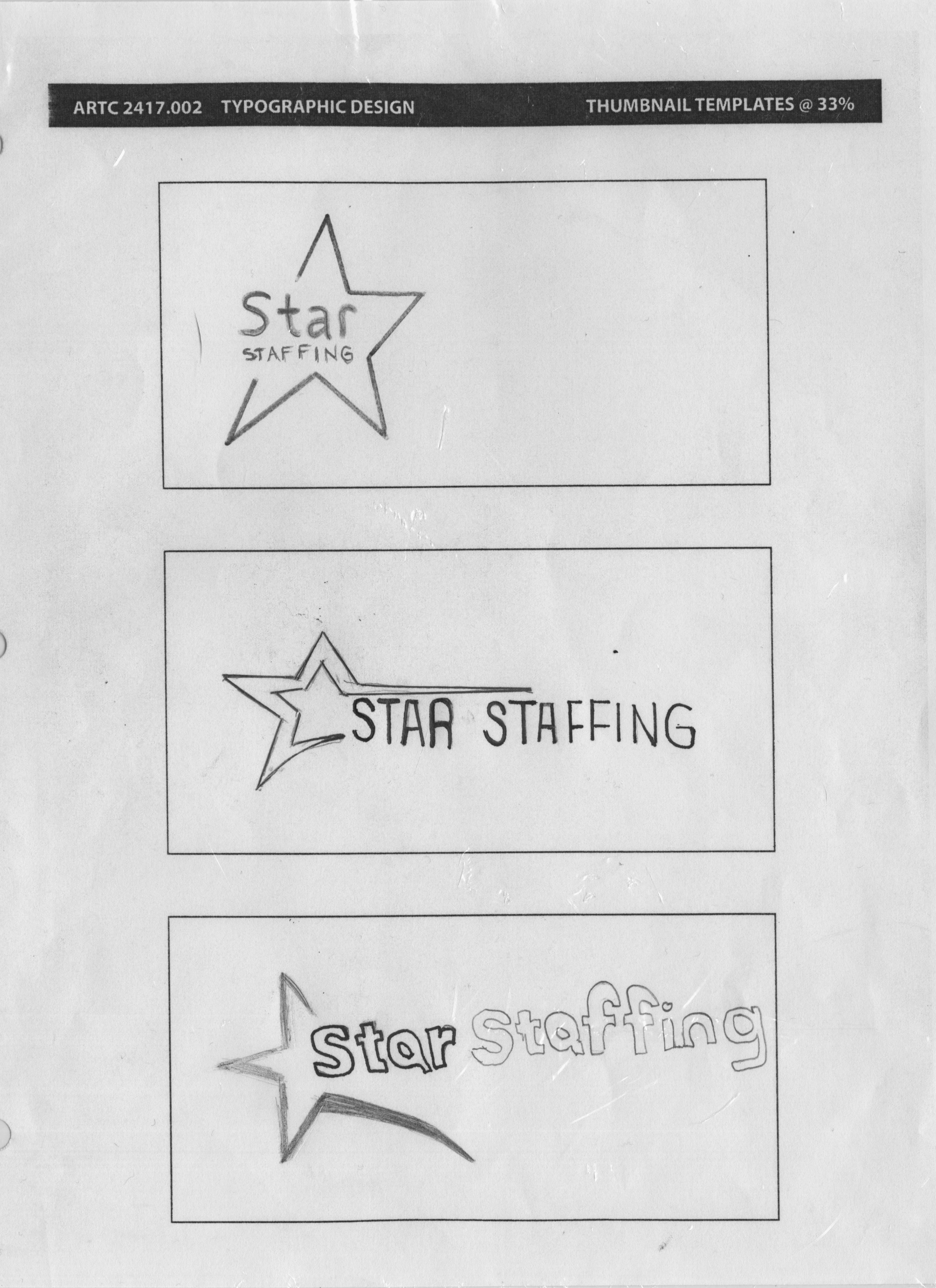
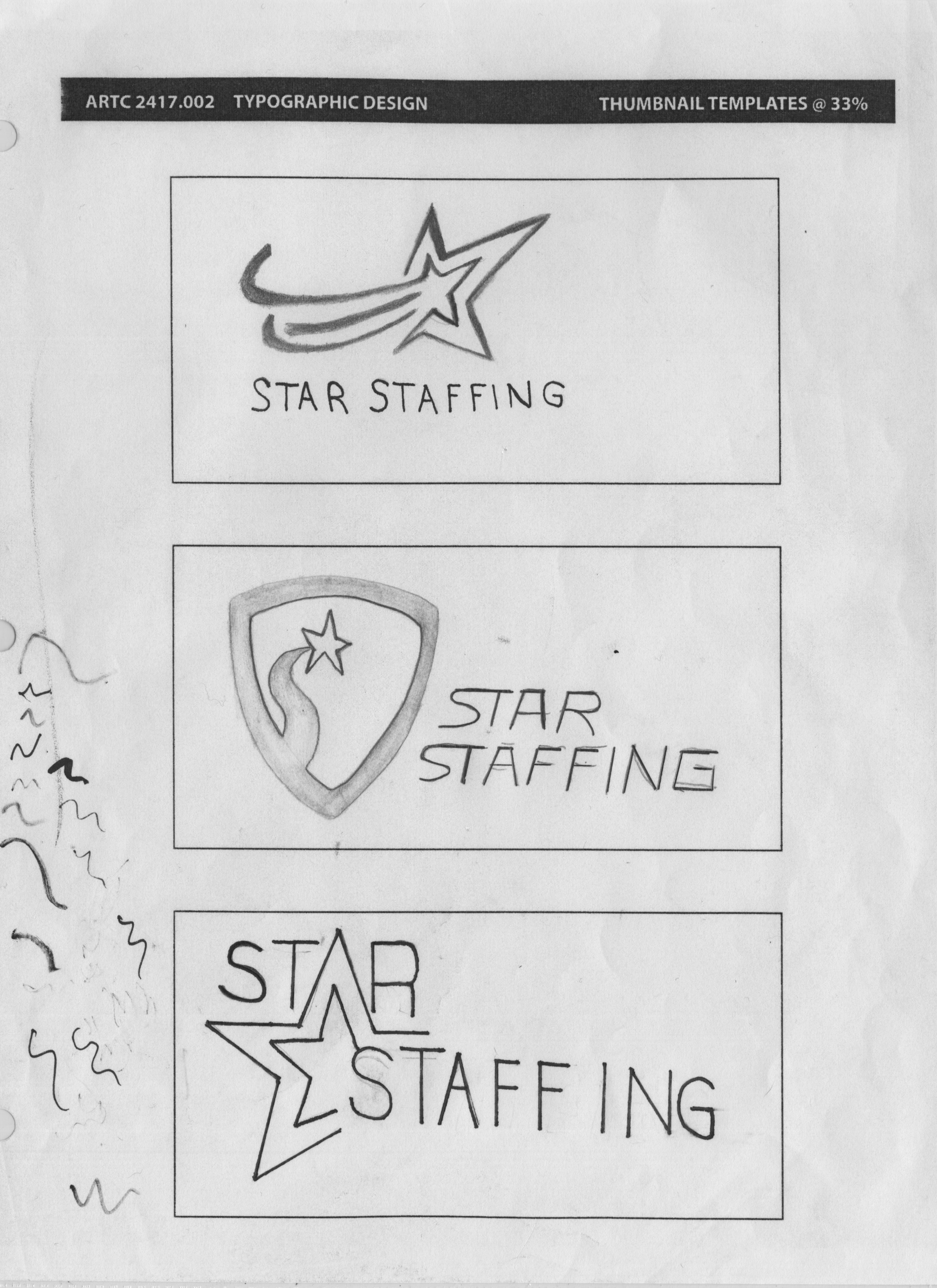
Process Sketches
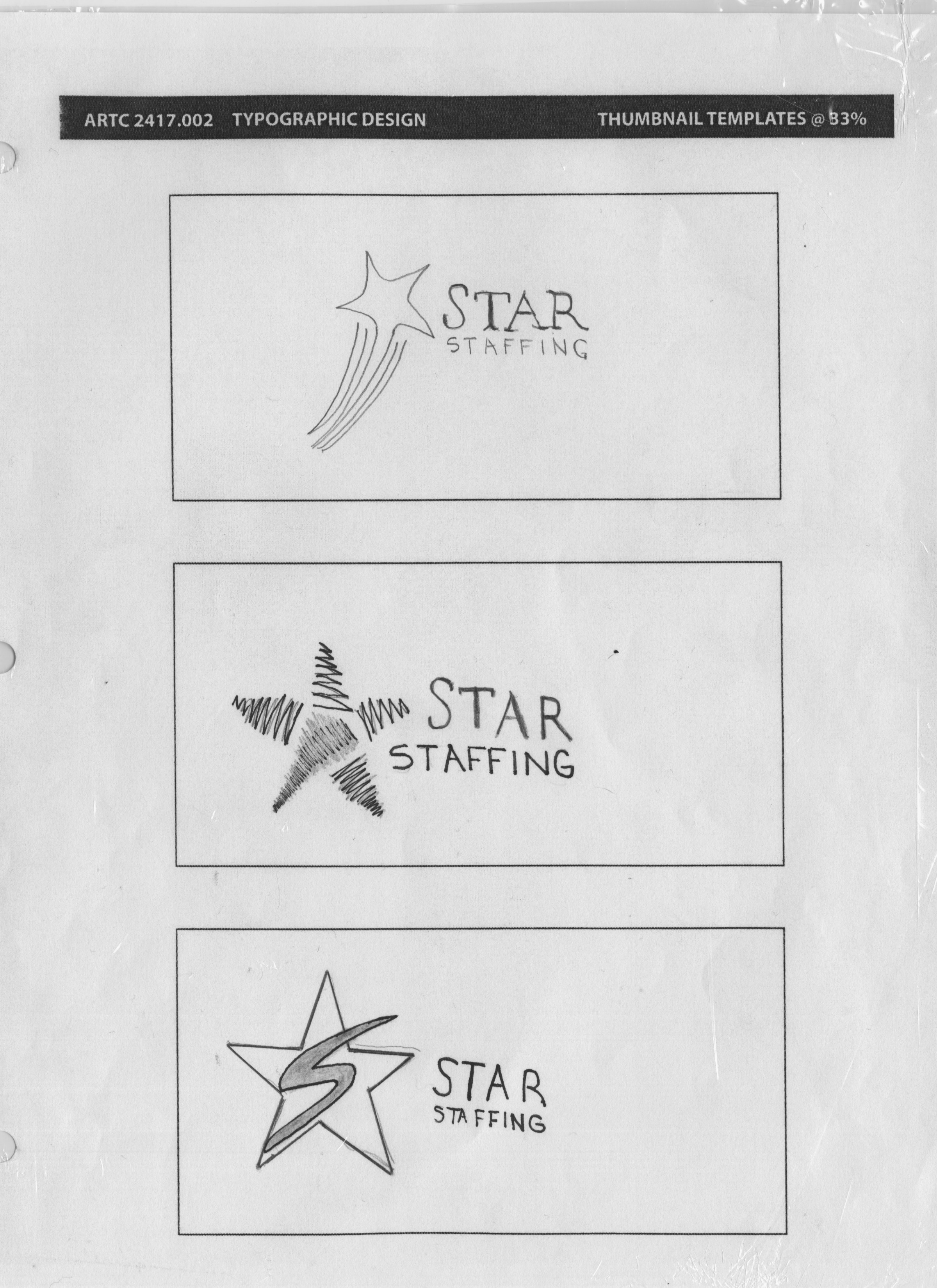
The shape of the star remained central to the design and concept of the logo.
Site Architecture
Before the web design process began, a visual map detailing the site's functionality needed to be created. The principles of Design Thinking were applied during the development of the project.
User Experience Sketches
For me, it was essential to research different layout options and compile a design that would produce a pleasant experience for users. By combining different components from other agencies, I was able to customize a design that minimized hassle and exceeded client expectation.
Paper Prototypes
The paper prototypes would carefully crafted and attention was paid to the functionality of each component.
User Testing
All of the tests conducted on test subjects proved that users could navigate through the website with relative ease.
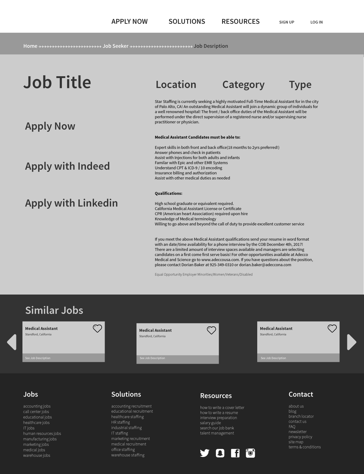
Wireframes
These wireframes show how an applicant would navigate to find the information they are looking for. From the landing page, the entire process has been scaled down to just three pages. This experience eliminates most of the hassle typically found with other agency websites.
Desktop Website
After the wireframes were constructed, it was only a matter of time before the branding was applied to the final design.
Star Staffing Home Page
At the home page, users must make a selection before they can progress into the website. This routes employers to find talent through a recruiter or directs job seekers to the job listings page.
Star Staffing Job Listings Page
The job listings page is the second screen where a potential job seeker would use specific filters to find information on a job that is relevant to them.
