Toytoise
Toytoise Product Photograph by: Eric Guzman
Creative Brief
Toytoise is an online retailer specializing in toys that are sourced from various manufacturing facilities around the world. These toys are classic and contemporary, fanciful, functional, simple and sophisticated. The brand appeals to both hemispheres of the brain by combining design and engineering. Each product appeals to the sophisticated customer with an understanding of design and an appreciation of quality.
Design Challenge
Developing a new logo and color palette will entice the target market to make a purchase. Once the new branding system is implemented across all online platforms, customers will be more engaged with the product and should have a better consumer experience.
Toytoise Product Photograph by: Eric Guzman
Field Research
All of my research is based on visits I made to local independent toy retailers in San Antonio. Attention was paid to the branding applications, social media presence, and demographics of the patrons observed making purchases. Both stores had toys similar to Toytoise but neither one carried the exact items sold by this vendor. A full report of my findings are available for download and review.
Logo Development
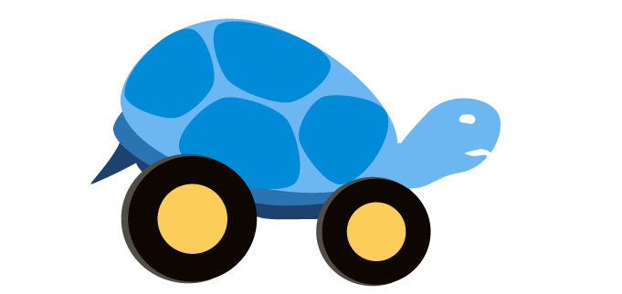
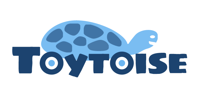
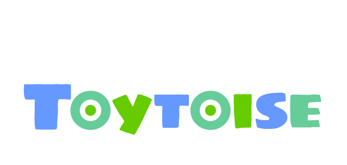
Initially, the logo design was inspired by a photo I saw online of a tortoise with wheels in place of limbs. Afterward, the incorporation of the wheels into the name of the company felt like a natural progression of the brand. Once the appeal of the wordmark was made obvious, the references to the tortoise disappeared and the colors used for the brand were made final.
Site Architecture
Before I picked up a pencil to start sketching, a visual diagram detailing the site's functionality needed to be mapped out. It was at this point that I began to apply the principles of Design Thinking to this project.
User Experience Sketches
It was essential for me to explore different layout options and compile a design that complimented the needs of the target audience. By comparing the design of other product pages, I was able to create a layout that effectively displayed the content in a manner that appeals to the user base.
Paper Prototypes
These prototypes were developed after reviewing various layouts and compiling features found on different websites.
User Test
User testing yielded results that I had not anticipated previously. For example, the placement of the thumbnails detailing alternate views of the product were misread during testing. More than one person saw the two images below the main product page as the thumbnails displaying different views of the same product.
Wireframes
By removing the alternate views of the product from the right side of the main product photo and placing them directly under the image, I was able to provide a better user experience by minimizing the possibility of confusion.
Desktop Website
Once the wireframes were built, I wanted to create an experience that was appropriate for the end user. The color palette selected compliments the excitement a child would experience while playing with the product. In addition, the site has good hierarchy and straightforward navigation.
Toytoise Home Page
Toytoise Product Page
Social Media Promotion
Facebook provides Toytoise with a platform to promote products and advertise to the target audience. Increasing brand awareness to a wider audience through social media is now standard practice for most businesses.
